
Infographic of the Day: The U.S. Trade Imbalance Eclipsed by Competing Charts
Two infographics rely on a similar visualization technique to tell different stories about where the economy is headed.
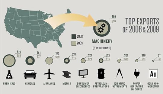
The infographic above depicts U.S. merchandise imports and exports over the last two years, and uses a graphic resembling an eclipse to emphasize the rapid shrinking of the American economy (full size here). A disc representing 2009 is superimposed over a disc representing 2008 to show how much expenditures on imports such as cars and consumer electronics has decreased...


No comments have been added yet.
David Lidsky's Blog

- David Lidsky's profile
- 3 followers
David Lidsky isn't a Goodreads Author
(yet),
but they
do have a blog,
so here are some recent posts imported from
their feed.

