Playing Favorites: Chapter 10
Welcome to the 5th edition of The Pulse -- The State of the Art -- a survey in words and pictures of the online artist community. The Pulse is a collaborative project that aims to introduce you to new artists, help you get to know familiar faces even more, and allow you access into the creative hearts and minds of a very talented crew of individuals. More than 130 artists have answered a series of questions which make up The Pulse. Their responses will be presented in a series of online posts which will run every Sunday.
Style File, Techniques & Tools, Master Class, and It's Still Life were the first four projects posted and links to all these posts can be found on the sidebar of my blog. The fifth project, Playing Favorites, continues now...

Participants were asked to: share a picture of a favorite piece of art that you have created and explain its meaning to you...
------------------------------------------
Dayna Collins
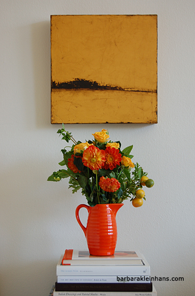
 "The Morning Smelled of the River. This piece incorporates the many things that I love: limestone clay on a wood substrate, which allowed me to paint, scratch, add texture, sand away, and add more layers. It also has a niche, so I was able to add a 3-D element, in this case, a stack of river rocks. This piece represents a peaceful, natural setting brought indoors."
Barbara Kleinhans
 "Thicket was one of those paintings that I consider a happy accident. I mixed the background color using the remnants of paint from a very old tube, along with a few other colors. The wet color was shockingly bright and I decided rather quickly that I'd have to paint over it. Then it dried to a beautiful deep curry color. I keep a color journal and had documented my color recipe but have been unable to replicate it."
Dorothy Simpson Krause
 "This book, 9/11+5, was conceived in response to the question, 'What can an individual do about the war in Iraq?". It first existed as a drum leaf book, 5.75" x 5.5", with acrylic paste paint and collograph printed pages on Fabriano paper, ceramic covers painted with acrylic and red kangaroo spine. The pages were scanned and text added in Photoshop. It can be seen as a page turning flip book here."
Stacey Merrill
 "Carnivore, a Polaroid emulsion transfer, is one of the few pieces I have carried around for years. In the early 90s I took a museum sketching class, which included working from Antoine Louis-Barye's bronze Tiger Attacking an Antelope. Drawing in the museum was a great experience. I found myself really looking at the art plus got over my discomfort with onlookers. Years later I had fun reinterpreting this sketch using the emulsion transfer technique. The fluid nature of the wet film gave me room to play, tearing at the edges to add energy to the piece."
Bonnie Clark
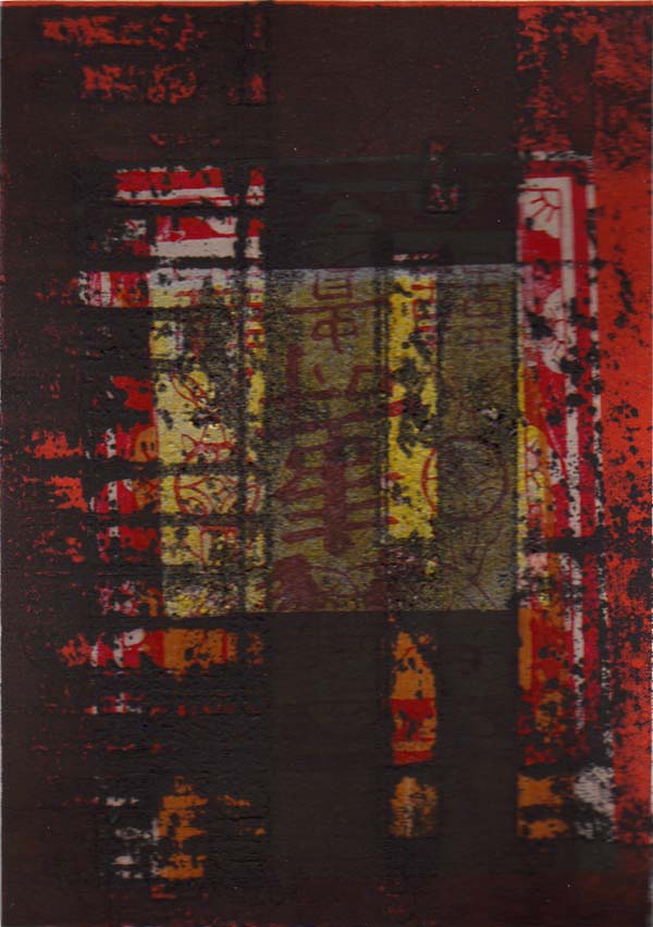 "Decay 1 is a chine colle print created using a solarplate created from a photograph taken in Chinatown of a graffiti covered wall, Akua printmaking inks, and Chinese joss paper. It reminds me that beauty and meaning often lie beneath the surface and aren't always recognizable to everyone."
Julie Shackson
 "This Blue Earth is a mixed media collage that portrays the micro and macrocosmic patterns repeated on different scales. It's an old work that I've never parted with because it's where I discovered what I wanted to say."
Lise Hoffman
 "This is a part of a piece called Jazz en Ciel, created in 2010. This is a summer night in a castle in France, during a Jazz concert. The piece was reflecting the warm atmosphere and wonderful sky on that night."
Laura J. Wellner
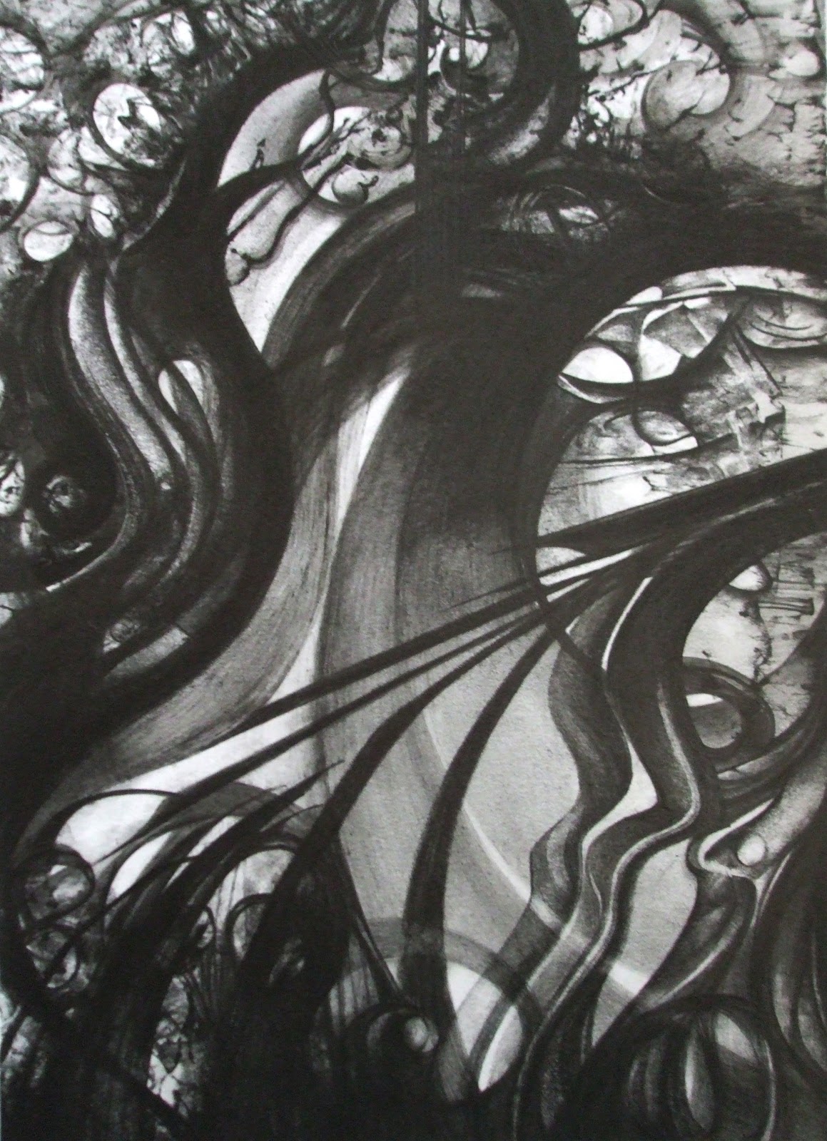 "I want more out of life 2008. The title says it all - I always come back to this one for a benchmark. There are parts of this drawing that are in perfect pitch for me, and then there are parts that are textured meanderings that seem to go nowhere and are seeking, exploring (like the grape vines sending out its tendrils to reach out and grasp and grow) - I love the random nature of it and the depth."
Marianne Konvalinka
 "Dream On. The first mixed media piece I did that I really liked. Love the prussian blue, the cards, my handprints, the raven. People see this at shows and stand in front of it and talk about how they could look at it a long time and always see something new. I love that about it. Successful use of transfers, stencils and layers. Good rock n roll name."
Pat Pitingolo
 "The sum is greater than the parts."
Marion Bockelmann
 "Vintage Woodland journal page. I made this book page for a tip-in project and didn't have any idea at first what to do for a journal with this theme. Then when I began gathering material appropriate for the theme, I began to be excited about it and a whole quiet world seemed to grow before my eyes."
Terry Garrett
 "Keys to Contentment. I made this a few years back. It represents the special place my partner and I like to go on the north shore of Lake Superior."
Robert Stockton
 "Approaching Fear is a shadowbox (one of what I call my scrapboxes). The title has a double meaning, which is, to me, almost like a question and an answer: fear is approaching someone, but that 'someone' has ways of dealing with, or 'approaching' this fear as well (a negative countered by a positive!)."------------------------------------------
Next "Playing Favorites" will be posted on Sunday, October 28th and will be the last in the "Favorites" series.[image error]


No comments have been added yet.