
best font forward
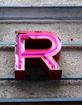
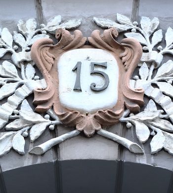
All cities are full of interesting details, especially if you look up, but not all locals appreciate the wealth and history of the fonts and numbers and letters and signs that surround them. So I loved the fact that a small, off-beat publisher created a Font Walk Map for the World Design Capital Helsinki 2012 programme. The map has sold out but can still be downloaded for free, and it's a clever piece of design in itself.
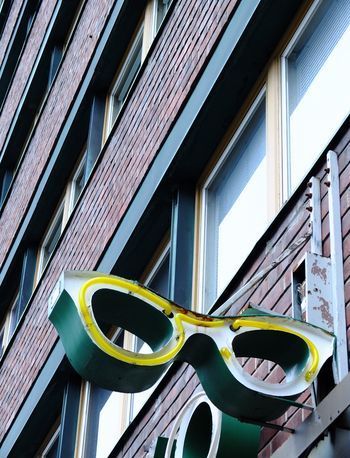
The walk takes about 45 minutes and guides you past all sorts of wonderful, curious, stylish, bizarre details on buildings, gates, fascias and doors. It makes you realise just how much you miss most of the time, and how much thought, ingenuity, skill, artistry and history is on view for free.
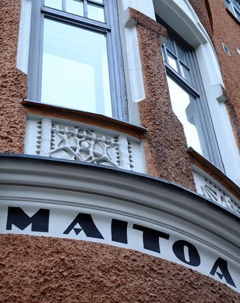
Helsinki is particularly rewarding in terms of fonts as there isn't the same rush to strip away the old and replace with the new and modern that you find in so many fast-forward places, so the city has a great mix of styles and eras (like Lisbon and Porto) and a real respect for craftsmanship and design; even if a sign or font is no longer cutting-edge, it still adds to the visual richness.
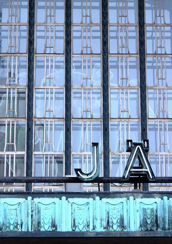
The above are all taken on the Font Walk, but there are plenty more fabulous fonts and numbers elsewhere. The Central Railway Station (below) designed by Eliel Saarinen is quite spectacular and worth spending time in and around,
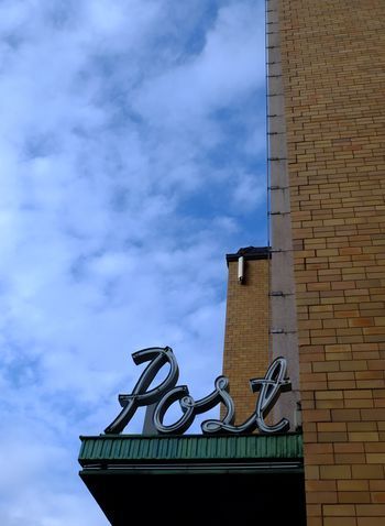
and I particularly like the 1938 main Post Office building.
Having learned so much on a 45-minute Helsinki Font Walk, I think it's time more cities put their best font forward.


Jane Brocket's Blog

- Jane Brocket's profile
- 27 followers

