
NEW Lettering from Gaspar Saladino!
This image and the next three below © Magnus Aspli, Michael Deshane and Jelena Dordevic (as close as I can type it here).
What were you doing in 1951? Myself, I was being born in January of that year in central New Jersey. Not far away, in New York City and Long Island, Gaspar Saladino was beginning his career as a freelance letter for DC Comics (among others). Gaspar continued to produce his skillful, dynamic, and creative hand-lettering for DC until they moved to all-digital lettering around 2002, essentially putting him into retirement. A few weeks ago I learned from fellow letterer (and friend and admirer of Gaspar) Clem Robins that “The Master” had returned to the drawing board to letter some sample pages for an international team of would-be comics creators, something arranged by Clem himself. With everyone’s permission and help, I’m delighted to be able to report on this work, which has allowed Gaspar to extend his comics lettering career to a seventh decade! The sample above is from the first page, and it confirms to me that my favorite letterer, and the man that I (and many others) saw as a role model in lettering has still “got it.”
The proposed comics project is titled by the creators, “Empire of Blood,” and co-writer Magnus Aspli describes it as “an epic historical drama grounded in realism, but which also deals with fantastical Slavic folklore elements, anachronistic technology and horror genre aspects.” It begins in “1855 as the Crimean War rages and the Russia Empire is in turmoil, internally as well as on the front lines; two men—one a vurdulak and protector of Tsar Nicholas I, the other a steadfast revolutionary—are sent on a vengeful collision course. A course that will change the fate of nations.”
Magnus Aspli is a native of Norway, his writing partner Michael Deshane lives in Canada, and their artist, Jelena Dordevic (my blog program simply will not recognize some of the actual letterforms in her name), resides in Serbia. Magnus told me, “I started with the idea, I think it was in 2010, then hooked up with Michael online and we began writing it together in the autumn of that year. We worked on the story/scripts for a year before we contacted Jelena through DeviantArt. Luckily she was intrigued and the three of us have been developing it since.” Earlier this year, with some finished art ready, they contacted Clem Robins online, hoping to enlist him as a letterer for their comics proposal.
Clem told me, ” I liked the art a lot, but with all that cross-hatching, I thought it’d look lousy with computer lettering. I called Gaspar and asked him if he’d be willing to try it. I wasn’t sure he would be, but he was delighted. As it happens, the artist was a big fan of (Gaspar’s work on) ARKHAM ASYLUM, and couldn’t believe he would be interested in working on her pictures. Gaspar did the work on vellum overlays and mailed it to Michael in Canada, who scanned the lettering and sent it to Norway, where it was digitally combined with the artwork. For his part, Gaspar liked the story, so far as he read it, and loved the woman’s art.”
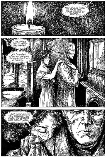
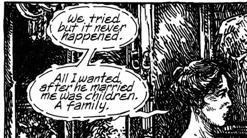
Here’s the complete first page, and you can see what Clem meant about all that cross-hatching, but I have to agree, I think the art is quite good, and doesn’t Gaspar’s handsome upper and lower case lettering work well on it? And the style he’s created for the whispered dialogue is creative and I think unique.
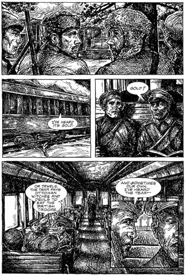
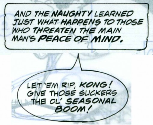
Here’s another page with standard balloon lettering that also looks great to me.
A closer look at one balloon. At this size, the lettering is a little rough in spots, but certainly quite readable and very much in Gaspar’s style, reminding me of what he was doing for DC in the early 2000′s.
I spoke to Gaspar this afternoon for the first time in at least 10 years, probably more. Clem has been encouraging me to give him a call, and this seemed a good time to make the effort, as I wanted to make sure he was okay with me blogging about this project. We had a good talk, and Gaspar sounds just the same as ever. After some catching up, I asked how it was for him doing this lettering, was he rusty? “No, not really,” he replied, telling me that he keeps his hand in practice by writing things every day, but with a regular pen, not lettering pens. He seemed very happy to have this chance to do some hand-lettering again, and when I told him nearly all my lettering work is on the computer now, he said jokingly, “You should get back to hand-lettering, you traitor!” But he understood when I told him that computer lettering is what all the major companies are geared for now, and what they want from me.
Before I conclude this post, I thought it might be interesting to look at some examples of Gaspar’s standard balloon and caption lettering over the years, and they begin below. (Gaspar, if you’re reading this, hope you don’t mind this stroll down memory lane!)
This image and those below © DC Comics, Inc.
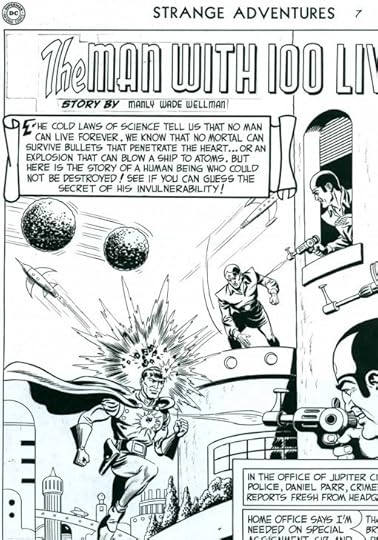
Here’s part of a page from STRANGE ADVENTURES #7, cover dated April, 1951, which I believe is lettered by Gaspar, and quite early in his career. It’s scanned from original art.
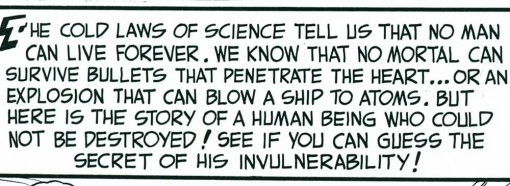
A closer look at the big caption shows elements that identify it for me, including Gaspar’s distinctive S with a long straight central bar. This early work is a little stiff, but quite professional. Editor Julie Schwartz was already making good use of Gaspar’s talent, even then!
In this panel from SWAMP THING #2, cover dated December, 1972, Gaspar’s work had become rounder, and begun to show his use of a pen with a slight wedge tip, making the horizontal strokes a little thicker than the vertical ones. (It was a Speedball FB6 filed down to a wedge shape, I believe.) This example is also more condensed, and it’s worth noting that this lettering is done smaller than the earlier sample. The standard DC art size had shrunk from about 200% of printed size to about 150%.
Here’s part of a page of lettering on vellum over photocopied art from the LOBO PARAMILITARY CHRISTMAS SPECIAL from 1991. Look at that great first caption and its decorative capital S! I could write volumes on all the wonderful display lettering and sound effects in this comic alone.
But I’m focusing on the regular lettering here, and these two examples show Gaspar’s style had shifted again to one that’s more angular and less rounded. The wedge-tipped pen work is also more obvious and pronounced. Some of the S shapes are getting back to the angular look of the first example from 1951. And while I don’t have any examples handy, I think this trend continued toward more angular work until Gaspar’s style reached the place it is today in his latest lettering.
When I spoke to him, I asked Gaspar if he’d like to do more lettering. He said he would, and this confirms what Clem has told me, that he was very happy to have this small project in front of him. Of course, he’d be doing hand-lettering, and I imagine would like something he could take his time with, nothing with a tight deadline. Perhaps other projects that would fit that bill will come his way in the future. I and all my long-time lettering friends would be delighted if they did. We’d like nothing better than to see more work from the man we admire so much, the one we call “The Master.”


Todd Klein's Blog

- Todd Klein's profile
- 28 followers

