
The Graph You Really Need When Watching the Republican (and Democratic) Conventions
Ezra Klein gives us a graph from the Center on Budget and Policy Priorities that shows the ratio of debt to GDP from 2001 to 2019. The graph attributes the rise in the debt to various causes. The Bush tax cuts and the wars in Iraq and Afghanistan are shown to be major culprits.
There actually is a much better graph that people can use. This is the graph showing interest on the debt as a share of GDP.
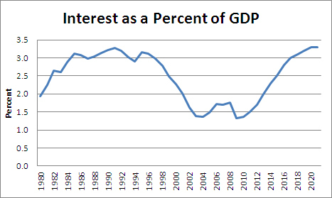
Source: Congressional Budget Office.
Note that this one looks considerably less scary. We do...


No comments have been added yet.
Dean Baker's Blog

- Dean Baker's profile
- 2 followers
Dean Baker isn't a Goodreads Author
(yet),
but they
do have a blog,
so here are some recent posts imported from
their feed.

