The Ideas Shoppe: The Making of a Superhero (Part 1)
When I was first outlining the story that would become Vanguard Prime: Goldrush, I had nothing but a few spare ideas of what I wanted it to be, which I gathered together in a file on my computer called “YA superhero story”. Those ideas included the goal of creating superhero characters that felt authentic, that could be a main character in their own right, and that would have a certain weight and sense of history to them.
Eventually, I’ll explain how I come to create each member of the Vanguard Prime team, but for this first post in the series, I thought the best place to start was at the heart of the team with Goldrush himself.
By the book’s own nature of being a Young Adult story, I knew I had to have a young character at the centre of events. I wanted the main character to be relatable, so he had to have a fairly basic power that had the potential to develop over the course of the series.
My first idea was to draw on the characters I created when I was a teenager (and an aspiring comic artist), which included ‘Soundstorm’, a superhero who could absorb sound and transform it into energy. I toyed with this idea for a while, before eventually dismissing it as unworkable.
The next power I considered was a stranger one; a hyper-kinetic ability that would give the character the ability to bounce and ricochet from one surface to another, like a human superball. This seemed too difficult a power to encapsulate for a reader unused to superhero stories, so once again I canned it.
All the while, I was trying to work out what the character’s visual motif would be. Superheroes need a strong visual “gimmick”, for lack of a better word. The most famous superhero characters have an iconic appearance that generally stems from a simple concept; a man dressed up as a bat or a spider, a soldier dressed in his country’s flag, a speedster who uses bold colours and lightning bolts to convey motion (Superman gets a pass on his visual being so generic because he’s the guy from which all other superheroes stem).
Drawing from my old note books again, I found ‘Goldrush’ listed in the ranks of a superhero team I’d generated names for but never created any characters to go with them. Turning the name over in my mind, I realised it was perfect. It gave me a colour scheme to work with, it suggested a power, and it stuck in the memory. It sounded a little goofy, but in a cool way that the best Gold and Silver Age superhero names sounded.
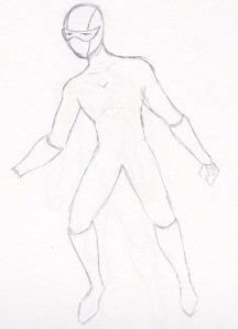
But why “gold”? Just because of his costume? And what were the limitations of being a speedster? Would he need to wear a helmet to protect himself from the velocity he’d be travelling at? I sketched out an idea of what the character might look like with a mask, guarding him from both g-forces and the media’s cameras (you’ll have to forgive the roughness of the drawings – there’s a reason I gave up on trying to be an artist).

The first sketch of the character that would become Goldrush
It just didn’t look right, though. I had run into the same problem that Hollywood does whenever it produces a movie about a masked superhero; you limit the range of emotion you can show. Not that that’s much of an issue in prose, of course, but there was always the book cover to consider.
I took another pass at the design, deciding on white and gold as the colour scheme to help differentiate the character from the Flash. I liked how sunny and positive it was, but felt it still looked cool. Having decided on the name Sam Lee, my character was formed. Now I just had to write about him.

Goldrush as he was first envisioned.
Three years later, when my book was finished and had been picked up by Penguin, the design process for Goldrush began all over again. The designer and publisher felt that a mostly-white costume wouldn’t work, and asked how I’d feel about swapping the suit’s colours. At first I was unsure, but then I sketched out a rough idea of what it might look like and found myself pleased with it.

The inverted Goldrush uniform, incorporating ‘V’s into the design.
From there, the illustrator and designer took over. The first step was in finalising Sam’s look, with the illustrator providing a preliminary design that I can’t post now, but hopefully at some stage I will. It retained some of the white elements, coupling them with glowing neon and a black base layer that was visually stunning, but a little busy.
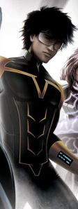
Working with that feedback, and moving in a darker, more realistic direction, the illustrator took a second – and final – pass at the costume. Streamlined, strong, futuristic, Goldrush’s V-suit (as the team’s outfits are called in the VP universe) looks like what an expert costume designer would create for the big budget Hollywood adaptation of the book.

The finalised Goldrush design, as featured on the book’s cover.
But most of all, it retains the most important elements that I’d aimed for when first coming up with the character; it has a strong visual theme, it identifies him and the team he works for, and most of all…it looks cool! Beyond his visual appearance, however, Sam also had to be sketched out as a person.
Once again drawing from my own adolescence, I took the pressure and intimidation I felt in transitioning from primary school into high school and multiplied it a thousand times. I knew I didn’t want to refer to my own experiences too much, however, as I’d basically included myself as the main character in the first manuscript I’d tried to get published, and it hadn’t turned out well.
So I thought through Sam’s life and his predicament – wouldn’t it make things harder for him if his life back home was happy, even idyllic? How would his parents feel about shipping him off to what amounts to the most high-pressure military school in the world? And what was the incident that saw Sam gain his powers? What got him to that moment, and in what ways was he changed after it?
These were all the questions I had to ask and answer in creating Sam, and they’re the same questions that are posed through the course of the book. Because it’s not just the flashy costumes that draw us to superhero characters, it’s the people beneath them.
…which sounds a little dirty, now that I think about it.
I hope you’ve enjoyed this peek behind the publishing curtain. Make sure to come back for Part 2 in the Making of a Superhero, to be posted…well, whenever I get around to it, really.
‘Til then.


