Home
As you may already know, I'm hard at work on a new book, a vessel holding poems and prose. Today I have spent the entire day working on the design of the front cover:

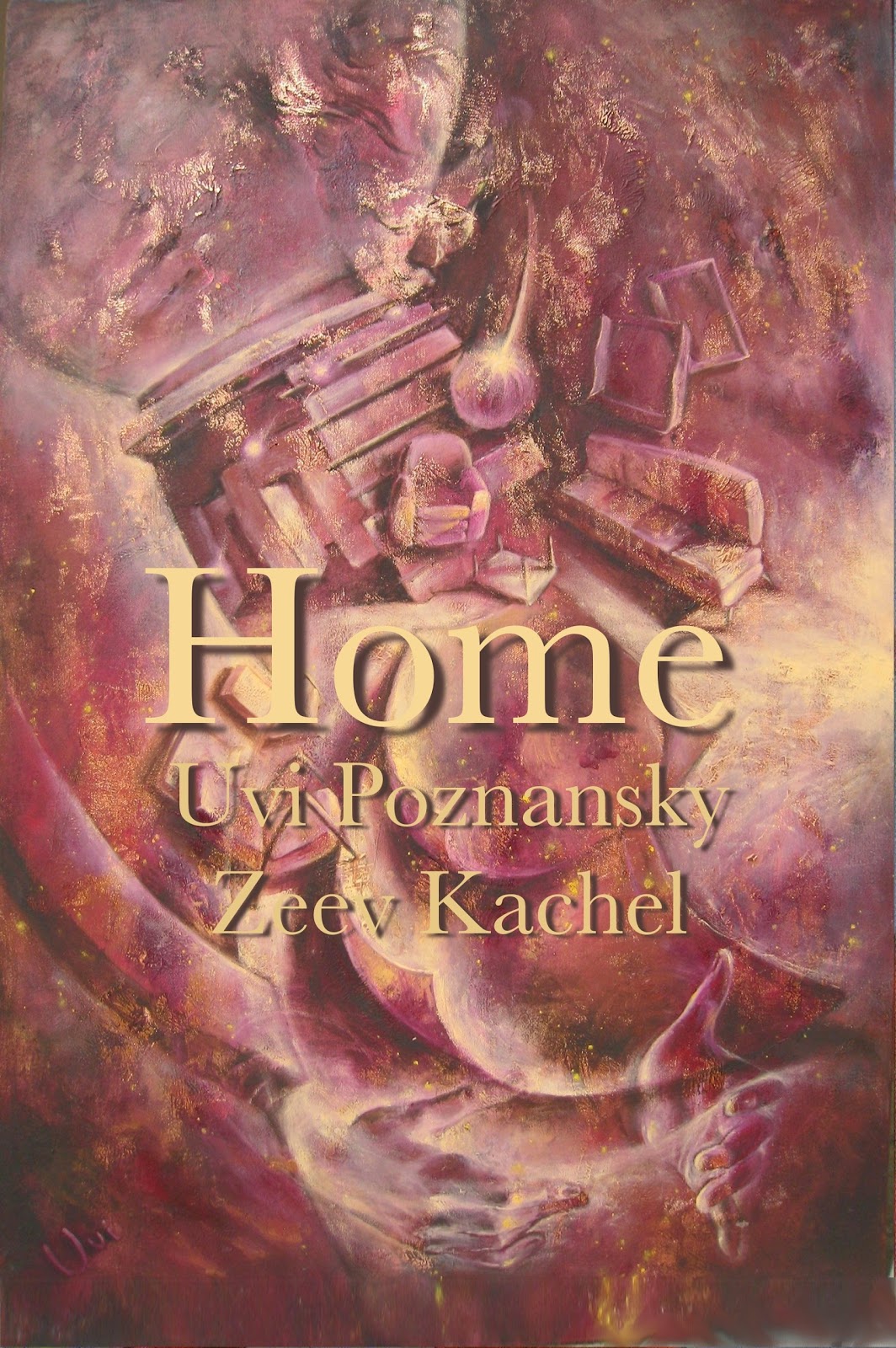
The image may look familiar to you, I have showcased it in My Father's Armchair, and offered details in Muse and in This is the Place. However, I needed a higher resolution image for the front cover, which presented a real challenge. It is extremely difficult to photograph this piece, because the layer of gold, which is exposed in places, reflects light in unpredictable ways. So I snapped the picture in one room, then another, with diffused daylight coming from the side, the front, the top, with and without flash, then took it outside and snapped it in sunlight, in the shadow, here, there and everywhere... You get the picture.
At last I found one version that looked fine to me. First I had to fit the image to a prescribed size (according the book size I have in mind.) Then I created the shadows of the lettering. You may notice that the shadow's color is not black, but rather it is the darkest purple of the painting (which can be seen in the lower left corner.) Also, I blurred these shadows, so they do not have hard edges, but fuzzy ones. Then I selected a soft yellow, with which I typed the title, Home; and a less bright version of this yellow, with which I typed my name and my father's. Being brighter, the title 'comes forward' in relationship to the author names.
Normally I would make sure that all text fields are of the same width, or that they are arranged in a way that the one on top has the shortest width, and the one at the bottom has the longest width, which creates a sense of stability. Not so here, because I view my childhood home through the shaky lens of memory...


No comments have been added yet.