Cover Design for T.R. Verten – A Co-operative Working Model #bookcovers
T.R. Verten is a novelist with whom I had the pleasure of sharing a publisher – Republica Press. As publishers change, covers must be changed as well, because the cover is IP that has usually been paid for and is owned by the publisher, not by the author. I asked T.R. to allow me to have a go at designing a new cover for the novel “Confessions of a Rent Boy.” We used a combination of GChat and email to show things back and forth to each other. I wanted to get a sense of what was good about the original design, and what was lacking. Also a preference for fonts, colours, etc. T.R. graciously allowed me to have a go and, even more graciously, has written up a description of the process of working together with me to develop something that represented the spirit of the story, but would also stand out amidst the thousands of other books out there.

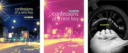
Original Cover
The original design was a stock photo with added text, which contained some of the elements I wanted, but had a pretty generic appearance. After we talked, RG took her cue from the aspects of that original cover that I liked: the long-exposure lights, the feeling of isolation. I wanted the cover to have the feel you get after being out all night partying and waiting for the first bus in the early morning hours.
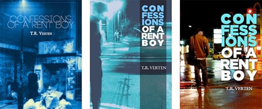
The first set of covers (5,6,7) didn’t really resonate with me, even though the streetscape they portrayed had the right kind of vibe.
I much preferred the one with the man standing against the backdrop of an urban street in options 2 and 3, and the blue-toned cover was in the running to be one of the the final two. In the end, however, I decided that the solitary figure might actually confuse the issue, making the protagonist out to be a street prostitute, rather than simply a loner. Cover one gave off the same sort of impression, and was almost too seedy.
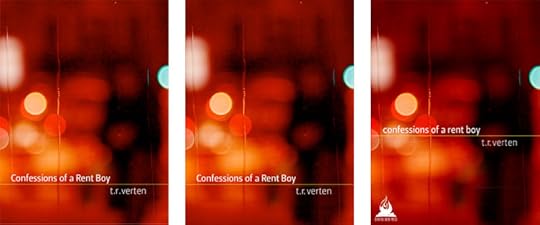
When I saw the abstract cover, though, I knew it was the right choice. The colors were rich and saturated, the pattern on the glass almost reminded me of tears. Though the book is erotica, it is suffused with sadness. The blue cover with a lone figure portrays a solitary man, whereas the cover I ultimately chose places the viewer in the protagonist’s place. Like the best writing, it shows rather than tells.
For my part, I’m really happy with the cover T.R. Verten chose. There’s a very nice semiotic contrast of the heat of the red tones and the cool of the drips of water. I like the ghostly lone figure of the protagonist, unfocused and waiting to be interpreted by the reader. It speaks to me of being terribly lonely in the midst of a crowded city. In the final (far right version) I lowercased all the typography as requested, and agreed that this really spoke to it being a very 21st century story, with aspects of pragmatism and alienation.
But mostly, I hope it will really attract the reader’s eye. It will pop off the shelf or off a webpage and intrigue the potential reader, while allowing them the pleasures of anticipating unknown and yet somehow familiar landscapes.


