Lumen: A History in Book Covers!
As Lumen is nearing its release, I thought I'd share with you, all the different looks I've gone for with Lumen. And when I'm looking back at these pictures I'm thinking to myself... did I really think that looked good! In fact, I think this post should be called "A History of Joe playing with Photoshop" well, either title is accurate!
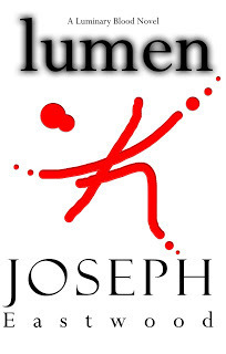
1st Draft
At the time of creating this... I'm going to say around June 2011, I was so excited and so happy that I'd created it. But now I think back and I'm like, whoa... who let me on Photoshop! LOL! But I'm glad that I got to play around with it because if I didn't then I'd never have the design that I have now, and I probably wouldn't have been spurred on to write and edit the rest of the novel.
So this is the first ever cover that I created on Photoshop. Aren't you just proud of me... I mean, proud that I didn't stick with this and actually played around until I made something that I would be happy about when it did come to publishing.
Let's all thank some deity somewhere from stopping me making a huge mistake! Although I really did like what I was going for with the symbol on the front *cough* that symbol is very important in the *cough* novel. Hehe.
What do you think?
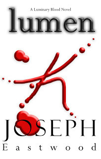
2nd Draft
Well, this one is a little better than the first, but I haven't done much to change it. I just used a lot of bevel and embossing. I tried to make the symbol in this copy mimic blood... and as you can see, it didn't go down very well. I was trying and trying for hours, asking people and looking at tutorials... I think I know how to do it now, but then again, this cover was made over a year ago.
Well, yeah, this one was also made in June 2011... so over a year ago, this is where Lumen stood, and thank goodness it fell flat on its face and made way for more covers!
I do like the blood splatter lines, and it looks more like a person dancing than a scar... in fact, I could probably create this now with all that I know. I had the image of a flesh coloured book, and then the symbol being etched into skin, perhaps scabbing over. (No, Joe... stop thinking of what you could do, you've got the final cover, so stop being silly!)
What do you think of this one then?
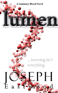
3rd Draft
This one was created in August, so nearly a year! And I really liked this one, I thought that this one would be the actually front cover, with a few minor changes... like the title, WHAT WAS I THINKING? The embossing on that alongside the background image just does not go well together.
I was trying to go for a blood-like DNA thing with the image on the background. Not sure if it worked, did it? Ah, well, I've got my final image now, and by the looks of things I learnt from this mistake, and in fact, with each front cover I've got better at using Photoshop. YAY!
So far, all the cover designs have been pretty same-ish, the whole white background, black title and name, and then a red image. I really wanted to incorporate blood into the design that I was too busy thinking of how to do it... instead of thinking outside the box! (More about that in the next image!)
What about this one?
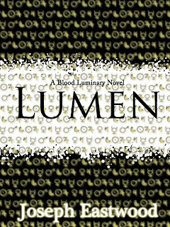
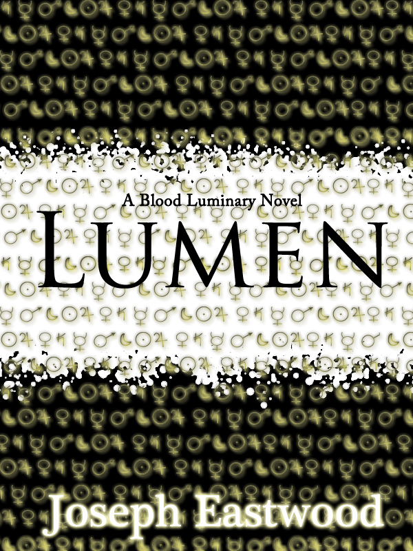
I didn't design this cover until January 2012! The time when I got my new laptop, and I guess that's all I needed to get the right design. Although now that I look at this I know it's too wide at the side (I usually use H - 8 inches and W - 5.5 inches, but the width on this had a whole extra inch.)
Oh, so the cover art for this bad boy took my hours! I realised that I was thinking inside the box too much with all of those other covers that I needed to think outside of it, and I needed to think about the series as a whole! From outside the box I brought together some very peculiar symbols! 10 POINTS if you know what they are. (Don't ask about the points, they may, or may not exist.)
Also, if you didn't notice I changed the series name from "Luminary Blood" to "Blood Luminary" either one would go, and both have a similar meaning... but I liked the way that I could say "It's a Blood Luminary novel" hehe. So this was the cover art for 7 months!
What do you think?
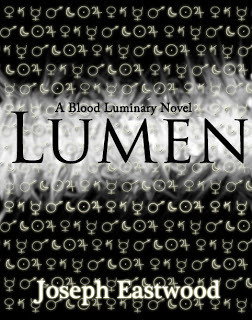
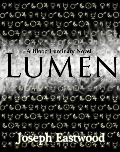
FINAL DRAFT!
Looking at this now I know that there are a few things I want to hop back onto Photoshop and change. Like the title, I want it to be BIGGER, and perhaps the "A Blood Luminary Novel" but bigger and probably bolder. I'll probably do that later on.
The symbols are brighter in this image, and in the white they've changed form and are etched into it like stone, maybe a marble of some sort. Hmm. I'm not sure.
I know what you're going to be asking "Joe, why did you change the cover art?" and I can't really say why because I don't really know, I just know that I was playing around with the cover art for the other 3 novels in the series, and I realised that Lumen could be better, and I could maybe get a shared design going. So yeah, each cover has this look, but each cover will have a different colour scheme and title.
So, your final thoughts! What do you think of this?
10 DAYS!!
Let the fun begin! Don't forget to get your copy of Lumen... you won't be disappointed! And if you are, then stop putting unrealistically high expectations on me ;) ha! Also, do not forget to Add Lumen on Goodreads! because I'm sure that there will be some fun stuff to happen in the future when Lumen is published! And... "LIKE" my page: Joseph's Writing because that's where I'm most active, and I don't want you missing out on any chance to win some goodies!
Are you excited? Happy?
-Joseph
Comment. Follow. Share.


1st Draft
At the time of creating this... I'm going to say around June 2011, I was so excited and so happy that I'd created it. But now I think back and I'm like, whoa... who let me on Photoshop! LOL! But I'm glad that I got to play around with it because if I didn't then I'd never have the design that I have now, and I probably wouldn't have been spurred on to write and edit the rest of the novel.
So this is the first ever cover that I created on Photoshop. Aren't you just proud of me... I mean, proud that I didn't stick with this and actually played around until I made something that I would be happy about when it did come to publishing.
Let's all thank some deity somewhere from stopping me making a huge mistake! Although I really did like what I was going for with the symbol on the front *cough* that symbol is very important in the *cough* novel. Hehe.
What do you think?

2nd Draft
Well, this one is a little better than the first, but I haven't done much to change it. I just used a lot of bevel and embossing. I tried to make the symbol in this copy mimic blood... and as you can see, it didn't go down very well. I was trying and trying for hours, asking people and looking at tutorials... I think I know how to do it now, but then again, this cover was made over a year ago.
Well, yeah, this one was also made in June 2011... so over a year ago, this is where Lumen stood, and thank goodness it fell flat on its face and made way for more covers!
I do like the blood splatter lines, and it looks more like a person dancing than a scar... in fact, I could probably create this now with all that I know. I had the image of a flesh coloured book, and then the symbol being etched into skin, perhaps scabbing over. (No, Joe... stop thinking of what you could do, you've got the final cover, so stop being silly!)
What do you think of this one then?

3rd Draft
This one was created in August, so nearly a year! And I really liked this one, I thought that this one would be the actually front cover, with a few minor changes... like the title, WHAT WAS I THINKING? The embossing on that alongside the background image just does not go well together.
I was trying to go for a blood-like DNA thing with the image on the background. Not sure if it worked, did it? Ah, well, I've got my final image now, and by the looks of things I learnt from this mistake, and in fact, with each front cover I've got better at using Photoshop. YAY!
So far, all the cover designs have been pretty same-ish, the whole white background, black title and name, and then a red image. I really wanted to incorporate blood into the design that I was too busy thinking of how to do it... instead of thinking outside the box! (More about that in the next image!)
What about this one?
I didn't design this cover until January 2012! The time when I got my new laptop, and I guess that's all I needed to get the right design. Although now that I look at this I know it's too wide at the side (I usually use H - 8 inches and W - 5.5 inches, but the width on this had a whole extra inch.)
Oh, so the cover art for this bad boy took my hours! I realised that I was thinking inside the box too much with all of those other covers that I needed to think outside of it, and I needed to think about the series as a whole! From outside the box I brought together some very peculiar symbols! 10 POINTS if you know what they are. (Don't ask about the points, they may, or may not exist.)
Also, if you didn't notice I changed the series name from "Luminary Blood" to "Blood Luminary" either one would go, and both have a similar meaning... but I liked the way that I could say "It's a Blood Luminary novel" hehe. So this was the cover art for 7 months!
What do you think?
FINAL DRAFT!
Looking at this now I know that there are a few things I want to hop back onto Photoshop and change. Like the title, I want it to be BIGGER, and perhaps the "A Blood Luminary Novel" but bigger and probably bolder. I'll probably do that later on.
The symbols are brighter in this image, and in the white they've changed form and are etched into it like stone, maybe a marble of some sort. Hmm. I'm not sure.
I know what you're going to be asking "Joe, why did you change the cover art?" and I can't really say why because I don't really know, I just know that I was playing around with the cover art for the other 3 novels in the series, and I realised that Lumen could be better, and I could maybe get a shared design going. So yeah, each cover has this look, but each cover will have a different colour scheme and title.
So, your final thoughts! What do you think of this?
10 DAYS!!
Let the fun begin! Don't forget to get your copy of Lumen... you won't be disappointed! And if you are, then stop putting unrealistically high expectations on me ;) ha! Also, do not forget to Add Lumen on Goodreads! because I'm sure that there will be some fun stuff to happen in the future when Lumen is published! And... "LIKE" my page: Joseph's Writing because that's where I'm most active, and I don't want you missing out on any chance to win some goodies!
Are you excited? Happy?
-Joseph
Comment. Follow. Share.


No comments have been added yet.