Judging Books by Their Covers, Part 2: Things That Will Make Me Pick Up a Book Every Time
In spite of the age-old adage, we all have to find what we like to read somehow, and covers give you the first taste of a book. From the more obvious elements like the title and cover art to more subtle aspects like the shape, size, and even texture, the title is your handshake and the cover is your interview. And as any marketer will tell you, you don’t have more than a few seconds to either wow readers or kiss them goodbye. There are lots of books in this world, after all, and they don’t have time to give too many second chances.
I’ve already written about my top ten book icks, and now it’s time to show the other side of the story. Here are the top seven things that will make me pick up a book every time.
My Ideal Book FormatI’m just going to get straight to the point: my ideal book would be a used paperback, complete with foxing (that yellowish color books get with age—bet you didn’t know there was a name for it, did you?) and of course that seductive old book smell. (Seriously, they need to make a candle that scent. I’ve smelled multiple attempts, but so far none have appeased me.)
If you’re a book lover, I probably don’t have to tell you why all of these elements fill me with joy and recall memories of rainy afternoons spent luxuriously devouring half a book in one sitting. You know the magical thrill of walking into a bookstore and smelling those story-wrought pages. Combine that with your favorite hot beverage, and you’re set for the day. Mood = good.
There’s another aspect of old books, particularly paperbacks, that makes me feel at home, and that’s the sense of having comfortable, like-minded company in the ether as I read. When I bought my copy of The Silence of the Lambs, I knew it was going to be scary, so I needed company. I needed to see that someone else had been there before me and come out on the other side. So I wanted a used copy. I didn’t get my ideal paperback, but I was pleased with the result nonetheless.
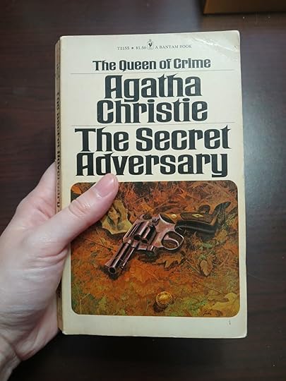
That sense of connection is even better when you know whose company you’re sharing. My grandfather posthumously introduced me to one of my favorite authors when my sister and I discovered his copy of Agatha Christie’s The Secret Adversary, which is still one of my favorites. It’s even dearer to me because it’s an interest I know we share, and that I own the very copy he pored over when he was alive.
You can keep your brand-new, perfect-condition copies; I want the ones that have a past, especially if it was shared with someone I love.
My sister and I refer to Signet Classics as the perfect hand-sized book. I measured, and they’re 4 x 7 inches, which is just about the length and width of my hand and ideal for carrying, reading, or holding close to your heart (if you know, you know). You could toss it in your purse or even stuff it in a cargo pocket in a pinch!
I can’t get enough of that perfect size. Something about it feels intimate and personal, like when you were a kid and there was a kid-sized shopping cart for you to push.
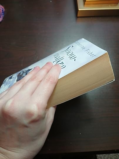
So this isn’t exactly about the cover, but it does have to do with the appearance of a book! Covers can be too big to be comfortable companions in the width x height dimensions, but when it comes to depth? Give me more, give me more, give me more! There’s nothing more satisfying than squeezing a book with a ton of pages with small or even tiny print, because you know you’ve got so many adventures ahead of you, all travel-sized for your convenience.
If you’ve ever thought hiring a cover artist would be a waste of money, this is your sign to reconsider. Visual artists have an eye for aesthetic and color that you don’t want to miss out on. Besides, why not support your fellow artists?
Specifically, I’ve found three aspects of color that can be relied on to hook my interest.
For a while, there was a trend toward an understated palette with black, white, gray, one metallic, and a pop of color, and I ate that up. Unfortunately, those covers were often paired with a stereotypical title (King of Blades and Darkness or whatever, you know?) so it didn’t always work, but I could at least appreciate the cover art.
Lately, I’ve been seeing more and more books come out with covers that are many bright colors, an explosion of color that still seems to come together, no doubt due to the skill of the artist. I know I’m not the only one whose brain is programmed for joy, and those wild and wonderful colors get me every time. I will at least pick it up and look at it.
Finally, on a subtler note, many authors are opting for colored page edges. I’ve experimented with painting mine myself and haven’t yet committed to it, but it has definitely managed to connect me with a book before. I spotted Starling House in an indie bookstore because the edges of its pages were painted a rich purple, my favorite color! (Yes, I ended up buying it.) Others still opt for a pattern or design on their page edges, perhaps flowers or stars. Personally, if we brought back entire paintings hidden in the gilded edges of pages, I would be 100% behind it. Make my life beautiful, one boring surface at a time!
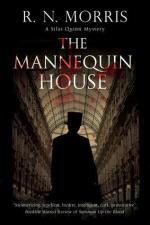
A Silhouette Walking Away From MeIt actually irritates me how reliably I will pick up a book with this cover art. I just find it so intriguing. Who is that person? Where are they going? I pay great attention to how they are dressed, as well as their surroundings. Since they are facing away, the usual sins and liberties taken with characters’ features can be avoided. If the colors are darkened and it looks like they’re going somewhere in secret? Take me with you!
Bonus points if the figure is wearing a top hat. (I have nothing to say for myself.)
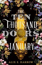
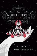
This item is entirely specific to me. Whatever gets you going, you know it when you see it, and you might be able to notice a pattern on your own shelves. For me, aside from the silhouette (which had to be its own item because it’s just so specific), my primary temptations are circus, gothic architecture and landscapes, and nautical scenes (think ships and lighthouses, not beaches).
I’m also drawn to any cover that simply strikes me artistically. Some of my favorite elements are scrolling/filigree, tons of detail, and a sense of movement. I love the kind of image that you could look at every day for a week and notice something new every time. I especially love if there are bits of stories visible in it, characters in different sections guiding your eye around the picture or interacting in intriguing ways.
Bonus points for any object that is so specific that it sticks in my memory or seems to point to a plot element. (Like a red leaf, for example!)
Indeed, what is in a name? A whole lot of promise, if you do it right.
My favorite titles have a few things in common: they’re unusual enough to catch my eye (enough of the Throne of Night and Sorrows trend), contain a clever turn of phrase, or sound like a story that makes me go, “I’ll write that if you don’t!” Sometimes, an entirely different premise leaps to my mind compared to what’s in the summary (and sometimes, I like mine better).

So what is your book aesthetic Achilles’ heel? Are there certain words that always capture your attention, or does a certain type of imagery have you in a choke hold? Let me know!