The Best Map Ever (Take 2)
Long ago, at the dawn of this blog, I declared Darlene's exquisite map of The World of Greyhawk to be "the best map ever." To be fair, in the linked post, I qualified my hyperbole somewhat, saying that no "map for a fantasy RPG setting has ever captivated me the way" this one had – and I stand by that. Darlene's map of the Flanaess is one of the greatest maps ever made for use with a fantasy roleplaying game. It's beautiful simply as a work of art, eminently usable, and, for me at least, almost as iconic as Dave Trampier's AD&D Players Handbook cover.
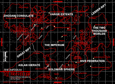
However, there is another map of which I am equally fond. Perhaps unsurprisingly, it's this one:
 I apologize for its small size. The original is quite large and the width of a blog post is inadequate to show its true glory. The map depicts the portion of Charted Space in which the Third Imperium and its interstellar neighbors exist, along with a couple of important astrographic features, like the Great and Lesser Rifts. Each of the rectangles represents a single sector, an area of space equal to 32 × 40 parsecs. Some of the sectors are named, like the Solomani Rim, the Beyond, and the Spinward Marches, but many of them are not.
 The map was, I believe, originally produced by GDW as a freebie to give away at conventions and to mail order recipients. I received mine in a large envelope after I'd written to the company to request their latest catalog. I was ecstatic to get it, because I'd previously seen a black and white reproduction of the map in a British book about RPGs whose title escapes me now (a No Prize to anyone who can tell me which one it was in the comments). I liked the map so much that I hung it on my bedroom wall, belong the Darlene Greyhawk map and there it stayed for years, even after I'd gone away to college. Unfortunately, the map was lost when I removed it from the wall some years later.
Unlike the Greyhawk map, this one is simple in its presentation and lacking in detail. Nevertheless, I'd still say it's quite beautiful. There's an elegance to it that I have always found incredibly appealing, an elegance that's very much of a piece with the elegance of Traveller itself. It uses only three colors – black, white, and red – just like the original Traveller boxed set, which I think contributes to rather than detracts from its attractiveness. In science fiction, minimalism is often a very solid esthetic choice and it's one that classic Traveller embraced from the very beginning (more on that particular topic in a future post).
The map's not without a couple of problems, the first of which being that it's a flat, two-dimensional depiction of three-dimensional space. That's an issue Traveller has always had and there's no easy way around it, though some fans have tried over the years. I've never been much bothered by it myself, since properly 3D star maps tend to be very complex and difficult to use in play. The bigger problem, in my opinion, is that most sectors of Charted Space are claimed by one or more large interstellar empires, which makes it feel fairly cramped rather than wide open. For many types of sci-fi campaigns, this is fine. If you're looking for one in which exploration is a central activity, it's less ideal, though there are some ways to fix this.
Even so, this remains one of my favorite RPG maps and one to which I regularly return for inspiration.
Published on December 20, 2024 06:20
No comments have been added yet.
James Maliszewski's Blog
- James Maliszewski's profile
- 3 followers
James Maliszewski isn't a Goodreads Author
(yet),
but they
do have a blog,
so here are some recent posts imported from
their feed.


