
Vote for a cover for Into Deep Waters
Some of you have read my recent free story Into Deep Waters
 . Right now it has the generic cover for the Love is Always Write event of the M/M Romance Group on Goodreads, for which it was written. As more and more wonderful stories are being released there, it's getting confusing, since the same cover is used for all 140+ stories. So even though I like the group design, I wanted a separate and specific cover, particularly since I hope eventually to make this story available from other book sites. The photo for which the story was written is not public domain and I haven't been able to track down who has the rights. I needed a different cover image, but the inexpensive stock photo sites didn't turn up anything similar so...
Enny Kraft, who generously gave me a free cover for my story Within Reach, made me a bunch of possible covers. They were all great and I simply couldn't decide on one. So I thought it would be fun to let you all have a look and vote on them.
I've numbered the covers 1-5. (BTW, if you see an odd swirl or circle on a picture - that is a watermark that will be removed when we actually buy the picture for final use. Watermarked free pictures let artists try out different stock photos before paying for their final choices.) Please leave me a comment with the number of your top choice for this story, and any comments or suggestions you have. On Monday the 28th I'll tally up the votes and see where we stand. Which of these covers would make you pick up this book, and would fit the story you'll find inside? You tell me.
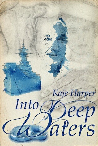
#1:
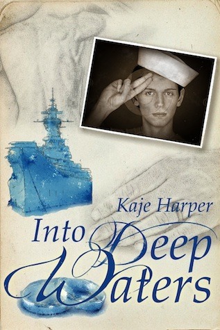
.
#2
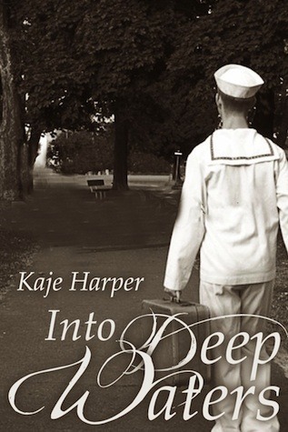
.
#3
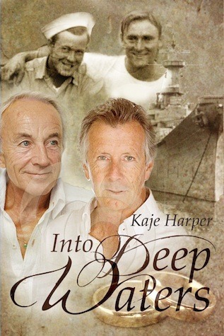
.
#4
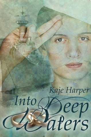
.
#5
.
So what do you think? # 1, 2, 3, 4, or 5? I hope you had fun admiring Enny's beautiful work and choosing a favorite.
***new question*** I love the rings on the covers, but then I know how the story plays out. The prompt will be at the front but... were any of you in doubt about the ending? Are the rings giving too much away for someone who hasn't read this? I love the look, but don't want to be too spoilery.
. Right now it has the generic cover for the Love is Always Write event of the M/M Romance Group on Goodreads, for which it was written. As more and more wonderful stories are being released there, it's getting confusing, since the same cover is used for all 140+ stories. So even though I like the group design, I wanted a separate and specific cover, particularly since I hope eventually to make this story available from other book sites. The photo for which the story was written is not public domain and I haven't been able to track down who has the rights. I needed a different cover image, but the inexpensive stock photo sites didn't turn up anything similar so...Enny Kraft, who generously gave me a free cover for my story Within Reach, made me a bunch of possible covers. They were all great and I simply couldn't decide on one. So I thought it would be fun to let you all have a look and vote on them.
I've numbered the covers 1-5. (BTW, if you see an odd swirl or circle on a picture - that is a watermark that will be removed when we actually buy the picture for final use. Watermarked free pictures let artists try out different stock photos before paying for their final choices.) Please leave me a comment with the number of your top choice for this story, and any comments or suggestions you have. On Monday the 28th I'll tally up the votes and see where we stand. Which of these covers would make you pick up this book, and would fit the story you'll find inside? You tell me.
#1:
.
#2
.
#3
.
#4
.
#5
.
So what do you think? # 1, 2, 3, 4, or 5? I hope you had fun admiring Enny's beautiful work and choosing a favorite.
***new question*** I love the rings on the covers, but then I know how the story plays out. The prompt will be at the front but... were any of you in doubt about the ending? Are the rings giving too much away for someone who hasn't read this? I love the look, but don't want to be too spoilery.


 Oooh- this is a tough one.
 I love the use of blue in 1, 4, and 5.
2 is nice ,but it's similar to your
 cover with the black and white.
 3 looks reminds me of some of Andrew Grey's covers. I really like 3 - I just wish there was some blue. I think this one is my top choice.
I like Penumbra's suggestion about switching the sailors in 1 and 3. I think that could work really well.
I also really like 4, but for some reason, this photo of the boy in color comes across as very feminine. I would worry that people might think they are reading about a woman, but maybe that's just me. maybe the color tints could be paler, so they look less like makeup?
They really are beautiful Enny!
 I would love #4 if the salute were US Navy. I just did a Google search to see if that was the salute during WWII and it changed (unlikely, as hidebound as the services tend to be, but possible). I found a couple of recruiting posters showing the same salute I'm familiar with - palm down. According to Wikipedia, the two-finger salute is used by the Polish military. But the point is, it looks weird to me since I know they're US Navy and the salute isn't.
I also love #3, and the sense of continuity through time it gives.
ETA: I can see Penny's point about the boy coming across as feminine. I got distracted by the salute. :) And I love Penumbra's suggestion of using the two sailors from #3 in #4. Or like Penny suggested, and use the blue tones of #4 on #3.
 I have to agree with jeayci that the salute looked a bit off and I don't know anything about salutes. I also agree that the image of the boy is a bit feminine looking, but I still really like the cover. Maybe change the boy's image and have someone using the correct salute?
My ex-husband was in the Navy, and it was a guaranteed source of hilarity ever time he tried to teach me to salute correctly. ;p
I have to agree with jeayci that the salute looked a bit off and I don't know anything about salutes. I also agree that the image of the boy is a bit feminine looking, but I still really like the cover. Maybe change the boy's image and have someone using the correct salute?
My ex-husband was in the Navy, and it was a guaranteed source of hilarity ever time he tried to teach me to salute correctly. ;p
 jeayci wrote: "I would love #4 if the salute were US Navy. I just did a Google search to see if that was the salute during WWII and it changed (unlikely, as hidebound as the services tend to be, but possible). I ..."
Yeah, I wasn't sure about this one - it sort of made me think of boy scouts. But there are apparently not a lot of stock pics with Navy guys in them.
Here's a US Navy salute from Wikipedia 
And a WWII-era recruiting poster (which looks a lot like my attempts that the ex laughed at) [image error]
Dunno if that helps at all, if there's a dearth of stock pics. But I figured I could at least show what I was talking about. :D
With the caveat that I know nothing about stock photos, I found this guy at istockphoto.com. Aside from the striped shirt (and maybe the position of his thumb), he looks good to me. Could you substitute him instead of the guy in #4?  I'll see what Enny thinks; thanks for the search! I don't know what sites she uses, but this looks good (although for a free story I'll have to look at the cost too.)
I wonder if she uses the same site (or the same images are available at multiple sites?) because I also found this there
I'll see what Enny thinks; thanks for the search! I don't know what sites she uses, but this looks good (although for a free story I'll have to look at the cost too.)
I wonder if she uses the same site (or the same images are available at multiple sites?) because I also found this there 
But I don't know nuthin' 'bout cost, Miss Harper. ;)
jeayci wrote: "I wonder if she uses the same site (or the same images are available at multiple sites?) because I also found this there But I don't know nuthin' 'bout cost, Miss Harper. ;)"
She got that one on Dreamstime, so I guess it's on multiple sites.
I couldn't see the prices on istock but I surely will go look (it's probably my security settings again.)
I just checked Dreamstime and didn't like any of the salute photos I found there. istock looks like they go by credits, and if I'm interpreting correctly it looks like the guy I found would be $20-50 depending on the size used (and assuming you get the standard license which is good for 499,999 impressions).
jeayci wrote: "I just checked Dreamstime and didn't like any of the salute photos I found there. istock looks like they go by credits, and if I'm interpreting correctly it looks like the guy I found would be $20-..."That's not too bad - some pictures are over a hundred. Thanks for all the research.
 Hmmmm, since this is a story about two people, I prefer #3. The others only have one in the cover. Also because in the story, the photo that captures the moment features two people. Not just one saluting.
Wow! Like I said, I have no idea about cost. I've just checked a few other sites, and yeah, not terribly impressed with the selection. You're welcome, I'm having fun exploring. :)
Hmmmm, since this is a story about two people, I prefer #3. The others only have one in the cover. Also because in the story, the photo that captures the moment features two people. Not just one saluting.
Wow! Like I said, I have no idea about cost. I've just checked a few other sites, and yeah, not terribly impressed with the selection. You're welcome, I'm having fun exploring. :) istock definitely has the most possibilities I found, with the one I posted the one I think is the best. But I did find this guy at 123rf.com, and at least he has the right uniform and pose, though you can't see his face
 And, of course, there's the two guys in #3
 I most prefer #5. I wish it have less body parts, though.
If you don't mind a back view, Gettyimages has a great selection.
I most prefer #5. I wish it have less body parts, though.
If you don't mind a back view, Gettyimages has a great selection.This one is even two guys (on my ex's ship, even! :)
There's also this one
And this one
I'm googling and I've found these two:http://i172.photobucket.com/albums/w7...
A recruiting poster:
http://www.ww1propaganda.com/sites/de...
@jeayci: I saw that third image also and it's a nice one.
Because it's for a free story, and you're not making money off of it, I bet you could also use Flickr images with the Creative Commons licensing.
Penumbra, that's an intriguing angle on the first one you posted. Though it makes me feel a little OCD or something that my next thought is that his gloves don't fit right. :DI think it's my bedtime. G'night.

 Ami wrote: "Hmmmm, since this is a story about two people, I prefer #3. The others only have one in the cover. Also because in the story, the photo that captures the moment features two people. Not just one sa..."
That's a good point, Ami! Nevertheless I think either #1 or #5. I don't really care for the kind of salute - sorry that I'm ignorant that way:) My question would be: Do the rings have to be on the cover? As they relate to the ending of the story, I'm not sure whether that's something I would like to have shoved into my face from the beginning.

 All of them are inspiring, but I prefer number 3 because it hints at a love spanning many decades, past and future coming together... And I agree with Ami's point that the cover should include the two protagonists; after all, the story is a tribute to both of them. Perhaps replacing the rings with some of those lovely strokes of blue would create a balance and not reveal too much too early.
 I'd stop and pick up #3 if I saw it on the book-shelf. And having already read IDW, I must say it shows a truer reflection of the story than the others. So, #3!
 Those are great. But is it possible to incorporate the photo that prompted the story? It fits the story so perfectly (or maybe it goes the other way around)
Derp. You explained why it couldn't be used. Well, okay then. I vote #2
Kate/Summer
Kate wrote: "Those are great. But is it possible to incorporate the photo that prompted the story? It fits the story so perfectly (or maybe it goes the other way around)Derp. You explained why it couldn't be ..."
Yeah, I would have loved to and Enny did a lovely cover with it, but we can't find the rights info.
 I really like #4 the best but yeah that salute is all wrong. #2 looks like it is for a tragedy, otherwise I'd like it.
Maybe #4 with the picture from message #8? Something to think about.
I really like #4 the best but yeah that salute is all wrong. #2 looks like it is for a tragedy, otherwise I'd like it.
Maybe #4 with the picture from message #8? Something to think about.BTW, if you missed it above I'd love to know what you think about including the rings. It's a gorgeous image but is it too much of a spoiler? The prompt will be included at the beginning of the story, but I don't know what readers thought going in. Were you in doubt about the ending? Will it lessen the impact there?
I'm not crazy about the ring because it's a bit of a spoiler.
I'm with you on that, as I mentioned above:)
Edina wrote: "#4 with pic from message #8 would fix the salute and could mix up nicely.About the rings, on #4 I would suggest keeping them. The prompt makes it clear there is a wedding coming anyway. I think #4 is already showing very little: only one man & no older man picture. The ring is not too much info, it even is the only hint of romance on the cover. On #3, I would suggest taking off the rings. ..."
Interesting - thanks for the suggestions. It's really cool to hear people's opinions here.
 On #3, I would suggest taking off the rings.
 I agree with this.
I like the rings on the cover.I also think that the image of the sailor in #8 looks like he could actually be the young version of the older man on the right of cover #3
A reason that I don't like cover #3 is that it is too busy and cluttered. All the items on the cover show up strongly, even the sepia images of the two sailors in the back. My eyes don't settle on one nice image but zip around and around the cover, making it uncomfortable to look at.

 #3 is definitely my favorite, and I wouldn't remove the rings as some people have suggested. That's half the appeal for me. :)
 I realy like #3 the best, I like that it incorporates an older photo of the two men. I don't know that it necessarily needs literal pics of the men as older men. I like the image, maybe, of just two male hands holding each other-older, weathered, wrinkled with age, etc. (if you can find a photo.)
The rings--LOL, I had to go back and read the prompt, I forgot that it mentions marriage. I had forgotten that even when I read the story and so I was nervous as I got toward the end, assuming that one of the older men was going to pass away from old age. In other words, the wedding was a nice surprise. So yes, it's my opinion the rings could be spoilery...but then again not if you read the prompt first, before reading, unlike I did. :)
A nice compromise might be if each of the hands had a ring on them. It might be more subtle that readers wouldn't quite catch it at first and therefore wouldn't be as spoilery. (Of course that just made your photo--two hands holding each other WITH rings on the left finger--harder to find, but maybe the rings could be retouched in.
Cheri wrote: "I realy like #3 the best, I like that it incorporates an older photo of the two men. I don't know that it necessarily needs literal pics of the men as older men. I like the image, maybe, of just tw..."We did search for an image of two older hands without much luck; I'll look again.
I'm noticing several people who feel the wedding was not a given fact as they read the story - that's relevant to know, thank you.
Yeah I was afraid it might be a hard image to find. Did some searching myself and came across an age stock photo site, not sure what the price points are on some of these those but I picked some that might be on the more affordable end:http://us.fotolia.com/id/41537931
http://www.agefotostock.com/en/Stock-...
These might be a little more expensive but they're still royalty free:
This one is of a man and woman's hands, but if the woman's ring was replaced with a man's ring, I don't think you could tell anymore that one is a woman.
http://www.agefotostock.com/en/Stock-...
http://www.agefotostock.com/en/Stock-...
http://www.agefotostock.com/en/Stock-...
And this randomly came up, it is two men but kind of mimics the sepia photo:
http://www.agefotostock.com/en/Stock-...
Wow, you found some interesting images. It is kind of cool how that last one matches the black-and-white, isn't it? Almost eerie - but fun. I like the one with the woman's hand too - as you say, it's hard to tell.And that's an interesting site to have access to, so I doubly appreciate the search efforts. (I may have older characters again in the future, not least if I do a sequel to Full Circle for Jamie.)
@Cheri - a few of those images definitely look like a woman's hand or figure is in the image and not two males.
Penumbra wrote: "@Cheri - a few of those images definitely look like a woman's hand or figure is in the image and not two males."It would take some cropping, etc - but with age the difference decreases. (which as an older woman is a little bit...ouch. But true. If you have to study them to decide, then the differences are slight.) We'll see how the vote goes - if there's a clear favorite we probably won't do many changes but if not... two hands was one of the images we discussed.
 @Penumbra I was looking strictly at cropping or outlining & deleting the background, any figures in the image wouldn't matter. As for the photos, there were some that came up where you could see fingernails on the second hand that made it obvious it was a woman and I didn't link any of those. These few that I linked really only show the hand of the second person and not many fingers. To me, the only indication that it could be a woman's hand is that one hand is slightly smaller. Since not every man is big or tall or has big hands (especially as they age) I think they could be plausible. The hands could even fade into the background a bit or any number of things so they are not front and center and as "noticeable."
 They are just options to be considered. Two older men holding hands is going to be hard to find. (as society continues to change, hopefully twenty years from now it won't be an unusual subject to find pictures of.)
 I like the colors of #4, and I like the large battleship in the background, and I like the overall artistic rendering. (I'm not a huge fan of a bunch of clipped-in stock photos typically.) However, I share some qualms about the femininity of the man portrayed. For whatever reason, I think he looks a lot better in the black and white photo shown in #1. If that could be switched out with another appropriate image, or adjusted so it doesn't look quite so feminine, I think it'd be great. Also, I'm not crazy about the bright gold rings in cover #4...they just really stick out on that cover. I would say either do away with them altogether or make them more blurry/"artistic" like in covers #1 and #5. (It's just, everything else on cover #4 is washed in blue/green and all artsy, then you've got these bright GOLD rings right up front...they just stick out a bit too much for me.)
My second choice vote would be #1.
Also, I'll mention that although a number of people seem to like #3, and I'll even agree that in some ways it might be the most representative of the book.....personally speaking, I don't get excited about reading m/m fiction with old guys on the cover. (Aggghh!! I'm taking cover!! Please don't hate me, I'm just being honest!) As much as I loved reading this story, and loved watching the characters grow into old age together, I just feel like if there are going to be stock photos on the cover, I would rather see some young hot sailers. But that's just me.
HAHA Good luck sorting all this out and coming to a decision Kaje!! :)
@Ravyn the more I look at it, I tend to agree with you about the rings in #4. I think they fight too much with the W in Waters, with them being intertwined with the W.I am liking the "blue" overall look of #4 more and more. It is also the simplest of all 5, with (other than the rings image) only two main images, the boat and the sailor. Sometimes simpler is just cleaner.
If people don't like the sailor then maybe another sailor without the salute? Or maybe the vintage photo of the two men from #3?
Ravyn wrote: HAHA Good luck sorting all this out and coming to a decision Kaje!! :) Opening up design decisions to a "committee" is always dangerous. Kaje and Enny may regret this. ;)
Cheri wrote: "Ravyn wrote: HAHA Good luck sorting all this out and coming to a decision Kaje!! :) Opening up design decisions to a "committee" is always dangerous. Kaje and Enny may regret this. ;) ..."Nah - I'm having a great time seeing all the comments (although I can't speak for Enny, who did all the work.) I'm getting good feedback on what people like and don't. And since this is a free story, my choice of cover isn't going to cost anyone money if I get it wrong. It's cool that people are interested.
And I found out about two stock sites that are new to me, which is fun, even if I'm probably going to hire Enny to do my freebie covers rather than do them myself from here-on. I was so unaware of stock photos (or anything else) when I put out "Lies & Consequences" and "And To All a Good Night" that I used my own pictures for those covers so I was sure I had the rights to them. Not the most artistic results.
 ok, here's my thoughts on this: I knew not too far into the story where it was going and I was fine with that. In fact, I was so sure I was gonna ball my eyes out in happiness at the end, that I was just waiting for that to happen. ... and then one of the guys made me laugh my ass off instead. Oh well. lol.
 So, for me, I love ther rings. In fact, I like them better than I like the picture of the two older men.
My first vote would be for #4. But with the issue of the salute and the fact that the sailor is only one sailor, I would see if you can take him out of #4 and put in the older picture of the young guys from #3. The ship, the guys, and the rings, and I love the font you've chosen too. That would be perfect for it. Oh yeah, and the colors you chose look fantastic. I can't wait to see the final outcome!


I love the colors and it's easy on the eyes. It all blends well together.
My second choice is #1 although I'm not sure about the single sailor. Maybe the sepia image of the two sailors from #3 would work better?