
How do I write thee, let me count the ways
If I was producing an alphabet book, and in a rather silly, Edward Lear kind of mood, I might put this in about the strange letter Q:
Where did the alphabet come from, anyway? An alphabet is a set of letters used in a specific order to produce words, which can then be strung together to make sentences, then paragraphs, then entire books, or blogs 
Before the alphabet was invented, records were made in a form that could be produced and read consistently, i.e. in the form of pictures, known as hieroglyphics. They’re believed to have originated around 3100 BCE in Mesopotamia as a way to document business transactions when communities grew large enough to make such things necessary.
However, as archeologists discovered thousands of years later, hieroglyphics weren’t easy to read. There were thousands of images used to represent words, and selected people trained intensively to become scribes to be able to write and decipher them.
 The Seated Scribe, 4th Dynasty Egypt; Source: By Rama, CC BY-SA 3.0 fr, https://commons.wikimedia.org/w/index.php?curid=73338717
It’s believed that sometime between 1900 and 1700 BCE an alphabet system was developed that brought reading and writing to more people, and simplified record-keeping considerably. Why or by who isn’t currently known, but at some point someone conceived of the idea of creating symbols to denote consonants, instead of pictures. These consonants could then more easily be strung together to make words.
The consonant symbol represents a massive leap in writing, even though it may seem simple/obvious today.
Curiously, early written forms of languages, including Egyptian and Phoenician, didn’t use anything to represent vowels. When modern Egyptologists translate hieroglyphs, they’re guessing at how the resulting words actually sounded, as there are no vowels included to help out. Think of our word for “banana” – in Egyptian style, it would have been inscribed as ‘bnn’, and we’d have no idea what sounds came between the consonants. What if the Egyptians pronounced it like ‘binini’, or just ‘binin’?
Symbols representing vowels were only added around the 8th century BCE, 1000 years later, when the alphabet made its way to ancient Greece. Scholars feel that this began the development of the first “true” alphabet, because the addition of vowels removed the uncertainty of how words were spoken.
The Greek alphabet gave rise to a number of other alphabets, including Latin, which was the basis of the English alphabet we use today.
Development of alphabets allowed histories to be written and tales – oral traditions handed down for generations – to be recorded for posterity. All of the wonderful legends in cultures around the world are available to us today because of the alphabet, and the development of methods to transcribe them onto different media, beginning with clay tablets long, long ago.
Writing as we know it allowed people to create new stories, built on old legends, stories about the world around us and all the amazing phenomena in it, how people interacted with each other, strange mysteries, and then speculation about things that didn’t exist in nature (Mary Shelley’s Frankenstein was an expression of developing technology and how it could be misused if someone had a mind and a way to do it).

All books and stories used to be handwritten, for centuries – actually millennia – before our modern computer era. Some authors still prefer to write instead of type into a computer. Personally I love using computer software (I use MS Word, myself) because I can see exactly how my words look on a ‘printed’ page, and easily make revisions until they read just the way I want them to. But I’m of an era that learned how to write with a beautiful script, and I appreciate the use of different fonts and typefaces when I create graphics for my book covers, blogs and even Facebook posts.
The art of lettering is just that, an artform that’s been practised and perfected ever since writing was first invented.
When I was in elementary school, early on we began to be taught how to write cursive script. We had to use pencils (yes, totally dating myself, but I have lots of contemporaries who’ll know exactly what I’m talking about), and it wasn’t until we could prove ourselves proficient in handwriting that we could reach the Holy Grail of elementary school: being allowed to use a pen! I was the first person in my class to achieve pen usage. I was very proud
To this day, when I have to handwrite something, like my signature, people tell me how much they like my writing. If I want to write something formally, it comes out fundamentally as we were taught decades ago, which some might say isn’t very imaginative, but I don’t mind the compliments.
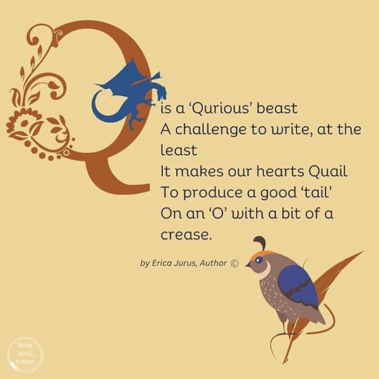
For jotting down something quickly, though, I do what most people do: print-write, often using short forms that I developed in university trying to jot down lecture notes as fast as possible. (I’m sure I sound like a dinosaur to any Gen Z or even Millennials who might be reading this). I never liked the letter “Q”, though; in formal cursive script it’s easy, but in print-writing it just doesn’t flow.
Writing and lettering have gone through many transformations over the centuries. It’s a matter of irony, and some bemusement, that Ontario elementary schools are reintroducing cursive handwriting in the curriculum. Hubby and I don’t have kids, so we never knew that they’d taken it out. Apparently teaching it became optional in 2006, I’m not sure why. From what I’ve been reading, it does take a fairly complex set of motor skills to be able to learn, but according to the research done so far, just doing the hand writing helps students think more about the words they’re writing down and improves their overall literacy. It’s felt that it’s a critical life skill while still in school and then when moving out into society afterward.
I don’t think beautiful penmanship is the ultimate outcome, and it’s not an easy end-result to achieve. I actually know far more people who don’t have ‘pretty’ writing/signatures than those who do. When I worked as a pharmacy assistant, prescriptions were all handwritten, and trying to decipher what a physician had written was a skill in itself. (Doctors all used short forms specific to the industry, but if we had any doubts about what was on the prescription, we called the doctor for clarification.) In this case, having prescriptions entered into a computer and faxed electronically is probably a far better idea
Interestingly, print-writing requires more working memory than cursive writing, but it seems to be the easier option for a lot of people, and it actually became a method of teaching writing that was developed in the late 1960s, called the D’Nealian Method.
Donald Neal Thurber created a form of print-writing, with a more flowing cursive version, in Michigan because he thought it was easier for students to pick up. But the bulk of it was still based on the method that was most popular through the bulk of the 20th century, the Palmer Method – the one that I and my schoolmates were taught, as best as I can tell based on the shape of the letters. It was a method developed in the US, and I can’t find confirmation of its use here in Canada.
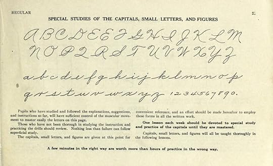 Alphabet and numerals from The Palmer Method of Business Writing; Source: Alphabet and numerals from The Palmer Method of Business Writing; Source: By A. N. Palmer – The Palmer Method of Business Writing https://archive.org/stream/palmermethodofbu00palmrich#page/n3/mode/2up, Public Domain, https://commons.wikimedia.org/w/index.php?curid=38006706
My writing is very much like this, although a few of my capitals are different, subject to other influences as I grew up. The Palmer “P” and “R”, for example, have too many strokes for my taste – but my “Q” is almost identical.
Thank goodness we weren’t subjected to learning the earlier style of handwriting, the Spencerian Script, in use from approximately 1850 to 1925.
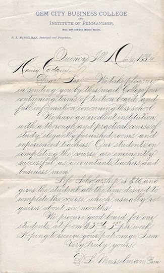 Example of Spencerian script from 1884 from the president of Gem City Business College of Quincy, Illinois; Source: By D.L. Musselman – http://www.iampeth.com/lessons.php#spencerian, Public Domain, https://commons.wikimedia.org/w/index.php?curid=7199905
Named for Platt Rogers Spencer, it was created to be legible for use in business correspondence but still elegant for personal letter-writing, all using a quill pen. Spencer was inspired by the forms of smooth pebbles in a stream and tried to create a graceful script resembling the shapes. I’ll admit to the gracefulness and flow, but for us today it’s not an easy read. However, it was a somewhat less flowery version of Copperplate, a script that was widespread throughout the 17th and 18th centuries, and is still heavily used in classical Western calligraphy.
In Spencerian Script, letters were written in a series of strokes without moving the pen away from the paper, even the complicated capitals. It was meant to be rhythmic and comfortable.
 Ford logo from 1911, predating the simplifications of 1927; Source: By Unknown author – http://www.fordfreundesuedharz.de/wissenswertes/fordlogo1910_1927.jpg, Public Domain, https://commons.wikimedia.org/w/index.php?curid=32885814
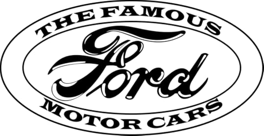
Here’s something you probably never thought about: Spencerian is written with a slant of 52 degrees, which was also used in Palmer script. (The ‘slant’ is measured counterclockwise from the baseline.)
That’s the way most of us were taught to write, but not everyone does. Some people don’t write with a slant at all – their letters are upright, and in Graphology, that denotes self-confidence and objectivity.
A backward slant is thought to be characteristic of left-handed writers, but apparently that’s not always the case. It may indicate someone exhibiting ”emotional withdrawal and a degree of introspection and self-interest”.
Forward-slanted writing, aside from the obvious influence of school-taught styles, is said to show “emotional responsiveness and expressiveness”.
Extreme slants supposedly represent extreme personalities in either direction, but professional graphologists are required to measure the slants of at least 100 pieces of lettering, and there are other factors about someone’s handwriting that they also consider.
A graphologist who was doing a session at an event I attended many years ago saw my handwriting on a note I’d provided to the person who introduced her (I was one of the organizers) and said it was “extremely interesting”, but never explained what she meant; I continue to live in analysis limbo, sadly.
But learning to write, or even print, is preceded by learning our alphabet, and teaching alphabets to children has a long history of its own.
Alphabet books have been around since Shakespeare’s time. They were called ‘syllabaries’, because they also included a list of syllables, as well as pronunciation of vowels and combinations of vowels and consonants. Eventually these books progressed to words and easy sentences, often in cute rhymes.
Early alphabet books were called ‘hornbooks’ because they consisted of a piece of parchment or paper pasted on a wooden board, with the paper protected by a transparent sheet of animal horn.
The next style of alphabet book was the ‘battledore’, which came from the small, racket-like instrument used for playing badminton. Similar wooden or cardboard tablets were developed to be used for the teaching books. However, in these books, entertainment was provided by the addition of illustrations – a brilliant idea, because we all learn much better when we’re having fun at it.
Along with that came the use of word associations, like A is for Apple. ‘Apple’ was a great word for illustrative purposes: the fruit’s widespread familiarity in North America going back to colonial days, its distinctive shape and colour(s), that apples could be made into apple pie (another meaningful word association), and that they had many cultural connotations, such as the ‘forbidden fruit’ in the Bible or the fruit that caused the Trojan War, allowing the inclusion of a little theology or mythology.
[Eris, the Greek goddess of Discord and something of a troublemaker, was unhappy about being excluded from a banquet on Mount Olympus to celebrate the wedding of Peleus and Thetis. She tossed in a golden apple that was provocatively inscribed with the words “For the most beautiful one”. Three of the goddesses in attendance claimed the apple: Aphrodite, Athena, and the chronically jealous Hera. Zeus, the host, wisely avoided an enormous trap and decided that the Greek hero Paris, of Troy, would be given the rather thankless task of choosing who the apple should go to. All three goddesses offered him bribes, but Aphrodite had the best one: the woman considered the most beautiful in the world, Helen of Sparta. Paris accepted the bribe and awarded the apple to Aphrodite. However, Aphrodite hadn’t bothered to mention that Helen was already married to the King of Sparta, and Paris had to steal Helen from him (although he was handsome and she may have left willingly). The rest, as they say, was history.]
The development of the alphabet lent itself to imaginative and often elaborate artistic depictions of the different letters. In the Middle Ages, scribe monks took this to the nth degree to create spectacular illuminated manuscripts for wealthy patrons. There were even pattern books for those scribes to help them in their task.
Illustrators of the slightly more humble alphabet books for children didn’t neglect the opportunity to engage their readers with whimsy. It wasn’t always an easy task, though: some letters were a bit of a stumper to connect to a good illustratable word. The letter ‘X’, for example, before the fortuitous invention of X-rays, was relegated to an ancient Persian king of dubious repute because his name happened to start with it.
That may seem like an odd choice for a children’s book, but Xerxes was also known as Ahasuerus, the king made ultra-famous in the biblical story of Esther, so not as much of a stretch as at first glance.
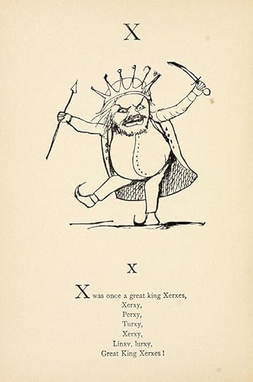 Edward Lear illustration for the letter X; Source: Nonsense Books (1888) by Edward Lear — Source. https://archive.org/details/nonsensebooks00lear2, in public domain
 The letter ‘Q’, my personal bête noire, was, I will admit, beautifully drawn and lavishly decorated in a series of prints in the 17th century titled Libellus Novus Elementorum Latinorum. I’ve always found the capital (uppercase) version of the letter Q to be very awkward when hand-writing it – it’s impossible to make it look nice. So this typographic version intrigues me with its delightful embellishments that solve the problem, and most specifically the fantastic sea beast that forms the weird tail.
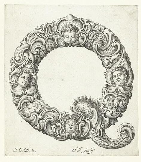 The letter Q from a series of 17th c prints titled Libellus Novus Elementorum Latinorum; Source: https://www.rijksmuseum.nl/nl/zoeken?v=&s=&q=Libellus+Novus+Elementorum+Latinorum, public domain
And just where did that tail come from, you may wonder? (Or not, but I have.)
It comes from ancient alphabets, as illustrated on Wikipedia:
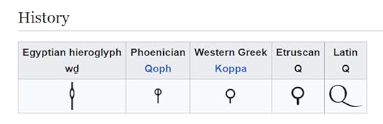
Q has been around a long time. It’s the 17th letter in the Latin alphabet, and thus in our modern alphabet, but its origins go much farther back. Its shape is speculated to have come from a knot, the eye of a needle, or a monkey with its tail hanging down. I wonder what prompted some ancient scribe to choose such an odd depiction – perhaps sitting one day with a clay tablet and a stylus and looking around for inspiration, eyes lighting upon a knotted rope, or a frisky pet monkey. We’ll likely never know, but it’s fun to imagine.
The tail of the ‘Q’ may either bisect its “bowl”, meet the bowl, or lie completely outside the bowl, depending on the typeface, which is a relatively modern invention that went hand in hand with the development of printing presses. Typefaces are more commonly called Fonts with the advent of computerized ‘type’. But that’s mostly a whole other blog post I’ll just mention that most books are set and printed, either in hard copy or electronic copy, in either Times New Roman or Garamond fonts – just an industry standard. However, cove designers go to great lengths to choose a font that evokes the genre of the book.
Sci-fi fonts tend to be very blocky and futuristic looking, like these:

…whereas Fantasy fonts are more flowery or medieval-looking, such as these:

The font I used for my book cover is called Inlander Texture. I chose it because my novels include elements of both urban fantasy and science fiction, and I felt that this font has some of the blockiness of sci-fi, with elaborations on the letters that aren’t quite serifs but have a slightly medieval look. The roughness of the interiors of the letters evokes a bit of mystery.

Your collection of books, whether fiction or non-fiction, have covers that were very carefully designed to grab your interest as well as give you a feeling for what type of book they are. The annals of lettering and alphabets go far back in history, and no longer just provide information, but entertain/provoke/calm/romanticize/thrill or any other emotions that prompt readers, like you, to look more closely. Check your own books out for fun!
The post How do I write thee, let me count the ways first appeared on Erica Jurus, author.


