How a humble subway map became an icon
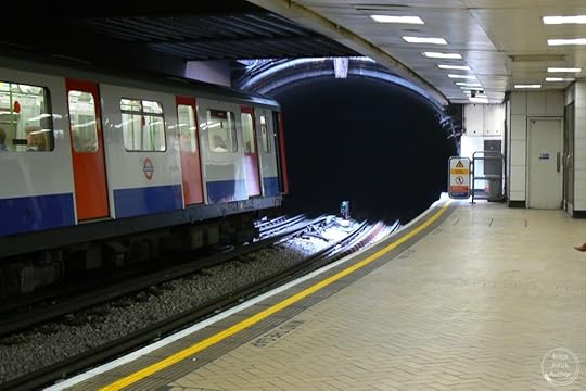 Standing on a platform of one of the London Underground’s subway stations
There’s a dragon approaching. You can feel its hot breath billowing out of the dark, sooty-looking tunnels. Soon it will emerge and devour you.
That was my first impression of the subway system in London, England. At its deepest levels, it’s like a medieval labyrinth. As the trains get close to the platforms where riders wait, they push air ahead of them, so you don’t really need to look at the myriad of electronic signs counting down the arrival times to know that a train is near.
My hubby and I were fascinated by the subway system, affectionately known as The Tube because of the shape of its tunnels. As visitors, it didn’t take us long to figure out that The Tube was the easiest, fastest way to get to points of the city that were too far to walk to. Nor did it did take us long to figure out the system itself, thanks to a brilliant, colour-coded map designed in 1931 by a man named Harry Beck. He did it so well that the map itself, showing all of the different ‘lines’ and their stops, as well as where several of the lines intersect so that you can transfer from one to another, has become an iconic symbol of London. If you’ve been there, you know exactly what I’m talking about.
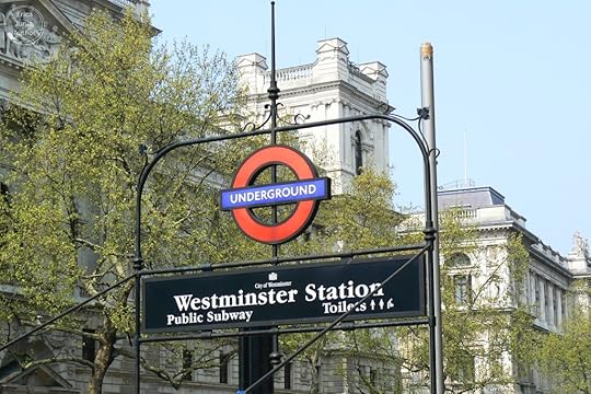 External signs for the Tube stations are instantly recognizable from the graphic symbology
Of course, the city’s subway system is remarkable in itself, transporting you pretty much anywhere you need to go – even out to Heathrow Airport. I’m sure the citizens of London are fairly blasé about it, but we rather enjoyed the experience, especially when some of the trains exit the tunnels and run along the surface – they gave us intimate views of parts of the city we’d never have seen otherwise.
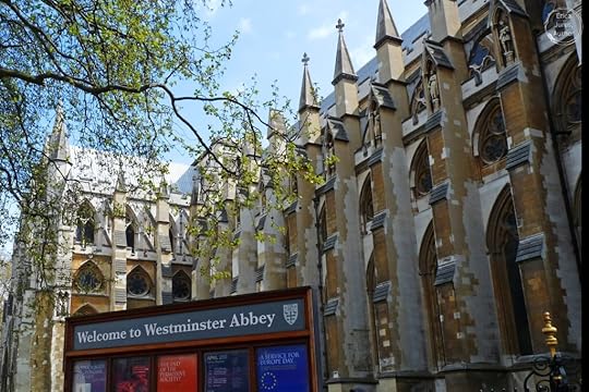
London is one of the most layered and engaging cities in the world. Its origins go as far back as the Bronze Age, with remnants of early settlers around 4800-4500 B.C. During Roman occupation it was known as Londinium, and you can still see pieces of old walls. Over the centuries, London accumulated an incredible number of famous landmarks, but even the residential streets with brown brick buildings and small fenced yards that you see as your train rattles past them tell their own stories.
The London Underground (the official name of the subway system) began its life in 1863, as the Metropolitan Railway. When we first visited, you could easily see the age of parts of it in the weathered old wood-surfaced escalators taking you deep into the bowels of the earth and back out. None of those wooden antiques exist any longer, after a fire under one of them spread from the massive King’s Cross St Pancras Station through several lines. By 2014 everything had been converted to metal, but I’m glad my hubby and I got to ride on the rickety, wood-slatted steps while they still existed.
Today, the Underground has 250 miles of track, covered by 11 different lines. Almost 5 million passenger trips are made daily, embarked on through 272 stations. Forty-five percent of the system is under ground; most of the more outlying portions are on the surface, serving Greater London and out to the counties of Buckinghamshire, Essex and Hertfordshire. It runs past every-day and historic, humble and exalted, all intrinsic parts of an amazing city.
 A subway train runs strikingly past old and new, including the venerable Black Friars pub.
As you might imagine, producing a portable map (that could be folded neatly and carried around in a coat pocket) of the massive system for residents to use was quite an undertaking. There were many maps before the one that became official. Early versions tried to illustrate everything with geographical accuracy, which proved impossible. Even at that time, a maze of lines criss-crossed a few squares miles of central London, but also stretched 50 miles from the central part of the city. In central London, there were some stations just a couple of hundred yards apart, while others were over a mile from each other. Those early maps tended to concentrate on the city itself, while far-flung stations were largely ignored by the designers.
In 1931, Harry Beck, a young engineering draughtsman who’d joined the Underground Group’s Signal Engineer’s Office in 1925, realized thatwhat passengers really needed to know was where the lines ran and how to get from one place to another as efficiently as possible.
He drew the different lines very simply on a grid, running either vertically, horizontally or at 45-degree angles to make them easy to follow visually. Then he listed all the stations in order, not by proximity, as well as where to change between lines. The lines were colour-coded to make them easily distinguishable from each other. When Beck first presented his map to Underground management, it looked pretty radical to their eyes, so they did a test print of 500 copies, which were distributed in 1932 from a handful of stations. In 1933 another 700,000 copies were made. Within a month, more had to be printed. The draughtsman had seen straight inside riders’ heads to create a map that was actually useful.
 The upcoming updated Tube map, showing the new lines and colours; converted for posting to jpeg from the PDF available at the Transport For London website,
 Beck tweaked the map over the years, refining his design and incorporating changes to the system as they came along. To this day, versions of his map are handed out to everyone who buys a one-day to multi-day ticket, and relevant sections are available on the walls of each station as well as in the panels above the windows of each train car. The colour-coding gives the map a fun, almost child-like quality, and an artistic flair that has captivated users for decades.
Visitors can buy a copy of the map on mugs, t-shirts and a variety of other souvenirs (we had a mug, but used it so much that the design began to wear off). In 2006 the “Tube map” was voted a national design icon. If you’ve been reading my blog for a while, you’ll know what I mean when I write that each subway line on the map has its own official Pantone colour. The Piccadilly Line, which runs all the way into the city from Heathrow, through King’s Cross St Pancras, and up to the northeast, is Pantone 072 – Corporate Blue; my hubby and I have ridden that line a lot over various visits, coming in from the airport and staying in Bloomsbury around Russell Square.Central Line, which runs through the heart of the city, is Pantone 485 – Corporate Red.
The names of some of the stations are delightful, as only British whimsy can manage: Tooting Bec, Nunhead, Pudding Mill Lane. Others are evocative of the city’s layers of history – Covent Garden, West India Quay, Whitechapel.
Recently the six newest lines have been given names that have historical/cultural significance, and are being marked on the map with double lines. They’ll also receive their own unique colour. The Lioness Line, for example, identified by two yellow lines, runs by Wembley and recognizes the achievements of the England women’s football team. And so the famous map evolves again.The Tube map is such a part of the London experience that you really have to go there and run around with it to fully appreciate how magnificently it conveys the information needed to get around. Beyond strolling the atmospheric streets around places like Buckingham Palace, Westminster or Knightsbridge, to get to places like the Tower of London simply find which Tube station is nearest to it, pull out your trusty subway map and trace your path there from your current location. (Of course, you could just take a cab, another iconic London experience, but you’ll miss the fun of exploring the oldest subway system in the world.)
Maps were created to help people find their way. Take a trip to London and enjoy the Tube map’s clever design as much as you enjoy the many places it will take you to.
All photographs in this post were taken by me, and all rights are reserved. E. Jurus
The post How a humble subway map became an icon first appeared on Erica Jurus, author.