
Art . . and a Prediction
Considering I've had cover art on the brain lately (grrrr), it's no wonder I've been paying even greater attention to this year's Rainbow Awards cover art competition. I'm beginning to realize what I don't vote for is probably more telling than what I do vote for. The covers I invariably skim past all seem to have one or more of these characteristics:
Two faces or two torsos, usually front and center and large. Such covers are so commonplace, they say nothing about a book except that it's m/m romance. But so what? I already know that. Tell me more! Or at least make me imagine more.Drawings that look generically yaoi-ish. These have gotten tiresome.Bland landscapes.Wings. Of the angel variety. I'm really sick of wings.Animals -- usually, wolves or cats. Aside from poser figures, the one thing sure to send me running in the opposite direction is a freakin' wolf on a cover.Shitty composition. Even if a cover has beautiful or intriguing graphic elements, I'm instantly turned off if those elements are out of proportion to one another or poorly arranged and balanced. Inappropriate fonts and/or colors. This is related to the above. Making bad font or color choices is probably the most widespread problem among designers, and it's one that can destroy otherwise promising covers.
I know I'm not an expert, and a lot of people aren't in the least bit bothered by the things I've mentioned. But every time this competition rolls around, I get more of an education on how important a unique, well-done cover can be. And I'm reminded why Anne Cain is so consistently brilliant.
Just for the record, I think this one might make it to the top:
Even if it doesn't, BRAVO, Dreamspinner and Shobana Appavu! Wow. Hard to get more arresting than this.
Two faces or two torsos, usually front and center and large. Such covers are so commonplace, they say nothing about a book except that it's m/m romance. But so what? I already know that. Tell me more! Or at least make me imagine more.Drawings that look generically yaoi-ish. These have gotten tiresome.Bland landscapes.Wings. Of the angel variety. I'm really sick of wings.Animals -- usually, wolves or cats. Aside from poser figures, the one thing sure to send me running in the opposite direction is a freakin' wolf on a cover.Shitty composition. Even if a cover has beautiful or intriguing graphic elements, I'm instantly turned off if those elements are out of proportion to one another or poorly arranged and balanced. Inappropriate fonts and/or colors. This is related to the above. Making bad font or color choices is probably the most widespread problem among designers, and it's one that can destroy otherwise promising covers.
I know I'm not an expert, and a lot of people aren't in the least bit bothered by the things I've mentioned. But every time this competition rolls around, I get more of an education on how important a unique, well-done cover can be. And I'm reminded why Anne Cain is so consistently brilliant.
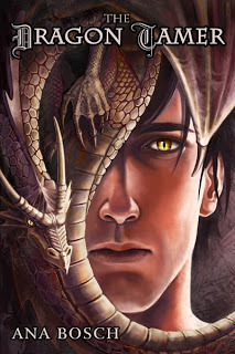
Just for the record, I think this one might make it to the top:
.jpg)
Even if it doesn't, BRAVO, Dreamspinner and Shobana Appavu! Wow. Hard to get more arresting than this.


No comments have been added yet.


