
More 1970s Letterers Part 2
 From THE INCREDIBLE HULK #219, Jan 1978, image © Marvel
Here are more letterers whose careers began in the 1970s. In 1977, Marvel hired Rick Parker as a production artist, doing art and lettering corrections. Rick had been there a few years earlier with his then-girlfriend letterer June Braverman (profiled in Part 1), but at that time Rick didn’t want to compete with June by asking for freelance work. By 1976, June had moved to Arizona, so Rick decided to try getting work at Marvel himself. He wasn’t accepted as an artist, but the following year landed the staff job. The page above is from his first credited story as letterer, and the work looks good to me, though the sound effects are a bit wimpy. The regular balloon lettering is done with a wedge-tipped pen and reminds me of Sam Rosen’s lettering. The emphasized words are larger and bolder, and really stand out, adding to the drama.
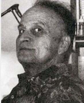
 Rick Parker, 1976
Richard Lowell Parker was born Aug 31, 1946 in Miami, FL and grew up in Savannah, GA. Rick said he didn’t see many comic books as a child, but was influenced by comics strips like Mutt and Jeff and Little Orphan Annie. After serving in the Army, he received an art degree from the University of Georgia, and moved to New York City in 1973 to attend Pratt Institute, getting his masters degree there in Aug 1975. Rick worked as a taxi driver for a while before landing the production job at Marvel, where he stayed about a year and a half before going freelance full time as a letterer. He also began to get work as an artist from Marvel in the early 1980s mostly on short humor pieces, some of which he also wrote.
 From WHAT IF? #7, Feb 1978, image © Marvel
Another early page lettered by Rick. I like the balloon shapes and the larger display lettering in the title and credits. While at Marvel and later, Rick also pursued a fine art career with work consisting of paintings, drawings, collage, assemblages, sculpture, lithographs, photographs, performance, and conceptual art. He was the founder of the Barking Dog Museum in New York City (1975–1987).
 From ALPHA FLIGHT #16, Nov 1984, image © Marvel
A closer look at Parker’s lettering from 1984. The letters have become a little more curved in some places, and are consistent and easy to read. This is fine lettering in the Marvel style. Rick wrote this about his lettering tools:
I used a Hunt 107 point for the thick and thin lettering. I clipped the tip with scissors, just a tiny bit and at a slight angle, and smoothed it down on wet/dry Emory paper by writing the word JOHNSON and SPORTS over and over again (those two words had all the movements of the alphabet) and then on a piece of glass wet with my own spit (gross, huh?). For the bold lettering I used an A-5 Speedball point straight out of the box and later a B-6 and sometimes an FB-6 Flicker point. For extra bold I used a B-5½ and a B-5. For borders I used a Rapidograph tech pen. My Ames Guide was usually set to 3.25 or 3.5 and for the Spider-Man and Hulk newspaper strips which I did for a time, I set it at 4. One’s goal should be to do everything the same every time, including the amount of ink in the ink jar, so that when you are working the only variable is you.
Rick is married to writer Lisa Trusiani, who he met at Marvel. He told me:
I met her in 1988 when she first started there. We were both in unhappy married relationships. By 1990, I was divorced and she was separated from her husband and living alone in NYC. We began dating and got married in 1992.
 From BEAVIS & BUTT-HEAD #5, July 1994, image © Marvel
“Beavis & Butt-Head” was an odd animated series by Mike Judge about two teenage slackers that first appeared on MTV in 1992, and began a regular series in 1993. In 1994, Marvel started a licensed comic series that was drawn and lettered by Rick, and it became the work in comics he’s probably best known for, running 28 issues. Rick’s lettering was intentionally different from his regular Marvel work, it has an underground comics look to me, with left-slanted letters and wavy balloon shapes. Rick captures the humor of the cartoons well. After this series ended in 1996, most Marvel lettering was being produced digitally, but Parker found work at DC and other publishers as a letterer for a few more years, and as an artist for publishers like Papercutz.
 From THE GRAVEYARD BOOK #1, 2014, image © Dark Horse and Neil Gaiman
In the 2010s, Rick’s hand-lettering skills were featured in several adaptations of Neil Gaiman books by artist P. Craig Russell at Dark Horse, sample above. I think Russell did the balloon shapes, the fine lettering is by Parker. Rick also produced the graphic novel DEADBOY, and he has several autobiographical graphic novels in the works. He and Lisa raised two sons in New Jersey, and they moved to Maine in 2012.
 From QUACK! #3, April 1977, Star*Reach, image © Scott Shaw
Carol Lay first began lettering comics by friends like Scott Shaw for alternative titles before landing work at Marvel, DC, and other publishers. She also found work as an artist and writer in comics. Her lettering on this story is very underground in style, but easy to read and with a nice variety of styles.
 Carol Lay, 2015, from her website
Carolyn Lay was born in 1952, in Whittier, CA. She’s the youngest of the family, with four older sisters. She graduated from UCLA with a Fine Arts degree at age 23, and then did some commercial art before one of her friends gave her a crash course in comics. Carol realized she had found her calling, using her skills and interests in drawing, storytelling, logic, and complex puzzle solving. She met other aspiring comics artists at conventions, and was soon working with them, as seen above.
 From KULL THE DESTROYER #25, Feb 1978, image © Marvel
It’s not clear how Carol began lettering for Marvel, but her work there was closer to the Artie Simek style the company favored. The story title on this example is particularly well done.
 From THE OZ-WONDERLAND WARS #3, March 1986, image © DC Comics
Carol is perhaps best remembered as the artist of this Captain Carrot spinoff for DC, THE OZ-WONDERLAND WARS, for which she also lettered issues 2 and 3. It was a fun project combining DC funny animals with characters from the Oz books and Alice in Wonderland. Carol’s lettering is creative and has variety.
 From BIZARRO WORLD, April 2005, image © DC Comics
In 2005, Carol did art, lettering, and coloring for this two-page Krypto story for a DC anthology, with lettering that’s again more personal and a good match for the art. Carol continues to find work at publishers like Ahoy Comics, as well as writing and cartooning for other markets.
 From KAMANDI #17, May 1974, image © DC Comics
In 1974, Jack Kirby hired a second inker/letterer, D. Bruce Berry, whose first work with Kirby is above. Mike Royer had been doing the same dual job on all the Kirby comics at DC, and now Berry took on some of the work. His lettering is similar to Royer’s, perhaps intentionally.
 D. Bruce Berry, date unknown, image found online
Douglas Bruce Berry was born Jan 24, 1924 in Oakland, CA. He served in the Army Air Forces in World War Two, and then worked in advertising for many years. Bruce did art and a small amount of lettering for various fanzines in the 1960s. I don’t know how he came to be hired by Kirby, but he worked with him starting in 1974.
 From 1ST ISSUE SPECIAL #1 (Atlas), April 1975, image © DC Comics
While I don’t think Berry’s work with Kirby was quite as good as Royer’s, it served well enough. Here he’s added a large open initial capital to the caption, and the sound effects are lively and have interesting overlaps.
 From NEW GODS #6, Nov 1984, image © DC Comics
When Kirby returned to DC in the 1980s to finally complete his Fourth World saga, his inker and letterer on the new material was again Berry. I love the machine-screen caption on this page, and the sound effect works well. Bruce does not seem to have worked in comics after this, and I don’t know anything else about him except that he died in Long Beach, CA in 1998.
 From WITZEND #11, 1978, image © William E. Pearson
Bill Pearson is a comics writer, letterer, and publisher, who began working with Wally Wood on WITZEND, and then took over that alternative comics series with Wood’s blessing. This Flash Gordon parody is all by Bill, including the art. His lettering is already easy to read but a bit uneven.
William E. Pearson was born July 27, 1938 in Belle Fourche, South Dakota. He began working as a technical illustrator at publisher Ziff-Davis in 1957, and worked at several other commercial art jobs while attending New York’s School of Visual Arts. His commercial art jobs supported WITZEND, which was sold only by subscription and carried no ads. The magazine lasted into the 1980s. Pearson was involved in Wood’s T.H.U.N.D.E.R. AGENTS for Tower Comics as a writer, and became an editor at Charlton Comics in the 1970s, wrote POPEYE THE SAILOR comics for Gold Key, and worked for many other comics companies.
 From FUNNY STUFF STOCKING STUFFER #1, March 1985, image © DC Comics
Bill’s lettering for this funny animal one-shot at DC is charming and full of variety, with mixed case captions and nice display lettering and signs.
 From THE HOBBIT #1, 1989, image © Eclipse Comics and the Tolkien estate
In 1989, Bill’s fine hand lettering graced a wonderful painted adaptation of Tolkien’s THE HOBBIT by Dave Wenzel. the wedge-point lettering is masterful, as is the Tolkienesque letter in the round panel.
 From DARK HORSE COMICS #19, March 1994, image © Disney
In the 1990s, Bill was lettering for Dark Horse, as on this Star Wars Droids story. The balloon lettering is now all done with a round-tipped pen, but the R2D2 ballon is fun, and the sound effect has great energy. Pearson became a mystery novelist in the 2000s and later, and now lives in Arizona.
 From MARVEL CLASSICS COMICS #35, 1978, image © Marvel
Diana Albers began lettering for Marvel in 1978, or perhaps 1977, and I’ve found out nothing about her other than that. Her mixed case lettering on this page is fine work, and the regular balloon lettering looks good too.
 Diana Albers, date unknown, image found online
This photo is reported to be of Diana, suggesting there’s more to know about her somewhere online, but I can’t locate it.
 From MARVEL TEAM-UP #130, June 1983, image © Marvel
When she lettered regular Marvel titles, Diana’s work was consistent and professional, with a fine, dynamic sound effect on this page, and good Vision lettering at upper left. She worked on many issues for many titles.
 From MARVEL COMICS PRESENTS #113, Sept 1992, image © Marvel
This story has great angular sound effects and open initial letters in the captions. Even the poor printing can’t keep the lettering down. Diana’s work at Marvel stopped around 1993, and she doesn’t seem to have worked at any other publishers.
 From SECRET SOCIETY OF SUPER-VILLAINS #13, March 1978, image © DC Comics
Having a father as a longtime artist and editor at DC couldn’t have hurt the chances of landing work there for his sons Adam and Andy, but they proved equally talented as artists, and Adam also began as a letterer. His work here uses a wedge-tipped pen for the regular letters, which are a bit uneven but easy to read, and the story title is creative.
 Adam Kubert, date unknown, image found online
Adam Paul Kubert was born Oct 6, 1959 in Dover, NJ. He began lettering at age twelve, his Wikipedia page says, and of course attended the school founded and run by his father Joe Kubert. The first credited story for him as letterer I found is above, but he was probably doing uncredited lettering for Joe’s war titles before that.
 From SGT. ROCK #394, Nov 1984, image © DC Comics
By 1984, Adam was a busy letterer at DC, and also beginning to get assignments as an artist. His lettering on this page is more regular, and reminds me of the work of John Costanza, who was also brought into comics by Joe Kubert.
 From BATMAN VS. PREDATOR #1, Jan 1992, image © DC and Dark Horse
 By 1991, Adam was inking his brother Andy’s pencils on prestige projects like this one that he also lettered. His work had developed a more personal style that blends perfectly with the art. Adam later became a popular artist for Marvel Comics as well as an instructor at the Joe Kubert School. He continues to work for Marvel and DC and as a teacher.
 From MARVEL TWO-IN-ONE #45, Nov 1978, image © Marvel
Another letterer at Marvel beginning in the 1970s was Michael Higgins. His balloon lettering was in the Marvel style, using a wedge-tipped pen for the regular letters. His sound effects are creative, I like the drop shadow on POP!
 Michael Higgins, 1970s, photo from the files of David Anthony Kraft, courtesy of Shaun Clancy
Michael P. Higgins was born June 8, 1957 in Brooklyn, NY. I haven’t found out anything else about his early life or how he came to work at Marvel, but after beginning as a letterer, he was hired as an editor in 1982, and also worked as a colorist into the 1990s.
 From CAPTAIN AMERICA #276, Dec 1982, image © Marvel
Higgins became a fine letterer in the Marvel manner, as seen here, with very consistent work, and he did plenty of it. I met Mike in the mid 1980s at Marvel when visiting there, and when I went freelance full time in 1987, he was one of the Marvel editors who offered me lettering work.
 From MARVEL ADVENTURES #16, July 1998, image © Marvel
Higgins continued to do hand-lettering at Marvel even after they had moved to mostly digital lettering, as seen above, and his work always looked good. In the 1990s he preferred to use the name Ul Higgins, and is sometimes credited that way. I don’t know what he’s been doing since.
 From ARMY AT WAR #1, Oct-Nov 1978, image © DC Comics
Soon after the DC Implosion of 1978, a new person joined the DC production department, Albert DeGuzman. I got to know him pretty well, as he was given the seat in front of me left vacant by the departure of Morris Waldinger. Albie, as he liked to be called, was a smiling, friendly young man from the Philippines. He was soon doing freelance lettering, this example, the first credited to him, might have been produced before he joined the DC staff. It’s uneven in places, including the title, but a good start.
 Albert DeGuzman, 1983, in the DC offices
Alberto Tobias DeGuzman was born Feb 15, 1951, in Manila, Philippines. I’m not sure when he came to New York, but I know he was working for DC as a retoucher and restorer of old comics stories from the company’s golden age that they had no film negatives for. The process used then was to either photograph old comics pages and try to remove some of the colors in the process, or to bleach the color out of the pages, and then make copies. Either way destroyed the original comics and still needed lots of work to make it look anything like the original printings. DC used Albie and probably other artists for that, so he had to be good with a brush and with a lettering pen too. Possibly he started that work in the Philippines, and with the promise of more came to New York. He did well at his staff job, was a hard worker, and was funny and a pleasure to have as a seat neighbor. He and colorist/cover assembler Bob LeRose became good friends, I didn’t know him as well, but we were friendly and talked a lot.
 From DETECTIVE COMICS #495, Oct 1980, image © DC Comics
A closer look at some of DeGuzman’s lettering. The regular letters lean left a bit, but are well-shaped and consistent. I find the story title a bit clunky, but it does the job, and the dot texture adds interest. The large sign lettering works fine.
 From THE ADVENTURES OF SUPERMAN #499, Feb 1993
Some time in the 1990s, Albie went freelance full time, and did lots of story lettering for DC. The example above has an excellent sound effect, and I think the balloon shapes are made with oval templates, something I was also doing at the time. At some point, Albie also became involved in estate agent, and he turned out to be very good at it, from what I hear.
 From BIRDS OF PREY #49, Jan 2003
DeGuzman continued to be prolific letterer for DC until the company went to an all-digital workflow in 2003. This is from one of his last stories. He did some lettering for Bob Layton’s Future Comics, then I think moved into real estate full time. He would call me to catch up every few years, and I was very sad to hear of his passing on Jan 3, 2022. His Facebook page has been kept alive with loving tributes by his large family, who miss him dearly.
 From SUPERBOY AND THE LEGION OF SUPER-HEROES #232, Oct 1977
One more new letterer at DC Comics in the late 1970s, Clem Robins has an appealing style based on the work of his and my favorite letterer, Gaspar Saladino. The printing on this early example isn’t good, but you can still read everything, and the title has great energy.
 Clem Robins, 2010, photo by Carl Samson
Clement Jared Robins was born Dec 16, 1955 in New York City. His father, Seymour “Rob” Robins had a thriving design and packaging studio in New York with many big-name corporate clients. Clem learned some things about drawing and painting from his father, then attended the Art Student’s League in New York. Clem was a comics reader and fan growing up, and while at ASL he began looking for comics lettering work around New York, and was first hired by Western, but then moved on to DC Comics and soon was also lettering for Marvel.
 From THE DEFENDERS #79, Jan 1980, image © Marvel
A few years later, Clem’s lettering had improved in my opinion. His title is creative and clever, and the balloon lettering, while still showing the influence of Saladino, has become identifiably by Robins. Clem told me:
When I finished at the [Art Student’s] League, I went to Kansas to study the Bible at a college there, and dropped out of the industry for a few years. I re-entered it in 1985, but had to work my way up through the Indie companies to get back in with Marvel and then DC.
 From A DISTANT SOIL #9, WaRP Graphics, image © Colleen Doran
Here’s an example of that, and the black and white art allows the lettering to shine.
 From CAPTAIN AMERICA #385, May 1991, image © Marvel
Back at Marvel in 1991, Clem’s letters had become narrower, perhaps to get them into a smaller space, and the result reminds me of John Costanza’s lettering at the time. The title might be type. Clem married Lisa Boswell in 1992, and they’ve lived in Cleveland, OH for more than twenty years.
 From HELLBLAZER #100, April 1996, image © DC Comics
A close look at Robins lettering for a Vertigo/DC title he was long associated with. Here, with more room, his letters are wider again. Clem said:
One tends to get a reputation based on the projects one gets to do. I got in with DC’s Vertigo imprint in the early 1990s. I did 100 issues of HELLBLAZER, and various other strips. I was uptight about going digital, but by 2001 I saw the writing on the wall, and began experimenting with digital lettering.
Clem not only became a masterful digital letterer, but by adding many variations of each letter to his fonts, created work that’s very hard to tell from hand-lettering. I’ve written about that HERE.
 From HELLBOY: THE ISLAND #1, June 2005, image © Mike Mignola
Robins also did lots of work for Dark Horse Comics, including many issues of HELLBOY, sample above. I think this is hand-lettered, and it looks great. Clem’s lettering was in demand from many publishers and he continues to work for Image Comics and others today as well as enjoying being a fine art painter. Long may it be so.
Next, I’ll continue with letterers of the 1980s.
The post More 1970s Letterers Part 2 appeared first on Todd's Blog.


Todd Klein's Blog

- Todd Klein's profile
- 28 followers

