
More 1960s Letterers Part 2
 From NOT BRAND ECHH #11, Dec 1968, image © Marvel
Continuing with another group of less known letterers of the 1960s, with valuable research help from Alex Jay. The letterer of this story, Jean Izzo, was the daughter of long-time Marvel letterer Artie Simek, the only example I can recall of a father-daughter lettering connection. Not surprisingly, her work looks at lot like that of her father, but there are appealing creative touches in the title, and I like the way two balloon tails take a sharp angle.
 From FANTASTIC FOUR SPECIAL #7, Nov 1969, image © Marvel
Gloria Jean Simek Izzo was born Sept 4, 1948, in Queens, NY. Her parents must have divorced not long after that, as by the 1950 census, she was living with her father and grandfather. I haven’t found out much about Jean’s personal life, but she sometimes used the name Jean Izzo, sometimes Jean Simek, and also Jean Hipp. Izzo was a married name, and I believe Hipp was too. Jean may have started out working in the Marvel Bullpen in the 1960s, but by the 1970s, she was lettering for other publishers as well as Marvel, including DC Comics and Warren. Her lettering career continued into the 1990s.
 From CREEPY #41, Sept 1971, Warren
Here’s one of the Warren stories with lettering credited to Jean, and she did a fine job on the EC-style title.
 From BATMAN #244, Sept 1972, image © DC Comics
Jean is credited with lettering this Batman story with great art by Neal Adams and Dick Giordano. As usual for the time, there was no printed lettering credit. To me this looks more like Artie Simek lettering than anything else at DC at the time.
 From LEAGUE OF CHAMPIONS #8, Dec 1992, Heroic Publishing
One of Jean’s last credited stories was from small publisher Heroic. Her lettering still looks very much like her father’s to me, and works well here. At some point, Jean relocated to Las Vegas, NV. She passed on Jan 5, 2012.
 From DONALD DUCK #127, Sept 1969, Western/Gold Key, image © Disney
This is one of many stories lettered by Bill Spicer for Western. Mark Evanier reported that Spicer essentially took over for Western’s long-time letterer Rome Siemon, who I profiled in THIS article. The letters are wide and regular, and use lots of curved shapes, perfect for Disney humor. The display lettering in the first panel is beautifully done.
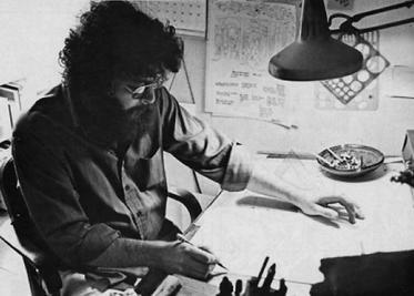
 Bill Spicer, undated, image found online
William Walter Spicer was born Oct 1, 1937 in Los Angeles, CA. He became an avid science fiction fan in his teen years. He learned professional lettering techniques while working at an ad agency from 1955 to 1967, and he became a letterer for Western Publishing in 1967.
 From FANTASY ILLUSTRATED #1, Winter 1963-64, Bill Spicer
A few years earlier, Bill began publishing one of the first independent comics-related magazines, Fantasy Illustrated, which contained work like this story, penciled and lettered by him, with finished art by another future pro, D. Bruce Berry. The name changed to Graphic Story Magazine, and reached issue 16 in 1974, though later issues had few comics stories and were focused on comics history. This early lettering is not as polished as his Western work, but it reads well and looks fine.
 From THE FLINTSTONES #1, Oct 1977, image © Marvel and Hanna-Barbera
Spicer lettered hundreds of stories for Western until 1982, and when Marvel got the license for Hanna-Barbera comics in 1977, he lettered some of those too. Here he used a wedge-tipped pen to make very consistent letters in symmetrical balloons.
 From WARP #2, April 1983, First Comics
By 1983, Bill was lettering for other publishers, and finally getting printed credit for his work, as on this great Steve Ditko story. The feature logo is in the style of Artie Simek.
 From DARK HORSE PRESENTS #1, July 1986, image © Paul Chadwick
In 1986, Spicer began working with Paul Chadwick on Concrete, a partnership that lasted for many years.
 From CONCRETE #6, Feb 1988
A closer look. For Concrete, Spicer used round-tipped pens, and his lettering remains consistent and easy to read. It’s small but wide. Bill lettered for other publishers, including Disney and Viz, but his work with Chadwick has the longest history, continuing until at least 2007. I don’t know if Bill is still lettering today.
 From CREEPY #23, Oct 1968, Warren
Another busy artist with a long career who often lettered his own work was Tom Sutton. He first landed comics work at Marvel, but the earliest stories he lettered himself were for Warren, as seen above. The large title on this story is dynamic and effectively creepy. The lettering is pretty small here, and somewhat uneven, but it reads fine.
 Tom Sutton, date unknown, image found online
Thomas F. Sutton was born April 15, 1937 in North Adams, MA. He described it as a small, rural, quiet town. After graduating from high school, Tom joined the Air Force, and was able to begin his comics career there drawing a strip called Johnny Craig for the military’s Stars and Stripes newspaper. Returning to civilian life, Sutton worked in various places as a freelance commercial artist while also studying art on the G.I. Bill. In 1967, he began getting comics work at Marvel and Warren around the same time. His style was energetic, detailed, and cartoony while also effectively scary when that was appropriate. His own lettering was a good match.
 From NOT BRAND ECHH #11, Dec 1968, image © Marvel
This example is the first story I’ve found with his lettering credit, and it emphasizes the cartoony side of his art, with lots of great display lettering and a fine title.
 From NOT BRAND ECHH #11, Dec 1968, image © Marvel
A closer look at another page, his lettering is angular and uneven here, and not typical for Marvel, but it works fine.
 From VAMPIRELLA #1, Sept 1969, Warren
At Warren, Tom did the first Vampirella story in her initial issue, capturing the teasing sexuality and horror in her blood bath perfectly. Again, the lettering is uneven, but right for the art.
 From GIANT-SIZE MAN-THING #5, Aug 1975, image © Marvel
A few years later, Tom’s captions have taken on an organic edge, and the story title is also organic in a style he often used, almost like something from an underground comic by Robert Crumb. Everything is a little loose, but charming and appealing. Many covers and stories by Sutton for Charlton Comics had a similar approach, and Tom found work at a wide variety of comics publishers.
 From ALIEN ENCOUNTERS #10, Dec 1986, Eclipse Comics
Tom’s work on this story has an excellent type-based title, and lots of interesting balloon lettering. For DC Comics, Sutton drew the feature “I…Vampire,” and penciled nearly the entire run of their STAR TREK series, but those were lettered by others. In the 1990s, Sutton did erotic comics for Fantagraphics, and also had gallery shows of his fine-art paintings. Tom died of an apparent heart attack in his Amesbury, MA apartment on May 1, 2002 at age 65.
 From GHOST RIDER #1, Feb 1967, image © Marvel
John Verpoorten is mostly remembered as the production manager at Marvel from 1970 until his death in 1977, but he began working at the company as a freelance inker and occasional letterer in 1967. There are only two examples of his lettering with a printed credit, one is above. As usual at this time, John seems to be trying his best to imitate the style of Artie Simek, Marvel’s veteran letterer. He did a good job, the story title, the balloon shapes, and the letters themselves are all similar to Simek’s work.
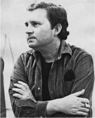
 From FANTASTIC FOUR SPECIAL #7, Nov 1969, image © Marvel
John Verpoorten was born May 15, 1940 in New York City. I’ve found almost no personal information about him, but in the 1950 census he seemed to be living on 2nd Avenue, Manhattan with his father, a much older brother, and his grandmother, based on their ages. His father was an elevator operator and he and the grandmother were born in Holland. John was a student at the School of Visual Arts in Manhattan for four years, and then found work in Tom Gill’s studio, Gill was the long-time artist on THE LONE RANGER comics and a teacher at SVA. By 1967, John had begun freelance work at Marvel, where a Bullpen Bulletin entry described him as 6 feet 6 inches tall and 290 pounds, clearly a big man.
 From TWO-GUN KID #87, May 1967, image © Marvel
This is the other story with a lettering credit for John. I imagine he learned lettering from Tom Gill, and was happy with any kind of freelance work Marvel would give him, though most of that was inking. The lettering here is wider, seems to be done with a wedge-tipped pen, and reminds me more of Sam Rosen’s work.
 From MILLIE THE MODEL #151, July 1967, image © Marvel
Verpoorten is also listed as lettering a handful of MILLIE THE MODEL stories in the Grand Comics Database, where the lettering had no printed credits. This example looks about the same as the one above to me.
In 1969, Marvel production manager Sol Brodsky left to start a new company, and John was hired to replace him. Marvel was quite small at the time both in office space and staff numbers, so Stan Lee must have had confidence in John’s ability to get the most out of that staff. Several have described him as imposing. Danny Crespi became a friend, and reported that John encouraged him to take on cover lettering at Marvel to help make ends meet around 1974.
John was found dead in his home on Dec 15, 1977 at age 37. It seems likely overwork and his weight were factors. His lettering career was brief, but I thought worth including because of his impact and reputation as a staffer at Marvel.
 From ARCHIE AND ME #4, Oct 1965, image © Archie Comics
I was not a reader of Archie comics growing up except when nothing else was available, so I missed a lot of fine lettering by Bill Yoshida. I’m depending on the Grand Comics Database to identify his early work for the company like the page above. The letters are very regular and most would fit in a square. I think they’re made with a slightly wedge-tipped pen, and they remind me of the lettering of Ben Oda, with good reason.
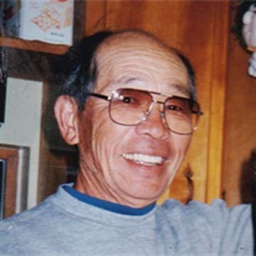 Bill Yoshida, date unknown, image found online
William Saburo “Bill” Yoshida was born on December 2, 1921, in Brawley, California to Japanese emigrant parents. His father was a gardener, and in the 1930 census the family lived in Beverly Hills, CA perhaps on the grounds of the home where he worked. At first Bill followed his father’s profession, and on his 1942 draft card, he’s described as a self-employed gardener. A month or two later, the family was forcibly evacuated from their home, along with many others of Japanese descent thought to be a possible threat during America’s war with Japan, and sent to an internment camp in Manzanar, CA, a remote desert location. Bill was released in 1944 and relocated to Chicago, where by 1950 he was married to Dorothy and had two sons. In an obituary by Jim Amash in Alter Ego #48 (May 2005, TwoMorrows), Bill was said to have worked there as a chef and nightclub singer. A few years later the marriage ended in divorce, and Bill move to New York, remarrying Sachiko Terada. He worked several jobs as a cook and chef.
 From ARCHIE #173, June 1967, image © Archie Comics
Now we come to the comics part. Yoshida was in an all-Japanese bowling league in New York City. One of his teammates was Ben Oda, and Ben taught Bill to letter. He advised him on assembling a lettering portfolio, and Yoshida was hired by Archie Comics in 1965. I can’t be absolutely sure the pages I’m showing here are lettered by Bill, but they all look like the same hand, and are credited to him on the Grand Comics Database. Bill spent the rest of his life lettering for Archie, but also did work for other publishers including Tower, Harvey, Marvel, DC, and Warren. CREEPY #15 (June 1967) says about their lettering:
The penciled pages are given to Ben Oda for lettering. Lately we have also been using up and coming young letterer Bill Yoshida to help lighten Ben’s burgeoning burden.
 From PEP COMICS #229, May 1969, image © Archie Comics
This page credited to Yoshida shows The Archies band with fine display lettering for the lyrics.
 From LIFE WITH ARCHIE #231, May 1982, image © Archie Comics
There are lots of sound effects on this page, and the lettering is a little larger, something that may have been done so stories would read well in digest-size comics, and Archie put out lots of those full of reprints.
 From ARCHIE AT RIVERDALE HIGH #110, Aug 1986, image © Archie Comics
By 1986, Bill was finally getting printed credit for his lettering, something he’d been doing over twenty years. It was only the half-way point of his Archie lettering career.
Bill and his family moved to Waldwick, NJ in 1969. He was nominated for Eisner Awards for Best Lettering in 1996 and 1999. Late in 1999 he was diagnosed with cancer, but continued to work for another four years. He passed on Feb 17, 2005 in Waldwick.
In a press release, Archie Comics remembered Yoshida:
It was Bill’s love of humor that made him a natural for lettering the Archie Comics line. His work complemented the art, as good lettering should. Bill was a dedicated company man, ever-conscious of deadlines and never missing them. His lettering style became the company look. Bill lettered an average of 75 pages a week for 40 years, for an approximate total of 156,000 pages. He’ll be missed as much for his humanity as for his dedication to his craft.
 From VAMPIRELLA #1, Sept 1969, Warren
Beginning in the 1960s, Mike Royer was an artist for Western Publishing who assisted others, and sometimes did his own complete art and lettering, though I haven’t found any credited work of that kind for him. In 1969, he also began doing art and lettering for short horror stories at Warren like the one above. His lettering is very regular and even with most letters fitting into a square, though his title and sound effect here have bounce and energy.
 Mike Royer, 2020, image found online
Michael Whitman Royer was born June 28, 1941 in Lebanon, OR. He moved to California in the mid 1960s to pursue a career in comics, first landing work at Western Publishing, where he assisted Russ Manning, Warren Tufts and others, as well as drawing his own stories, some of which he probably lettered. In the late 1960s he was also working for Warren, as seen above, but his name became widely known when he was hired by Jack Kirby in 1971 to ink and letter stories for Jack’s Fourth World titles at DC Comics. In his book Kirby, King of Comics (2008, Abrams), Mark Evanier wrote:
From the early seventies on, Jack’s favorite inker was Mike Royer. At first it was in part a geographic advantage: Kirby was in Southern California, and so was Mike. Jack wanted, as much as possible, to keep his work away from East Coast editorial types. But Jack soon came to appreciate Royer in other ways, especially the fact that that Mike decided to ink as opposed to reinterpret. Jack was very fast, and Mike’s job description required that he keep up with him, matching him page for page and also lettering the work, to boot.
 From THE NEW GODS #5, Oct-Nov 1971, image © DC Comics
The early issues of Kirby’s interconnected books at DC were lettered by John Costanza, with Royer taking over in the fall of 1971. His lettering is again regular and even, but the titles have more energy and bounce, probably following Kirby’s lead, and even the regular lettering is a bit looser. This lettering seems to be done with round-point pens.
 From THE DEMON #10, July 1973, image © DC Comics
More than a year later, this page uses a wedge-tipped pen for the regular letters, while the larger display lettering and sound effect are still full of energy and excitement.
 From SILVER STAR #2, April 1983, Pacific Comics
Royer also worked with Kirby at Pacific Comics on titles like this, where his very organic story title probably began with a roughed in one by Kirby. It’s a unique style that they developed together.
 From AUTUMN ADVENTURES #1, 1990, Image © Disney
After Kirby moved away from drawing comics, Royer worked on newspaper strips, and in 1979 took a staff job at Disney as a designer, where he did logos like this one for Disney’s foray into producing their own comics in the 1990s. Later he became a freelancer for Disney specializing in Winnie the Pooh projects. Since 2000, Royer has worked on many TV and toy projects as a designer. He and his wife Laurie now live in Medford, OR.
I’ll continue this series soon with more letterers of the 1970s.
The post More 1960s Letterers Part 2 appeared first on Todd's Blog.


Todd Klein's Blog

- Todd Klein's profile
- 28 followers

