The Logos of TSR's Gamma World
Over the weekend, I was cleaning the bookshelf nearest to my computer desk and saw the boxed sets of the first and second editions of Gamma World sitting side by side. Visually, they couldn't be more different from one another. Here's the logo of the first edition:
 I'm no expert on typography, so I can't tell which font is being used here. I can only say that, whatever it is, the font makes a certain point: Gamma World takes place in a "shattered" setting, one that has suffered some sort of catastrophe that has forever changed it. The logo also seems to imply a connection – thematically or otherwise – to its immediate predecessor RPG, Metamorphosis Alpha.
 Notice that the word "Alpha" in the title uses the same (or a very similar) font to that fond in Gamma World's logo.
 By contrast, the second edition of Gamma World sports a very different logo:
 I imagine that the new logo was, first and foremost, born out of a desire by TSR to distinguish the new edition from the old one, so that there could be no confusion between them. Likewise, the new logo has a more modern, even futuristic look to it, which makes sense, given that the game's setting is hundreds of years into our own future. I also can't help but wonder if the new logo was at least partly inspired by the logo used for the two modules and referee's screen released for first edition:
 The similarities between the two logos are small, I'll admit, but they both evoke a similar futuristic vibe, in addition to demonstrating that TSR has more money to devote to graphic design than they did when the first edition was released. That said, I actually prefer the alternate 1e logo to the 2e one. Obviously, TSR didn't feel the same way, since they more or less re-used the latter for the game's third edition.
 Mind you, Gamma World 3e re-used almost all of 2e's art assets, so who knows the logic of this decision? I believe I've read somewhere that 3e was produced during a time of financial uncertainty at TSR (1986), so every effort was made to economize on its production, hence the re-use of so much from the previous edition.
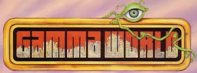
I did not own the game's fourth edition. To this day, I've still never done more than skim a copy of the book, which, as I understand it, had a very mixed reception at the time of its release (1992). The logo shares certain similarities with that of 2e/3e, with an additional whimsical flourish:
 I like the ruined buildings visible inside the letters of the title, but I have mixed feelings about the mutant eye resting on the top, since I think it leans a bit into the "Gamma World is goofy" end of things that I've never liked. That said, I like it nonetheless.
Published on November 27, 2023 09:00
No comments have been added yet.
James Maliszewski's Blog
- James Maliszewski's profile
- 3 followers
James Maliszewski isn't a Goodreads Author
(yet),
but they
do have a blog,
so here are some recent posts imported from
their feed.


