
Creating My First Large Print Book
“I want to read your books, but can you make the letters big, because it’s hard for me to read the lines when they’re regular books.”
The first request I got to release my books with larger print came even before I had published. It surprised me because the reader who was asking was around eleven years old. It turned out that my very first published book was designed by the publishing imprint, and I didn’t have any control over the layout. But the request was again iterated when I sold my books in person, all four of them laying side by side, and often heard the comment, “I’ll take this one. It’s easier to read.”
The books with the smaller print were often returned to their place, so I began formatting my books with larger font, around size 12 to 14 as my standard, rather than 10, though it depended on the type of font. Even though my regular books already have larger print, I decided to take it a step further and design versions of my book specifically for low-vision readers.
What constitutes a large print book?After reading several articles, I quickly learned that there is no legal standard for formatting a large print book, which means any LP book can be released without ticking off a specific set of boxes. The recommendations for types of fonts, space between lines, contrast, and style seemed to have a variety of choices though they did have some similarities. Since I decided I was going to make my book as accessible as I could, I finally settled on using the guidelines by the American Council of the Blind for optimizing documents. I chose Swing as my first formal Large Print project, because it has the simplest formatting out of my books.
I changed the font from its current 16 points to an 18 point font.
I changed the font from a serif to a san-serif style. A serif is the little line on the bottom and top of letters. (This font is a san-serif, meaning it doesn’t have a serif.)
To create a line height of 1.5 or higher, I had to do some research. I decided to use a 26 pt spacing using InDesign to create white space between the lines.
I added an extra space between the paragraphs instead of indenting them.
I let the lines end a little jaggedly instead of in a perfect block. In typesetting terms, I would say I allowed a ragged line instead of a justified-left.
I read that “titles and headings should also be a larger font and aligned to the left” so I made the font larger, but I left the chapter numbers in the middle of the page.
I replaced the italics with bold letters.
I added an inch of margin, though I found this recommendation somewhere besides the American Council of the Blind.
I also made my own decision to take out all heading matter and leave only important words on the page.
The Result?
It’s been fun to learn a new skill and I am excited to have an “official” large print book available. I plan on doing this with all of my books as I re-release them.
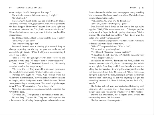
If your curious to compare it to my regular book - which still has a larger print and spacing, here is an example below. Neither of these photos will be the actual size of the 6x9 book.
In the meantime, let me know what you like best about the insides of books! Have you ever bought a book just because you liked the cover or layout? Personally, when I go into a bookstore, I love old books that have an old-world touch to their designs. I was also intrigued by the playful ideas in Jodi Picoult and Samantha van Leer’s book Between the Lines, where the book layout was literally part of the story.


