
Menewood as Objet d’art
Menewood is beautiful. Yes, yes, authors often say that about their books—we’re just like new parents who beam fondly at the squalling, squashed turnip-looking thing in their arms and declare fatuously, “Isn’t she beautiful!” And, okay, yes, I am totally biased, but also, Menewood really is beautiful! It’s not just the lush gorgeousness of the Anna and Elena Balbusso’s cover art, but also the interior design (which I’ve talked a bit about before), and—extremely important but often neglected—how the physical object handles.
ArtThe Balbusso twins create their art the old-fashioned way with ink and brushes—not the digital kind but ones you can hold in your hand and tap the handle on your teeth when you’re thinking. Here’s a short behind-the-scenes video borrowed from their Instagram feed:
Behind-the-scenes video of the Balbusso twins painting the cover of MenewoodThe whole, of course, is lovely. But I’m also fascinated by some of the detail.
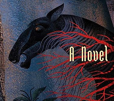 Detail from cover artwork by Anna and Elena Balbusso
Just look at that horse! It’s brilliant—fabulously powerful, the essence of warhorse, with the swirl of colour in the background hinting at some and flame, and the red filigree somewhere between tree branches and abstract arteries. Take a closer look at the left—the detail of the frayed weave of Hild’s cloak. It’s just perfect.
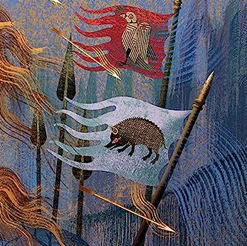 Detail from cover artwork by Anna and Elena Balbusso
The banners delight me for the simple reason that it means Anna and Elena Balbusso read the book and paid attention: the raven and the boar are the totems of two rival families—exactly right.
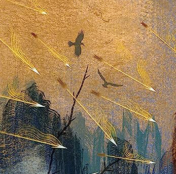 Detail from cover artwork by Anna and Elena Balbusso
The gold around the arrows could be flame or it could be bright sun glinting on the death raining down from the sky. It does’t really matter. The whole is a marvellous tapestry of movement, texture and colour.
I like these images so much I used them as background to some of the quote tiles I build for my own amusement.
The physical reading experienceBut I want to step back and consider the novel as a book: that is, how it works. I’ve already talked about how it works as story—why I divided it into the Books, Parts, and Chapters that I did. Now I want to focus on the physical mechanics.
After the gorgeous cover, my guess is that the first thing a reader will notice is how big the book is. And it is BIG: 5.5cm thick. When I first picked it up I expected it to weigh a ton but…it’s light! I discovered that when I was taking pictures of it: it’s lighter than Hild even though it’s 25% longer. Cool, I thought, and went on taking pictures. (Really, authors really are like besotted parents; I love this book with a mad crazy love and want to take pictures of it in every light and circumstance and company…)
On Saturday it was my birthday. We went to the pub. I took along a copy of Menewood so we could leaf through it and find a couple of nifty readings for upcoming events (uh-huh, right nothing to do with the fact that I simply couldn’t bear to be parted from it  ). I ordered a pint of Guinness, opened the book, and set it on the table.
 Menewood about to enjoy a quiet pint
And that’s when I discovered something terrifically, amazingly, magically cool about this delicious book: whatever page you open it to, IT STAYS PERFECTLY FLAT!
 Look, Ma! No hands! (And a clover for luck.)
Seriously, perfectly flat. Unless like me you have small hands, or perhaps compromised arm strength, you have no idea what a boon that is. I don’t mind admitting that when I first saw this book I was worried: I thought the size and shape and weight would make it unwieldy. But when you add the lightness to the fact that it lies perfectly flat without any weight to hold it open, it starts to feel miraculous.
I was so taken with this that when we got home I experimented. The first thing I did was open it right at the beginning, to the Table of Contents and facing map.
 Big fat book staying open all by itself
 Look at that: perfectly flat and nothing holding it open. I can read this book all day if I want and not get tired.
How is it possible to make a book open just 0.01% of the way through—8 pages on one side and 712 on the other—and lie perfectly flat?? It’s magic, it has to be. I always knew book designers were wizards but, wow. I am amazed. Here are more pics to prove it—and, bonus, more maps!
 The beginning of Book Two, about 40% of the way through
 Part IV, Lord of Deira
For a refresher on how the book is structured, and why, see Three Books, Seven Parts, 38 Chapters
 Maps, maps, maps. These are ©Jeffrey L Ward.
These maps are based on my files, with the fonts professionally tidied up for publication. (Here’s a reduced-size file of my original of Deira, if you’re interested. One day I may post the large-format full-colour version—but today is not that day.)
And finally here’s one last photo of Menewood looking all moody and autumnal—just ready for you to curl up by the fire and read. and, hey, it’s the weekend…


Hope you enjoyed your Guinness! You earned it!