The Universal Effect of Color
Colors are a vital and aesthetically nourishing part of an object’s expression. But when creating sustainable design products that are meant to last and to be loved and maintained for years, decades, well, maybe even a lifetime, how does one supersede color symbolism and trend-based color-favoritism, which tends to shorten the lifespan of an object?
Maybe a way could be to work with the physical or sensuous effect of colors.
Sensorially, human beings have a tendency, for instance, to regard darker colors as being less expansive than lighter ones; a white room seems bigger than a dark blue one; black appears slimming because our gaze decodes color in this way. Further, colors such as blue, turquoise, and cyan appear cool; whereas red, purple, and orange seem warm by contrast. A red chair will feel warmer to sit in or to stroke one’s hands across compared to a blue counterpart. A room of cyan walls will feel colder than a room of purple walls, and so on.
Regarding color theory, a number of aesthetic principles challenging the color symbolism red for love, white for innocence, green for hope, etc.) and the trend-/ culture based approach to color, have preoccupied thinkers and artists such as Johan Wolfgang von Goethe (1749–1832) and Johannes Itten (1888–1967).
Basic universal principles of aesthetics, in regard to color, can help us understand how different colors affect the human senses and how to create an expression that fosters the most harmonic composition — that is not affected by trends, culture or symbolism.
In his work of 1961, The Art of Color: The Subjective Experience and Objective Rationale of Color, Itten sets up guidelines for creating color harmonies or contrasts. For Itten, harmony means equilibrium or symmetrical composition. The eye is always searching for symmetry, according to Itten, and the color contrasts, when followed, can provide it with the means of achieving a sense of equilibrium and harmony, which is immediately pleasurable.
For example, complementary contrast provides the eye with a calm aesthetic experience, as all three primary colors (red, blue, and yellow) are present, and because humans have an innate preference for the simultaneous presence of all three primary colors. This preference can be illustrated with the following example: staring for a minute at a green circle and then moving one’s gaze to a white surface will result in the eye creating the illusion of a red circle (Itten called this illusion simultaneous contrast). Since green is a mix of yellow and blue, all three primary colors are here present.
The complementary and the simultaneous contrasts are two out of seven color contrasts that can help create different color harmonies. The rest are the contrasts of hue, light-dark, cold-warm, saturation, and extension. According to Itten, our senses can only apprehend and process objects and expressions by way of comparison, and the different contrasts can affect the senses in more or less powerful or diverse ways.
The harmonious composition of the color contrasts can nevertheless be challenged. Designers and artists can choose a challenging, dynamic, and vivid expression in order to change the color scale in relation to the contrast of extension and thereby make room for the most “voluminous” or expansive color (yellow, say) in a given composition, as this would break with the harmony, which is attained by maintaining the internal sense of proportion. Itten bases his concept of scale on Goethe’s color theory.
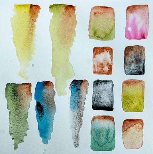
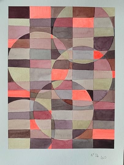 Artist x Artisan collaboration by Lene Refsgaard & Southeast Saga
In line with Itten, Russian painter and art theorist Wassily Kandinsky has discussed colors and their physical effect on the human senses in his poetic and theoretical work, Concerning the Spiritual in Art.
According to Kandinsky, colors have a physical, almost tactile, effect on the viewer that is based in the “spiritual vibration” of a given color. This sensorial, synesthetic approach to color, which is characteristic of Kandinsky, is expressed in the following quotation:
Many colours have been described as rough or sticky, others as smooth and uniform, so that one feels inclined to stroke them (e.g., dark ultramarine, chromic oxide green, and rose madder). Equally the distinction between warm and cold colours belongs to this connection. Some colours appear soft (rose madder), others hard (cobalt green, blue-green oxide).
The extent to which human beings are susceptible to the “vibrations” of colors and shapes, Kandinsky suggests, depends on their spiritual sensitivity. This means that it is only possible to truly impact the “spirit” of the viewer if she engages with and remains open to the aesthetic experience.
But what characterizes such a human being — a human being for whom, to quote Kandinsky, “[t]he expression ‘scented colours’ is frequently met with”?
And can spiritual sensitivity be taught?
Imputing to the artist (or designer) this kind of task is certainly idealistic: teaching humanity about spiritual sensitivity or about how to be open and receptive to aesthetic experiences and to recognize their value as such.
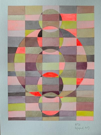 Artist x Artisan collaboration by Lene Refsgaard & Southeast Saga
Itten, Goethe, and partly Kandinsky take a phenomenological, rather than a symbolic, approach to color. In other words, all three are concerned with how colors and their “weight” or combinations/contrasts affect the body (and the mind), how colors feel to be around, rather than with what they symbolize or which associations they spark in the experiencing subject.
The phenomenological approach ignores culturally specific symbolic values, which are changeable and which are thereby antithetical to the universal (unchanging, eternal) human experience of color.
On the whole, phenomenology has a lot to contribute in terms of locating a universal experience of the world and its physical objects. If the corporeal understanding and apprehension of the world comes before the cognitive and the reflective, as French philosopher Maurice Merleau-Ponty (1908–61) thinks, the cultural “baggage” and connotative framework of human beings are not necessarily an impediment to creating aesthetically durable expressions or objects with the ability to please or challenge recipients and thereby affecting them in powerful ways. In fact, cultural connotations are entirely insignificant in this regard.
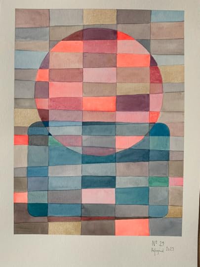 Artist x Artisan collaboration by Lene Refsgaard & Southeast Saga
Read more about the Artist x Artisan collaboration by Lene Refesgaard & Southeast Saga here.