
SAM & JOE ROSEN – Letterers Part 3
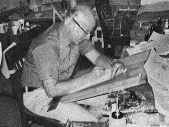 Joe Rosen from COMICS INTERVIEW #7, Jan 1983, Fictioneer Books
Thanks to a two-page interview with David Anthony Kraft from the above-named magazine, we know a little more about Joe Rosen from his own testimony than we do about Sam, who learned lettering first. In the interview, Joe reports: “My brother Sam is a letterer. He worked on THE SPIRIT, for Will Eisner, and on Fox’s THE BLUE BEETLE, in the 1940s. Sam got me into the business and taught me the trade. Sam got me my first lettering job, at Fox, doing THE BLUE BEETLE.”
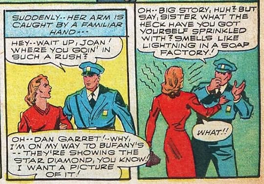 From THE BLUE BEETLE #11, Feb 1942
As recounted in Part 1 of this article, Sam was taken under the wing of letterer Howard Ferguson, who trained him to take his place at Fox so he could concentrate on lettering for Timely, the company now known as Marvel. That was in 1941. I have no idea what story or stories Sam gave to Joe, but clearly they were close and helped each other. The example above, which looks somewhat like Sam’s work to me, but not quite, could be by Joe, but that’s a guess, and this is likely too late to be Joe’s first. In the interview, Joe reports: “I started around 1940, 1941. I was lettering when the news came about Pearl Harbor. I was away in the service for three years [August 21, 1942 to August 28, 1945], then I came back after the war and went to National — I don’t recall if it was called National or Detective Comics back then. I’d done some work for them before the war. I did one comic for them called The Shining Knight. I worked up at National when Julius Schwartz was an assistant editor. Let’s see…I worked with Mort Weisinger and Jack Schiff.”
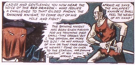 From The Shining Knight, ADVENTURE COMICS #69, Dec 1941, DC Comics. All DC images © DC Comics.
Shining Knight started as a feature in ADVENTURE COMICS with issue #66 cover-dated Sept 1941. The example above could be by Joe Rosen, but the only scans available to me are quite poor. You can still get some idea of what the lettering was like. Joe’s return to National/DC can be placed to no earlier than 1946, when National merged with All-American comics where Julius Schwartz was an editor (or assistant editor), and the All-American staff joined the National staff at 480 Lexington Avenue. Weisinger and Schiff, National staffers, were there then too. I haven’t been able to identify any of Joe’s lettering at National/DC from 1946-47, nor does the Grand Comics Database list any.
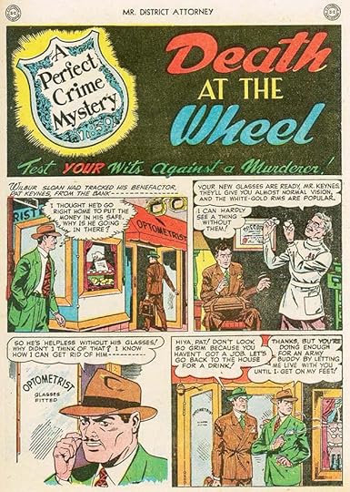
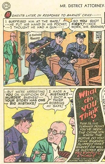 From MR. DISTRICT ATTORNEY #2, March-April 1948
National/DC Comics had two crime titles based on radio shows, this one and GANG BUSTERS. Ira Schnapp was lettering many of the stories in both, but this four-page recurring feature in issue #2 is not by him. It has slightly wider letters made with a wedge-tipped pen with a little bounce and very round circles. I think it’s the work of Joe Rosen. The display lettering in the last caption here is also unlike Ira’s work. The basic lettering style is similar to what Sam Rosen was doing at the time, and as Joe said he was working for DC at this point, it makes sense to call it his. The editor was Jack Schiff.
 From MR. DISTRICT ATTORNEY #3, May-June 1948
The same feature in the next issue is also by Joe, notice the distinctive rounded title letters, again something Schnapp didn’t do, though I think Ira designed the feature logo at top left. One oddity is the many very small loops in the thought balloon in the first panel.
 From MR. DISTRICT ATTORNEY #16, July-Aug 1950
This story from about two years later has more typical Joe Rosen work, though the wedge-tipped pen style is not evident. Sometimes those points wore down a bit, making the line more even.
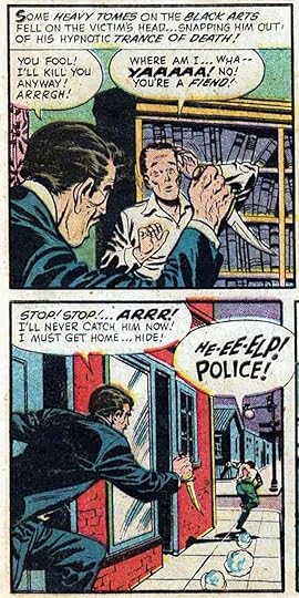
 From WITCHES TALES #1, Jan 1951, Harvey Comics
In the interview, Joe said: “I went to Harvey in 1950 and worked there until the 1970s, when I went to Marvel.” For Harvey Comics, Joe did all kinds of stories including horror, science fiction and cartoon characters. This is an early example, he’s listed as letterer on most of the stories in this issue on the Grand Comics Database. The move makes sense, since Ira Schnapp and Gaspar Saladino were getting the majority of the lettering assignments at DC in 1950, perhaps at Harvey he was able to work more steadily. In the interview, Joe continued: “In the old days you were on your own, really. You had to run from place to place, getting work. We were young, so whatever we made was great, you know? I used to get 50 cents a page.” The 1950 census shows that Sam and Joe were still living with their family in Brooklyn, so that made things easier, I don’t know how long that was the case.
 From TOMB OF TERROR #2, July 1952, Harvey
This story probably lettered by Joe has some effective larger display lettering.
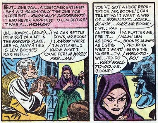 From WITCHES TALES #23, Feb 1954, Harvey
A few years later, and Joe’s lettering is looking more polished, even with all those words to fit in. Note that he was using the old style breath marks, parentheses, around GULP in the first balloon. Later they would become radiating dashes.
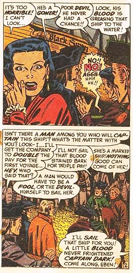
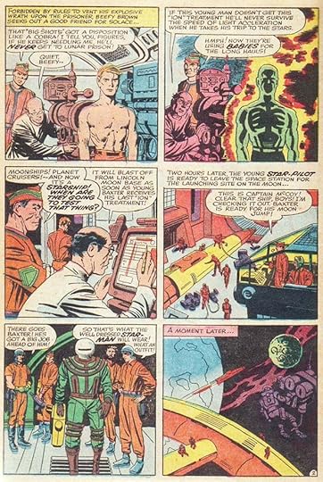 From RACE FOR THE MOON #3, Nov 1958, Harvey
By 1958, horror comics were mostly gone due to the Comics Code, and science fiction was in style due to the real-life space race. Here Joe got to work with penciler Jack Kirby and inker Al Williamson. There’s not much to distinguish the work of Sam and Joe Rosen in the 1950s, so I have to go by where Joe said he was working, but I’m sure they continued to help each other with tight deadlines if needed.
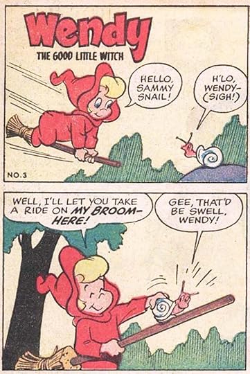 From WENDY THE GOOD LITTLE WITCH #3, Dec 1960
Joe also lettered lots of cartoon character comics for Harvey like this one, especially in the 1960s. One advantage was simple stories with much less lettering.
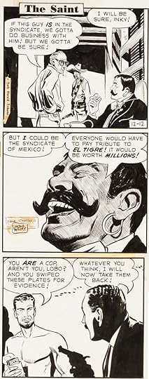 From THE SAINT Daily, Dec 12 1960, original art courtesy of Heritage Auctions.
In the Vital Statistics sidebar in his interview, Joe lists this daily newspaper strip among his lettering. It ran from 1948 to 1962. I don’t know when Joe worked on it, but this Daily could be by him with balloon shapes by the artist.
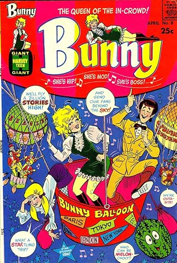 From BUNNY #8, April 1969, Harvey
Joe did both cover and story lettering for this Harvey series with artist Hy Eisman, though I think the logo is by Otto Pirkola. There’s a nice variety of styles on this cover.
 From PREZ #1, Aug 1973
Joe returned to DC briefly in 1973, probably brought in by writer Joe Simon, who he would have known at Harvey, to letter issues 1 and 4 of this odd Simon series.
 From DRACULA LIVES! #1, May 1973, this and all Marvel images © Marvel
While it’s not mentioned in his interview, the Rosen family had gone through a major upheaval in 1972 when Sam stopped lettering completely. I find it telling that, in the 1982 interview, ten years later, Joe says, “My brother Sam is a letterer.” Perhaps he had hope that Sam would recover and return, but Sam never did. Meanwhile, Marvel was in need of good lettering, and they called Joe in to take some of Sam’s workload. The earliest credits for him in the Grand Comics Database are for stories in magazine-size black and white magazines that Marvel was putting out to compete with Warren’s CREEPY and EERIE, for instance. These did not need comics code approval, and they didn’t have lettering credits, but the work is very much in the style Joe would use often at Marvel. The lettering is quite small on the page, and is a bit looser and less even than what he was doing before. The small size is something Joe became known for. In the interview, David Anthony Kraft asked Joe when he started lettering smaller, and Joe told him:
“It was when Sam was working for Marvel. He had too much work and I didn’t have enough, so I did a story for him. It was a SGT. FURY. And I thought: There’s only one way I’m going to get all this copy in — by making it as small as it was possible to letter it and still make it clear. I actually was not too sure it would be all right. I’m still not sure. But I’ve never had any complaints about it.”
 From FANTASTIC FOUR #153, Dec 1974
Here’s the first credit I see for Joe Rosen on a Marvel color comic, and again the lettering looks small, it even floats with extra air inside the balloons. This new style of smaller lettering was something writers and artists liked, it allowed more words on the page and more room for the art, making Joe a sought after letterer at Marvel, and soon he was working there exclusively. Joe was happy with the arrangement, and said in the interview:
“When I started, I got the impression that everyone was in it as a short-time proposition to make a few bucks ’til they could go into advertising or whatever. Nobody was in it as a career professional. That’s why I admire Marvel. By instituting credits, they helped make you feel prouder of your work. And by being so successful, they revamped the industry and launched so many titles that they made it possible to have a professional career. Now I’m treated as an employee, with benefits and so on. I’m under contract, which would have been undreamed of thirty years ago. So for me, it’s better financially.”
 From MASTER OF KUNG FU #35, Dec 1975
Joe’s lettering was soon being seen in many Marvel titles. Here he makes a little more room for art by overlapping his balloons across the panel breaks.
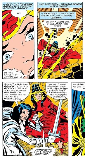 From THOR #265, Nov 1977
Many Marvel comics were written plot first, with the artist using that to pencil the story, then dialogue was written to match the art and the pages were lettered before inking. It worked when artists remembered to leave room for the lettering, as Walt Simonson did here.
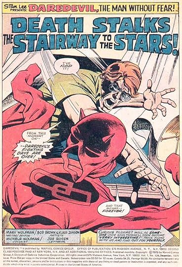 From DAREDEVIL #128, Dec 1975
Joe began lettering DAREDEVIL in 1975, and he lettered 127 issues over the next 16 years, making it the title he was probably most associated with. The story title here it typical for him, well-drawn block letters, but nothing flashy. To me, he didn’t have the same level of creativity in that area as his brother Sam, but he always did a professional job.
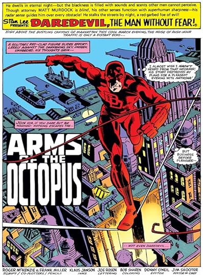 From DAREDEVIL #165, July 1980
When he teamed with Frank Miller and Klaus Janson on the art, Joe’s lettering seemed a perfect match, and it became a favorite run of myself and many others.
 From DAREDEVIL #180, March 1982
With Frank Miller also writing, the balloon placements became a thing of beauty, choreographed perfectly to help tell the story. Here they lead the reader down a vertical stack of panels by careful overlapping.
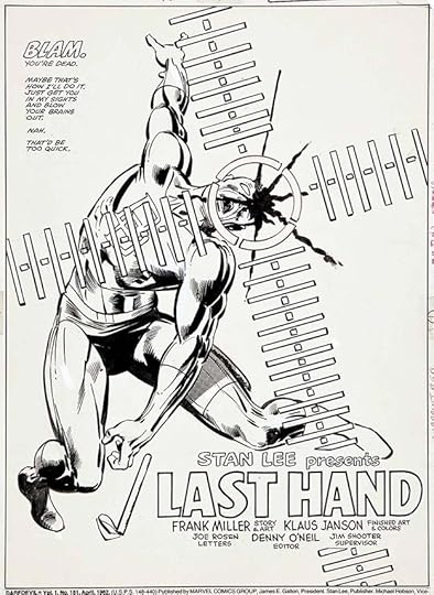 From DAREDEVIL #181, April 1982, original art courtesy of Heritage Auctions
Here the title and credit lettering is almost part of the story, and I also like the understated but still larger BLAM at upper left.
In the 1982 interview, Joe was asked about his workload and work schedule. He said he lettered about 40 pages a week, and worked all seven days, saying: “People I know who went into regular jobs don’t quite understand it. They see me around the house all the time and it’s hard for them to understand that I’m working, too.” At the time his regular assignments were SPIDER-MAN, CONAN and DAREDEVIL.
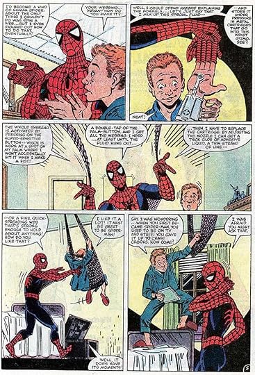 From THE AMAZING SPIDER-MAN #248, Jan 1984
This story, “The Kid Who Collects Spider-Man,” makes good use of Joe’s small lettering to get a lot of story into the page and leave room for the art.
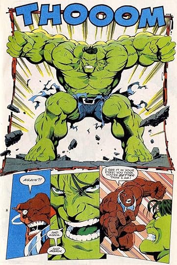 From THE INCREDIBLE HULK #409, Sept 1993
Here Joe shows he can do big sound effects too, when asked.
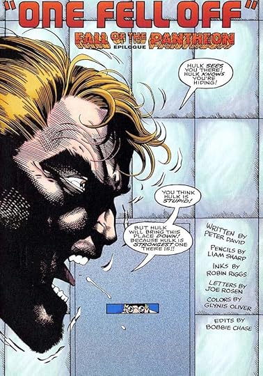 From THE INCREDIBLE HULK #426, Feb 1995
This is the last issue of HULK lettered with pen and ink by Joe Rosen, the next issue began a run of digital lettering from Comicraft. It may have prompted Joe to retire around this time at age 75, or perhaps he was just ready. I remember hearing about it and being glad he was able to make that choice. Joe’s final word in the 1982 interview is: “All I did was letter one page, and then I lettered another page, and then another and another.” It’s the summary of a long and admirable career. Joe passed October 12, 2009 at age 88.
The post SAM & JOE ROSEN – Letterers Part 3 appeared first on Todd's Blog.


Todd Klein's Blog

- Todd Klein's profile
- 28 followers

