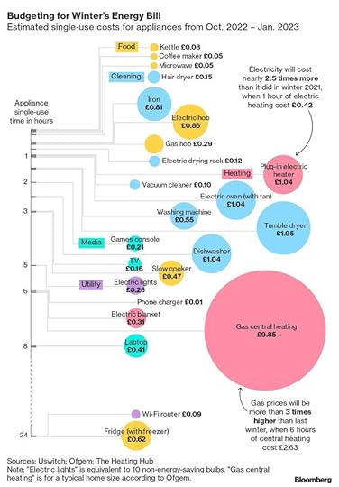
As price rises drive people to look for ways to save energy, there is suddenly a wealth of well presented information about energy use in the home. One of my favourites that I’ve seen recently is this chart from Bloomberg, which details the price of a variety of household appliances. It shows how much it costs to use them, ranked according to how long you will use it for.

As I regularly tell people in workshops on home energy, heating is the killer. They’ve assumed six hours of heating he...
Published on September 08, 2022 05:00
