
GASPAR SALADINO in THE AVENGERS Part 2
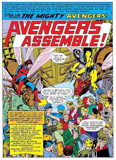
 All images © Marvel. From THE AVENGERS #110, April 1973
Continuing my overview of Gaspar Saladino’s lettering for this important Marvel Comics team book, in addition to lettering quite a few covers (as discussed in Part 1), Gaspar was often assigned to letter just the first story page of many issues. I suspect the idea was to make that page more exciting when potential buyers looked at it, to help clinch a sale, and I will add that it worked on me. On these, Gaspar always credits the letterer of the rest of the story, but this plan was mainly used for less experienced or less dynamic letterers, and the difference is clear when you see it. I think Gaspar was paid extra for these, and it shows in the work, he always seems to give more care to the story titles and credit blocks, as on the first one, above. Saladino also lettered a few full stories for the title. Note that my images on these are not from the original comics but from reprints, so the brightness and colors are not accurate to the originals, but the lettering looks fine.
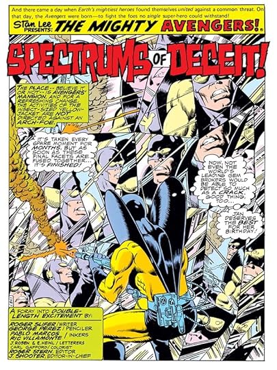
 From THE AVENGERS #117, Nov 1973
The title on this story is full of Gaspar’s drippy horror style and texture. His burst balloons are also full of energy.
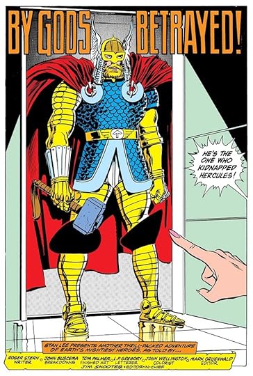
 From THE AVENGERS #118, Dec 1973
Here the Saladino page 1 treatment was used on an early lettering job by Tom Orzechowski. A few years later, Tom was doing wonderful title and credit work of his own, but at this point, he was a newcomer, and not yet as accomplished.
 From THE AVENGERS #137, July 1975
On this one, rather than use his own Avengers cover logo, Gaspar does a new one that works well in this giant word balloon title.
 From THE AVENGERS #138, Aug 1975
Writer Steve Englehart’s story title mimics Robert A. Heinlein’s “Stranger in a Strange Land,” but Saladino’s version of STRANGER makes it visually interesting.
 From THE AVENGERS #140, Oct 1975
Penciler George Tuska left plenty of room for this story title, and Saladino makes good use of it. They would work together on “The World’s Greatest Superheroes” comic strip in a few years.
 From THE AVENGERS #147, May 1976
This story title almost predicts DC Comics’ CRISIS ON INFINITE EARTHS in the 1980s.
 From THE AVENGERS #150, Aug 1976
This story title could have been a cover logo if Saladino hadn’t already designed a better one.
 From THE AVENGERS #151, Sept 1976
This more crowded cover needed a smaller title, but it’s still bold and full of impact.
 From THE AVENGERS #154, Dec 1976
Here’s a rare example of a Saladino page 1 on a story lettered by John Costanza, usually he did his own. The treatment of ATTUMA adds to the unsettling camera angle.
 From THE AVENGERS #156, Feb 1977
Has Doctor Doom’s name ever held more dark energy and menace?
 From THE AVENGERS #157, March 1977
Gaspar lettered this entire story, so gets to put his own name in the credits for the first time. He might have used a pen name, as in past stories, but must have felt it was okay to use his own by this time. Over at DC he was still not getting printed credit for his work, but that would start later in 1977.
 From THE AVENGERS #159, May 1977
Look at the subtle lightning symbol in this title. Gaspar was always adding creative touches.
 From THE AVENGERS #160, June 1977
There’s only so much you can do with a sedate title like this one, the large size helps.
 From THE AVENGERS #161, July 1977
The lower case A’s in ANT-MAN are a nod to his small size.
 From THE AVENGERS #162, Aug 1977
Perspective in the title adds depth and interest.
 From THE AVENGERS #163, Sept 1977
Three styles in the title that all work together, and the rough DIE adds excitement.
 From THE AVENGERS ANNUAL #8, 1978
A busy cover, but Saladino’s title stands out.
 From THE AVENGERS #168, Feb 1978
Larger names in the credits add importance. Gaspar went smaller for the letterer and colorist to save space, and perhaps to indicate a lesser role for them.
 From THE AVENGERS #173, July 1978
Texture and a heavy, rough outline on OBLIVION add excitement.
 From THE AVENGERS #181, March 1979
Lower case in the title adds interest and helps emphasize HEROES.
 From THE AVENGERS #182, April 1979
Here lower case works differently but still effectively to gain attention.
 From THE AVENGERS #184, June 1979
Another fine title, DEATH always grabs the eye.
 From THE AVENGERS #188, Oct 1979
Saladino lettered this entire story, so gets to add his first name in script to the credits, his favorite way of doing that. The extended E in ELEMENTARY is a rare misfire in my opinion, it reads more like an F. And for the first time, Gaspar uses his cover logo in the title, sort of. Not quite the same.
 From THE AVENGERS #192, Feb 1980
The brush lettering in NIGHTMARE is something Gaspar excelled at.
 From THE AVENGERS #211, Sept 1981
I find this large and wordy credit block amusing because it’s meant to be a dialogue between letterer Janice Chiang and writer/editor Jim Shooter, but it’s all done with Gaspar’s elegant and distinctive lettering.
 From THE AVENGERS #281, July 1987
I was surprised to find Gaspar lettering this entire story, late for him at Marvel, and he’s using his L. P. Gregory pen name, so perhaps hoping DC wouldn’t notice.
To sum up, the details of Saladino’s story lettering are below.
#110 April 1973: page 1 only
#117 Nov 1973: page 1 only
#118 Dec 1973: page 1 only
#137 July 1975: page 1 only
#138 Aug 1975: page 1 only
#140 Oct 1975: page 1 only
#147 May 1976: page 1 only
#150 Aug 1976: page 1 only
#151 Sept 1976: page 1 only
#154 Dec 1976: page 1 only
#156 Feb 1977: page 1 only
#157 March 1977: 17pp
#159 May 1977: page 1 only
#160 June 1977: page 1 only
#161 July 1977: page 1 only
#162 Aug 1977: page 1 only
#163 Sept 1977: page 1 only
ANNUAL #8 1978: page 1 only
#168 Feb 1978: page 1 only
#173 July 1978: page 1 only
#181 March 1979: page 1 only
#182 April 1979: page 1 only
#184 June 1979: page 1 only
#188 Nov 1979: 18pp
#192 Feb 1980: page 1 only
#211 Sept 1981: page 1 only
#281 July 1987: 22pp
That’s a total of 81 pages. Other articles in this series and more you might enjoy are on the COMICS CREATION page of my blog.
The post GASPAR SALADINO in THE AVENGERS Part 2 appeared first on Todd's Blog.


Todd Klein's Blog

- Todd Klein's profile
- 28 followers

