
GASPAR SALADINO in THE AVENGERS Part 1
 All images © Marvel. From THE AVENGERS #108, Feb 1973
Gaspar Saladino did quite a lot of work for this important Marvel Comics title, including the design of the distinctive logo seen here, which is still being used in Marvel films. I’m going to split my survey into two parts, doing covers in this part, and inside pages in the second. Early on, Marvel’s main cover letterers were Artie Simek and Sam Rosen, but Sam stopped lettering in late 1972, which may have opened the door for Gaspar Saladino to step in on covers like this one. There’s no one thing I can point to as the Saladino style, but it all looks like what he had been doing for DC Comics for years. Gaspar’s fine work was well known in the industry, and he’d already been asked to do some Marvel logos, as you can see.
 From THE AVENGERS #109, March 1973
The bold rough outline around the first balloon on this cover is typical for Saladino.
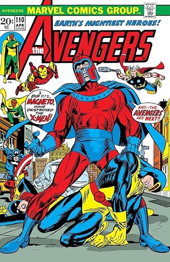 From THE AVENGERS #110, April 1973
The creative way X-MEN fits into the balloon here show’s Saladino’s skill.
 From THE AVENGERS #111, May 1973
The other main cover letterer stepping in around this time was Danny Crespi, and his work is often close to that of Saladino, so I might get a few wrong, but there are subtle differences in the way they approached small open lettering and regular balloon lettering, and this looks like Gaspar to me.
 From THE AVENGERS #117, Nov 1973
These almost rectangular balloon shapes are similar to what Artie Simek often did, but the letters inside them are by Saladino. The balloon border for Namor is also very much a Gaspar thing.
 From THE AVENGERS #118, Dec 1973
The small burst around THIS IS IT! is very Saladino on this one.
 From THE AVENGERS #120, Feb 1974
Another tough call, but I see more Saladino here than anyone else.
 From THE AVENGERS #121, March 1974
The creative treatment of TAURUS signals Saladino on this cover.
 From THE AVENGERS #122, April 1974
Again, many subtle style points suggest Saladino.
 From THE AVENGERS #123, May 1974
Here I would point to the serif I in ISSUE in the bottom caption. It’s something often considered bad lettering, and most pro letterers would never do that, but Gaspar iked it at the beginnings of words.
 From THE AVENGERS #124, June 1974
The artfully uneven style in the bottom caption is pure Gaspar.
 From THE AVENGERS #125, July 1974
FEATURING in the bottom caption is very Gaspar, the top cation looks like type except for the exclamation point, so possibly added later.
 From THE AVENGERS #129, Nov 1974
The style of KANG is very Saladino on this one, as is the treatment of the open letters in the burst.
 From THE AVENGERS #130, Dec 1974
Only the bottom caption here is lettered by Gaspar, the character names are type.
 From THE AVENGERS #132, Feb 1975
ELECTRIFYING is very Saladino. If you look closely at the lettering in the top balloon, notice many of the horizontal strokes in the letter E are slightly arched, something Gaspar did and Crespi didn’t.
 From THE AVENGERS #133, March 1975
Danny Crespi lettered this cover, which I’m showing as an example and contrast. Notice his balloon lettering is wide and done with a wedge-tipped pen, like Gaspar’s, but the horizontal E strokes are straighter, and the S and O are more rounded. In the bottom caption the open lettering is quite different from what Saladino usually did, the shapes are uneven and bouncier for one thing, and the heavy outline around HOODED ONE is more his style. Also notice how some letters seem to lean to the left.
 From THE AVENGERS #134, April 1975
Gaspar’s balloon lettering style is clear here, but he used an alternate style Y in SLAY, something he also did at DC occasionally.
 From THE AVENGERS #142, Dec 1975
The style of THE in the top caption is pure Gaspar, something he learned from DC’s Ira Schnapp.
 From THE AVENGERS ANNUAL #9, 1979
Saladino lettered just one AVENGERS ANNUAL cover.
 From THE AVENGERS #187, Sept 1979
The open letters in the bottom blurb again have that Saladino touch of being uneven but somehow in just the right way to add interest.
[image error]From THE AVENGERS #189, Nov 1979The style of HAWKEYE with added texture is pure Saladino.
 From THE AVENGERS #190, Dec 1979
This bottom blurb is full of Gaspar’s creepy styles.
 From THE AVENGERS #192, Feb 1980
This blurb is a tough call, but notice the notch in each R is below the center of the horizontal stroke (more so on the second one), a typical Saladino style point.
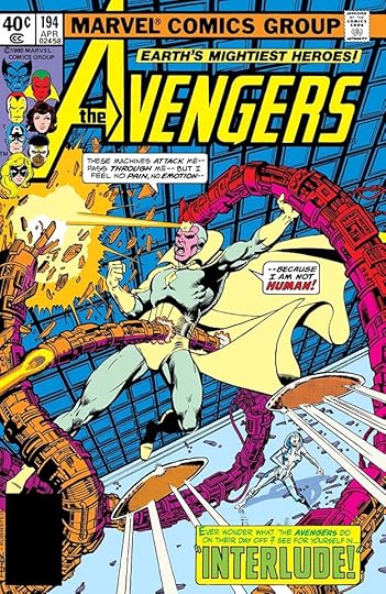 From THE AVENGERS #194, April 1980
Gaspar’s balloon lettering style is clear on this cover.
 From THE AVENGERS #201, Nov 1980
All right, I’m going to skip some now, you get the idea. I’ve always loved this cover, and feel sure it’s lettered by Gaspar.
 From THE AVENGERS #207, May 1981
Saladino’s spooky style is in the large letters of this caption.
 From THE AVENGERS #214, Dec 1981
This blurb is the last one in the series I think was lettered by Gaspar, it’s again full of his spooky style and texture.
To sum up, I found Saladino lettering on these covers: 108-111, 117-118, 120-125, 129-130, 132, 134, 142, 187, 189-190, 192, 194-196, 198-199, 201, 203-207, 209-210, 214, Annual 9. That’s 36 in all. Other articles in this series and more you might like are on the COMICS CREATION page of my blog.
The post GASPAR SALADINO in THE AVENGERS Part 1 appeared first on Todd's Blog.


Todd Klein's Blog

- Todd Klein's profile
- 28 followers

