IELTS Report, topic: Multiple Bar Chart of US’ Processed Food Export Markets (from IELTS High Scorer’s Choice series, Academic Set 3)
This is a model response to a Writing Task 1 topic from High Scorer’s Choice IELTS Practice Tests book series (reprinted with permission). This answer is close to IELTS Band 9.
Set 3 Academic book, Practice Test 14
Writing Task 1
You should spend about 20 minutes on this task.
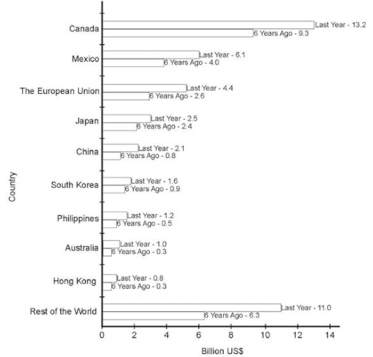
The bar chart below shows the US’ top ten processed food export markets for last year and six years ago.
Summarise the information by selecting and reporting the main features, and make comparisons where relevant.
You should write at least 150 words.
Top 10 US Processed Food Export Markets (for last year and 6 years ago)

The bar chart gives data on the top ten processed food export markets for the United States from last year and six years ago.
It can be clearly seen that all the countries in the bar chart imported more processed food from the US last year than 6 years ago.
The largest market by far for last year and six years ago was Canada, with income for the US of 13.2 billion US dollars and 9.3 billion US dollars, respectively. The second highest figures were for what is identified as the Rest of World at 11 billion US dollars and 6.3 billion US dollars, respectively.
The remaining eight countries ranged from Mexico with income for the US of 6.1 billion US dollars for last year and 4 billion US dollars for six years ago to Hong Kong with income for the US of 0.8 billion US dollars for last year and 0.3 billion US dollars for six years ago. Therefore, the two largest markets the US depends on for their processed food exports were the closest ones, Canada and Mexico.
Compared to 6 years ago, last year US processed food exports to Australia experienced the most significant growth of 300%, to China, Hong Kong and the Philippines – just over 200%, and to the other countries – under 100%.
Go here for more IELTS Band 9 Reports
Related posts:IELTS Report, topic: Bar chart describing Scotland’s exports (from IELTS High Scorer’s Choice series, Academic Set 3) This is a model response to a Writing Task 1...IELTS Report, topic: Bar chart and pie chart describing Australian water consumption (from IELTS High Scorer’s Choice series, Academic Set 1) This is a model response to a Writing Task 1...IELTS Report, topic: Bar chart of average rainfall by month (from IELTS High Scorer’s Choice series, Academic Set 1) This is a model response to a Writing Task 1...IELTS Report, topic: Multiple line graph describing the percentage of students learning a second language (from IELTS High Scorer’s Choice series, Academic Set 2) This is a model response to a Writing Task 1...IELTS Report, topic: Table and pie chart describing day and overnight stays in public and private hospitals in Australia (from IELTS High Scorer’s Choice series, Academic Set 2) This is a model response to a Writing Task 1...


IELTS-Blog.com
You will find here valuable info about the IELTS test, strategies, tips and secrets of success. Join us! ...more
- Simone Braverman's profile
- 52 followers


