
New Year, New Idea, and Upcoming Release
*|MC:SUBJECT|* p{ margin:10px 0; padding:0; } table{ border-collapse:collapse; } h1,h2,h3,h4,h5,h6{ display:block; margin:0; padding:0; } img,a img{ border:0; height:auto; outline:none; text-decoration:none; } body,#bodyTable,#bodyCell{ height:100%; margin:0; padding:0; width:100%; } .mcnPreviewText{ display:none !important; } #outlook a{ padding:0; } img{ -ms-interpolation-mode:bicubic; } table{ mso-table-lspace:0pt; mso-table-rspace:0pt; } .ReadMsgBody{ width:100%; } .ExternalClass{ width:100%; } p,a,li,td,blockquote{ mso-line-height-rule:exactly; } a[href^=tel],a[href^=sms]{ color:inherit; cursor:default; text-decoration:none; } p,a,li,td,body,table,blockquote{ -ms-text-size-adjust:100%; -webkit-text-size-adjust:100%; } .ExternalClass,.ExternalClass p,.ExternalClass td,.ExternalClass div,.ExternalClass span,.ExternalClass font{ line-height:100%; } a[x-apple-data-detectors]{ color:inherit !important; text-decoration:none !important; font-size:inherit !important; font-family:inherit !important; font-weight:inherit !important; line-height:inherit !important; } #bodyCell{ padding:10px; } .templateContainer{ max-width:600px !important; } a.mcnButton{ display:block; } .mcnImage,.mcnRetinaImage{ vertical-align:bottom; } .mcnTextContent{ word-break:break-word; } .mcnTextContent img{ height:auto !important; } .mcnDividerBlock{ table-layout:fixed !important; } body,#bodyTable{ background-color:#FAFAFA; } #bodyCell{ border-top:0; } .templateContainer{ border:0; } h1{ color:#202020; font-family:Helvetica; font-size:26px; font-style:normal; font-weight:bold; line-height:125%; letter-spacing:normal; text-align:left; } h2{ color:#202020; font-family:Helvetica; font-size:22px; font-style:normal; font-weight:bold; line-height:125%; letter-spacing:normal; text-align:left; } h3{ color:#202020; font-family:Helvetica; font-size:20px; font-style:normal; font-weight:bold; line-height:125%; letter-spacing:normal; text-align:left; } h4{ color:#202020; font-family:Helvetica; font-size:18px; font-style:normal; font-weight:bold; line-height:125%; letter-spacing:normal; text-align:left; } #templatePreheader{ background-color:#FAFAFA; background-image:none; background-repeat:no-repeat; background-position:center; background-size:cover; border-top:0; border-bottom:0; padding-top:9px; padding-bottom:9px; } #templatePreheader .mcnTextContent,#templatePreheader .mcnTextContent p{ color:#656565; font-family:Helvetica; font-size:12px; line-height:150%; text-align:left; } #templatePreheader .mcnTextContent a,#templatePreheader .mcnTextContent p a{ color:#656565; font-weight:normal; text-decoration:underline; } #templateHeader{ background-color:#FFFFFF; background-image:none; background-repeat:no-repeat; background-position:center; background-size:cover; border-top:0; border-bottom:0; padding-top:9px; padding-bottom:0; } #templateHeader .mcnTextContent,#templateHeader .mcnTextContent p{ color:#202020; font-family:Helvetica; font-size:16px; line-height:150%; text-align:left; } #templateHeader .mcnTextContent a,#templateHeader .mcnTextContent p a{ color:#007C89; font-weight:normal; text-decoration:underline; } #templateBody{ background-color:#FFFFFF; background-image:none; background-repeat:no-repeat; background-position:center; background-size:cover; border-top:0; border-bottom:2px solid #EAEAEA; padding-top:0; padding-bottom:9px; } #templateBody .mcnTextContent,#templateBody .mcnTextContent p{ color:#202020; font-family:Helvetica; font-size:16px; line-height:150%; text-align:left; } #templateBody .mcnTextContent a,#templateBody .mcnTextContent p a{ color:#007C89; font-weight:normal; text-decoration:underline; } #templateFooter{ background-color:#FAFAFA; background-image:none; background-repeat:no-repeat; background-position:center; background-size:cover; border-top:0; border-bottom:0; padding-top:9px; padding-bottom:9px; } #templateFooter .mcnTextContent,#templateFooter .mcnTextContent p{ color:#656565; font-family:Helvetica; font-size:12px; line-height:150%; text-align:center; } #templateFooter .mcnTextContent a,#templateFooter .mcnTextContent p a{ color:#656565; font-weight:normal; text-decoration:underline; } @media only screen and (min-width:768px){ .templateContainer{ width:600px !important; } } @media only screen and (max-width: 480px){ body,table,td,p,a,li,blockquote{ -webkit-text-size-adjust:none !important; } } @media only screen and (max-width: 480px){ body{ width:100% !important; min-width:100% !important; } } @media only screen and (max-width: 480px){ .mcnRetinaImage{ max-width:100% !important; } } @media only screen and (max-width: 480px){ .mcnImage{ width:100% !important; } } @media only screen and (max-width: 480px){ .mcnCartContainer,.mcnCaptionTopContent,.mcnRecContentContainer,.mcnCaptionBottomContent,.mcnTextContentContainer,.mcnBoxedTextContentContainer,.mcnImageGroupContentContainer,.mcnCaptionLeftTextContentContainer,.mcnCaptionRightTextContentContainer,.mcnCaptionLeftImageContentContainer,.mcnCaptionRightImageContentContainer,.mcnImageCardLeftTextContentContainer,.mcnImageCardRightTextContentContainer,.mcnImageCardLeftImageContentContainer,.mcnImageCardRightImageContentContainer{ max-width:100% !important; width:100% !important; } } @media only screen and (max-width: 480px){ .mcnBoxedTextContentContainer{ min-width:100% !important; } } @media only screen and (max-width: 480px){ .mcnImageGroupContent{ padding:9px !important; } } @media only screen and (max-width: 480px){ .mcnCaptionLeftContentOuter .mcnTextContent,.mcnCaptionRightContentOuter .mcnTextContent{ padding-top:9px !important; } } @media only screen and (max-width: 480px){ .mcnImageCardTopImageContent,.mcnCaptionBottomContent:last-child .mcnCaptionBottomImageContent,.mcnCaptionBlockInner .mcnCaptionTopContent:last-child .mcnTextContent{ padding-top:18px !important; } } @media only screen and (max-width: 480px){ .mcnImageCardBottomImageContent{ padding-bottom:9px !important; } } @media only screen and (max-width: 480px){ .mcnImageGroupBlockInner{ padding-top:0 !important; padding-bottom:0 !important; } } @media only screen and (max-width: 480px){ .mcnImageGroupBlockOuter{ padding-top:9px !important; padding-bottom:9px !important; } } @media only screen and (max-width: 480px){ .mcnTextContent,.mcnBoxedTextContentColumn{ padding-right:18px !important; padding-left:18px !important; } } @media only screen and (max-width: 480px){ .mcnImageCardLeftImageContent,.mcnImageCardRightImageContent{ padding-right:18px !important; padding-bottom:0 !important; padding-left:18px !important; } } @media only screen and (max-width: 480px){ .mcpreview-image-uploader{ display:none !important; width:100% !important; } } @media only screen and (max-width: 480px){ h1{ font-size:22px !important; line-height:125% !important; } } @media only screen and (max-width: 480px){ h2{ font-size:20px !important; line-height:125% !important; } } @media only screen and (max-width: 480px){ h3{ font-size:18px !important; line-height:125% !important; } } @media only screen and (max-width: 480px){ h4{ font-size:16px !important; line-height:150% !important; } } @media only screen and (max-width: 480px){ .mcnBoxedTextContentContainer .mcnTextContent,.mcnBoxedTextContentContainer .mcnTextContent p{ font-size:14px !important; line-height:150% !important; } } @media only screen and (max-width: 480px){ #templatePreheader{ display:block !important; } } @media only screen and (max-width: 480px){ #templatePreheader .mcnTextContent,#templatePreheader .mcnTextContent p{ font-size:14px !important; line-height:150% !important; } } @media only screen and (max-width: 480px){ #templateHeader .mcnTextContent,#templateHeader .mcnTextContent p{ font-size:16px !important; line-height:150% !important; } } @media only screen and (max-width: 480px){ #templateBody .mcnTextContent,#templateBody .mcnTextContent p{ font-size:16px !important; line-height:150% !important; } } @media only screen and (max-width: 480px){ #templateFooter .mcnTextContent,#templateFooter .mcnTextContent p{ font-size:14px !important; line-height:150% !important; } } *|MC_PREVIEW_TEXT|* View this email in your browser

 Welcome to the Bijou Bugle Newsletter! So glad you've subscribed.
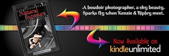
 Natural Exposure FREE on Kindle Unlimited!*
*LAST CHANCE - Comes off KU Feb 5th, 2022
CLICK HERE for the Elemental Exposure
After a little time off around the end of the year (and playing/beating Deathloop, which I LOVED) I've been back to writing and editing, and oddly enough, already came up with my Camp NaNo idea.
Which brings up the question of, would you (as a follower and reader) only read my erotic romance books, or would you read anything else I'd write, even if under a different pen name? I'd love to know, if you want to take this poll.
When it comes to Bijou Basin I haven't started on anything new, and I don't plan on starting anything new at least until the middle of the year. But, Book 3 of the Bijou Basin Book Bites - A Double Dose of BDSM - is with Betas and I'm hoping for a February 14th release if all goes well. It's currently available for pre-order. Cover, and blurb below.
Natural Exposure will be on a $0.99 sale again upcoming - February 11th - 15th. I hope you'll grab it then, if you haven't already!
So, what am I working on? Two things, for now.
1 - My Cruise mystery - Murder on the Marianas Majesty - is in the hands of beta readers. It needs a LOT of work, including some help with some parts of it. I love the book and the story and the characters but I have a lot to figure out with it.
2 - In the meantime, I've been doing re-writes for my psychological thriller - RoE - which is my 2021 NaNo project. It's much more straight forward, to a point, and I'm about 20 chapters into a re-write, though I have no idea how many chapters there will end up being. If anyone would like to beta read either, please get in touch.
What's upcoming? Two things, for now. :)
1 - Edits and tweaks of DDofBDSM when I get notes back from the beta readers. Then formatting the paperback too. They rarely get purchased, but I love having them for myself.
2 - Camp NaNo in April. This time, I know what I'm writing and once again it's going to be different. And hard, and detailed. And it may *gasp* require some planning. My pantser heart can barely take it, but I'll survive because it'll be worth it. :D
Thank you! To those who have bought one of my books, or are reading Natural Exposure on Kindle Unlimited. I really appreciate it so very much. I hope you're enjoying Kenzie, Jarrett, and Ripley's stories.
----------
If you read any of my books, I would be grateful for some reviews as they have stalled out a bit for me. Reviews are everything for an author, even if it's simply a star rating.
If you read AND review Natural Exposure, send me a link to your review (Goodreads or Amazon preferred) and I'll send you a copy of Negative Exposure FREE as a thank you!
-----
Don't forget about Natural Exposure being FREE on Kindle Unlimited. Will only remain on Kindle Unlimited through February.
 In the six months since Kenzie and Jarrett began An Exploration of BDSM, they've learned a lot about themselves. They continue to grow as a couple and as their D/s evolves from a bedroom-only kink, to a 24/7 lifestyle.
With their one year anniversary approaching, Jarrett sets up a surprise for Kenzie. She has several items on her 'really want to experience' list, and he's more than willing to give her what she yearns for with A Double Dose of BDSM.
 Reading - The Kaiju Preservation Society by John Scalzi Breakaway by Craig AlansonRecently completed - Lost Time by Nathan HystadWatching - Book of Boba Fett (meh) Campaign 3 of Critical Role ARCANE!!! (2nd and not last re-watch)Playing - God of War (PC) If you'd like to review my books (on Amazon and/or Goodreads, along with any other retailer or book site) then please contact me at KorianaBrackson@gmail.com with the subject title "Review" for a free copy of my first book, Natural Exposure.
Please give a little detail in the body of the email (no emails with review in the title and nothing else - that's not really the type of interaction I like) such as what format (mobi / epub / ect) you'd like and when you'd hope to read it by.
If you'd like to chat about books, games, or anything else, feel free to message me. I enjoy meaningful interactions with my readers! My books are now sold at most major retailers!
Natural Exposure Amazon (Currently FREE on Kindle Unlimited) A Discovery of BDSM Amazon Smashwords Barnes & Noble Kobo Google Play
Negative Exposure Amazon Smashwords An Exploration of BDSM Amazon Smashwords Elemental Exposure Amazon Smashwords
 Need scents for your home? Help out my friend Kim's new endevor and try out Pink Zebra today!


 Copyright © *|CURRENT_YEAR|* *|LIST:COMPANY|*, All rights reserved.
*|IFNOT:ARCHIVE_PAGE|* *|LIST:DESCRIPTION|*
Our mailing address is:
*|HTML:LIST_ADDRESS_HTML|* *|END:IF|*
Want to change how you receive these emails?
You can update your preferences or unsubscribe from this list.
*|IF:REWARDS|* *|HTML:REWARDS|* *|END:IF|*
My Books
Natural Exposure on Amazon - FREE on Kindle Unlimited
Natural Exposure on Goodreads
Negative Exposure on Amazon
Negative Exposure on Smashwords
Negative Exposure on Goodreads
Elemental Exposure on Amazon
Elemental Exposure on Smashwords
Elemental Exposure on Goodreads
A Discovery of BDSM on Amazon
A Discovery of BDSM on Smashwords
A Discovery of BDSM on Goodreads
An Exploration of BDSM on Amazon
An Exploration of BDSM on Smashwords
An Exploration of BDSM on Goodreads


No comments have been added yet.


