
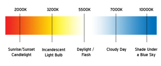
I looked up a color temperature chart. what I do is cert...
I looked up a color temperature chart.
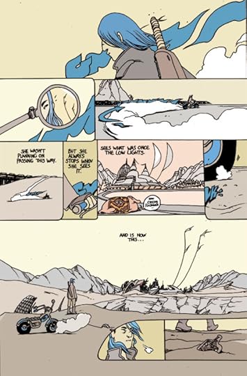
what I do is certainly a 70′s/80′s French comics influence (I dislike the look of 1990′s pro-animator Disney colors– ) but it might be that I came from black and white comics or that in recent years I’ve aimed to focus on tone over color. – like the one below with no gutters between panels– where the yellow of the sky is a different tone when it bumps up against another yellow sky panel.
For the page below– The red is meant to pop out as separate from the tone of the scene so the arrow in the last panel stands out. (the sound effects are red and blue because of a kind of Peter and the wolf thing I was doing to give each major vehicle in the story it’s own color)

I guess the short answer is, I just like how mid tones look. I imagine I’ll mess around with different tones in some of my future work I enjoyed doing this red light scene with the bright blue screens.


Brandon Graham's Blog

- Brandon Graham's profile
- 198 followers

