
Design Classics
David J Howe takes a look at a classic design of book covers from one UK publisher in the 1970s.
They say that you should never judge a book by its cover ... and yet we do it all the time. Nevermoreso than when looking at covers which enchanted and moved us back when we were children ourselves. Everyone has their favourites, whether it is the Pan Books of Horror edited by Herbert van Thal, or the Narnia books from C S Lewis, or Susan Cooper’s magnificent The Dark is Rising sequence … but standing head and shoulders above them in my opinion are some series of paperback titles published by the Universal-Tandem Publishing Company in the seventies.Universal-Tandem was not large, and was run by an entrepreneur by the name of Ralph Stokes who employed approximately nine staff to handle everything, including Sales Manager Brian Miles. The company specialised in publishing mass market paperback fiction and non-fiction. Universal-Tandem’s book covers were almost exclusively handled by a freelance designer, Brian Boyle, who had a knack of creating an eyecatching cover.
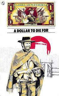 In 1968, Tandem had published three novels which tied into the Sergio Leone Dollars Trilogy of films: novelisations of For a Few Dollars More and The Good The Bad The Ugly were published, along with an original novel, A Dollar to Die For, and each featured photographically based covers. The rights to the original film – A Fistful of Dollars – were not available due to a legal wrangle with Akira Kurosawa over similarities to his film Yojimbo.
Miles recalled that once the legal issues were ironed out, then they were free to get the novelisation sorted. ‘Tandem had already established the first Dollar books from the American editions but there had not been a book for the first film. So I was very friendly at the time with Terry Harknett who wrote for one of the Trade journals, and I arranged a showing of the film in one of the private cinemas in Wardour Street and obtained the script and he wrote the book. The book was just as successful as any of the American editions!’ Harknett published the book under the name Frank Chandler, and went on to have a successful career as a Western novelist writing as George G Gilman with his series of Edge books from New English Library.
 In 1972, the novelisation of A Fistful of Dollars was released, together with reissues of the earlier titles, all with new matching covers featuring a simple title with colour illustration and a white backbround and a dollar bill at the top which incorporated each author’s name. A young artist called Christos Achilleos was commissioned to create these 1972-onwards covers, and he continued to complete eight titles in the series.
‘I came straight out of art school in 1970 and went into a job doing maps and illustrations based on my degree exhibition,’ explained Achilleos. ‘I spent six months doing that, and was then made redundant! So I headed into Foyles, the big bookshop, and looked at the book covers and started to ring around the publishers. One of the people I contacted was Brian Boyle. He was mainly a photographer, but worked as a freelance designer, and he gave me a couple of jobs: I remember the first was three covers for a fantasy series about Brak the Barbarian for Tandem. He then asked me to come and work in the studio with him at Great Portland Street, so I did, and I was doing art and book paste up and layout as well as painting covers. He quickly gave me a pay rise and wanted me to stay, and when the “Dollars” commissions came in I grabbed them.’
 Achilleos decided to use a specific method for creating the covers for the Dollar Westerns. ‘The image was intended to be printed in three colours, so I first sketched out the element that I wanted in black using an art pen. Then I overlaid a sheet of tracing-paper-like material and created on top – again in black – the areas I wanted to be in brown or sepia. Finally I created another layer with the red sun background on. All these layers then went to the publishers with the instructions as to which colour each layer should be. It was a good way of creating the images! I also painted and designed the dollar bill for those covers.’
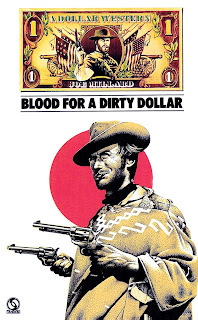
There was one exception to this approach, and this was 1974’s first edition of The Million Dollar Bloodhunt which used artwork with a colour background from the outset. Reprints of the books from 1974 retained the dollar bill at the top, but most now included a full colour background to the art. ‘Later on,’ explained Achilleos, ‘when they wanted to reprint the books, I took my original layers, and overlaid a sheet of white paper, carefully cut out to reveal the original black and white image, and then painted the colour element on that. The completed image was then stuck down on art board to create the finished art.’
From 1977, further reprints dropped the dollar bill design from the front cover and again mostly included Achilleos’ amended art (Blood for a Dirty Dollar however reused the original cover art rather than using the ‘colour background’ art). These reprints started as Tandem paperbacks but transitioned to Star (as Universal-Tandem had been bought by Howard and Wyndham in 1975 and they were rationalising the imprints). It’s interesting too that the title for the novelisation of the film The Good, The Bad and The Ugly, which had originally been published as The Good The Bad The Ugly, had the missing ‘and’ added to the book title for the 1977 reprint.
 By 1972, Universal-Tandem was doing so well that Stokes and Miles, wanted to expand further and to set up a childrens’ imprint, which they called Target. They engaged an editor called Richard Henwood, and Henwood set about finding titles for the new imprint.
‘Undoubtedly,’ said Miles, ‘what guaranteed the success of Target was the Doctor Who acquisition right at its heart. Definitely a publishing scoop of the first order that, retrospectively, I feel very lucky and privileged to have had come my way.’
Henwood picked up paperback rights for three Doctor Who novelisations (Doctor Who and … the Daleks, the Crusaders and the Zarbi) which had been written and first published in hardback (and the first two in paperback) in the sixties, and to provide the covers for the new Target paperbacks, they again contacted Christos Achilleos
‘One day I got this call from Brian Boyle,’ Achilleos recalled. ‘He said that Universal-Tandem were doing three Doctor Who books, and would I like to do the covers? They wanted to have something like the ones that Frank Bellamy had done for the Radio Times; so they asked if I would do them in that style.’
 Achilleos was provided with photographs, and created his covers using a style reminiscent of that of Bellamy, of who Achilleos was a big fan. ‘Generally when you illustrate a book,’ he recalled, ‘you get a copy of it and either it’s a reprint, in which case you can have a look at what the other fellow’s done, or if it’s new, you just read through a manuscript quickly looking for something visually exciting, maybe an actual scene in the book. But the cover is more than just an illustration of a particular bit in the book, it has to be a graphic interpretation of it. The cover of a book is what sells it.
‘As far as designing the Doctor Who covers was concerned, it was left entirely up to me. The art director would tell me which one was next, and I just gave him the finished product, which was how I got away with so much. I used a technique I’d learned at college for scientific illustration called pointillism for those covers, with a rapidograph pen which had just been released. The cover design and style was similar to that I’d used for the Dollar Westerns and other works.’
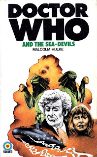 The Target imprint launched in May 1973, and the first 12 titles in the Doctor Who range represent a clear iconography and style (as well as the first three, these were: Doctor Who and … the Auton Invasion, the Cave Monsters, the Day of the Daleks, the Doomsday Weapon, the Sea-Devils, the Daemons, the Abominable Snowmen, the Curse of Peladon and the Cybermen). They are clean covers with colourful images against a white background, and with a simple block logo for the Doctor Who title. Of particular note is the fact that the lead character – in this case the Doctor – is rendered in black and white – the same approach as on the Dollar Western covers – which gave a neat focal point to the art. There is a magnificent consistency and excitement about the covers and their design, and this conformity was key to their success in crowded bookshops. Kids buying them were drawn to the imagery of monsters and adventure, and the simple design made them stand out on bookshop shelves.
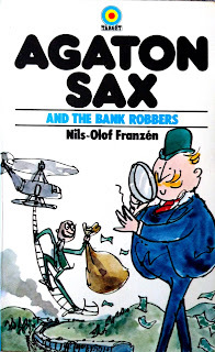
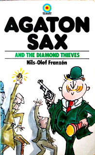 Also during 1973, as part of the initial ‘buying spree’ of books for the Target imprint, Henwood obtained the paperback rights to another series of novels, this time by a Swedish author called Nils-Olof Franzén. The Agaton Sax novels were an ironic pastiche on detective fiction and featured a titular detective who smoked meerschaum pipes (one for each day of the week) and a hapless Inspector Lispington of Scotland Yard (who seemed modelled after Lestrade from the Sherlock Holmes stories). They were first published in Sweden from 1955 onwards with covers and illustrations by Åke Lewerth, with André Deutsch in the UK publishing hardback editions from 1965 with covers and illustrations by Quentin Blake, a popular cartoonist and illustrator known for his collaboration with writers such as Russell Hoban, Joan Aiken, Michael Rosen, John Yeoman and, most famously, Roald Dahl.
 Researcher Charlotte Berry discussed the decision to use Blake for the UK hardback books in her 2016 essay ‘Keeping the Spirit of the Text’: ‘British children’s editors gave careful consideration to illustrations in their translated Nordic titles. Following the precedent set elsewhere in commissioning new British illustrations for translated children’s fiction in order to create a strong in-house style, Quentin Blake was selected as the new illustrator of the series as early as May 1964 as Pearce [Philippa Pearce, first Children’s Editor at André Deutsch] felt “his sense of humour exactly matched the humour in the stories”. As Royds [Pamela Royds, second Childrens’ Editor at André Deutsch] comments, “Agaton Sax [did not] establish his reputation in children’s literature but [...] built on it”.’
The covers for the new Target paperback editions were also by Blake, and he was most likely chosen for the covers precisely because of this intimate relationship forged with the subject matter, something that Achilleos had also achieved with the Doctor Who titles.
Berry notes in her essay: ‘Blake also became involved in the publicity for Agaton Sax and the League of Silent Exploders (1974), attending the Deutsch stand and doing drawings on the spot at Heffers’ Bookshop in Cambridge in autumn 1973 where the paperback Target editions “sold like hot cakes” according to Royds.’
The first four Target paperback Agaton Sax titles (Agaton Sax and … the Diamond Thieves, the Scotland Yard Mystery, the Bank Robbers (renamed from Agaton Sax and the Max Brothers) and the Criminal Doubles) went on sale in November 1973, and, it seems, were instantly as popular as the Doctor Who titles. These were followed up in May 1975 with the London Computer Plot and the Colossus of Rhodes, with a final title, Agaton Sax and the League of Silent Exploders following in August 1976.
‘The Agaton Sax books were not a great success,’ said Miles, ‘but the curtailment of further publication of that series may have had something to do with the destruction of Universal-Tandem by the takeover by Howard and Wyndham.’ Indeed there were three Agaton Sax titles which never received a Target paperback edition.
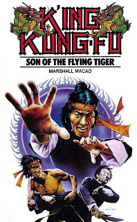 A further range of novels, again with the covers and logo painted and designed by Achilleos, was the K’Ing Kung-Fu series by the pseudonymous Marshall Macao. Published by Universal-Tandem from 1974 onwards, the books featured a series logo, with the book title and colour artwork presented against a white background. As Achilleos said, ‘It was a design structure that I was pleased with, and so I used it a lot on several different titles and ranges of books.’ The K’Ing Kung-Fu range ran to four titles in the UK, and Achilleos used a similar cover design on another title from Tandem: Kung Fu Master Richard Dragon: Dragon’s Fists by ‘Jim Dennis’ (Dennis O’Neil and Jim Berry), later to be developed by O’Neil into a comic book series for DC Comics.
What is distinctive about all these diverse ranges of books is the way that the covers are simple and uncluttered, and yet each has a precise series feel to them and draw you in: you want to collect all the books in the range, and the covers all sell the respective series magnificently. Even those initial Dollar Western covers, with the dollar design at the top, have a simplicity which just feels right.
In many ways these covers from Universal-Tandem, combined with the art and design from Christos Achilleos and Quentin Blake, form perfect paperback covers: memorable, effective and collectable. And all are true design classics.
With thanks to Brian Miles, Christos Achilleos, Russell Cook, Gary Russell, Matt Evenden, Mark Wayne Barrett, Peter Mark May, Stephen Laws, Fritz Maitland, Tim Keable.
References:
Howe, D. (2009) The Target Book (Telos Publishing, England)
Berry, C. (2016). Keeping ‘the Spirit of the Text’: A Publishing and Translation History Case Study of Nils-Olof Franzén’s Detective Series Agaton Sax. Barnboken – Journal of Children’s Literature Research, 39. https://doi.org/10.14811/clr.v39i0.258
Holland, S. https://bearalley.blogspot.com/2010/0...
Achilleos, C. http://chrisachilleos.co.uk/
Written in May 2020.


