3 Steps to a Professional-Looking Book Layout

Every year, we’re lucky to have great sponsors for our nonprofit events. Hermit, a 2021 NaNo sponsor, is a fast, elegant, and free to use web-based writing application that also lets you print physical copies of your books. Today, Alex, its founder and developer, shares 3 tips to create a professional looking book design by yourself.
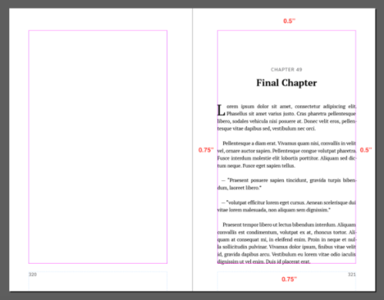
When designing a book, white space is important. Too little white space and the text will be so condensed that it’ll be hard and unpleasant to read. Add too much and you’ll end up with a huge amount of pages that’ll cost extra for each print.
For a 6x9” book, 0.5” is a reasonable amount of margin. It’s also good to add a bit more on the “inside margin”, the side of the page near the fold of the book — 0.75” would be a good amount.
Additionally, whenever a new chapter starts, it’s quite common to add a lot of top margin on its title page. This will give it some importance and help the reader understand that this is a new chapter and not just another heading.
When hesitant about white space, always do a print test on your home printer if you can.
Step #2: Make It Readable (Font Choice and Typesetting)Typography is an art. You might not have noticed, but even though the fonts used in the books you read are often similar, they’re very rarely the same. There are some classics, of course, but there are thousands of high quality fonts out there that you can use for your book project.
It’s tempting to use many fonts but one is generally enough. If you want to give your book some extra style points, you can also use a second one for the headings but more than that will usually make your book look less professional.
The font size and line height you’ll want to use actually depends on the font you selected. Most books go for something between 10 and 12. Serif fonts usually need to be a bit bigger than their sans-serif counterparts to be as readable.
A good amount of line-height is primordial to prevent eye strain and fatigue for the reader. Generally, you can start with the font size and multiply it by 1.5 to get an ideal result. Anything between 1.3 and 1.6 is reasonable; it all depends on the fonts you chose.
Just like for the white space, it is recommended to print tests using your home printer of various fonts and sizes. Do not trust your computer screen no matter how good it might be!
Step #3: Make It Fancy (Drop Caps and Other Stylistic Elements)There’s a couple of ways to add style points to your book design that involve almost no work at all. One of them is to add drop caps. Drop caps are large capital letters that act as an ornament, usually whenever a chapter starts.

Example of a drop cap that spreads over 2 lines
Another thing we can do is enable ligatures. Ligatures are when the font you selected has different ways of displaying certain groups of letters, generally by combining them into a single drawing. This adds a subtle touch of refinement to your text.

Examples of ligatures on “fi” and “fl”
There are many more things to take into consideration when designing a book layout but those few tips should give you a head start. If that feels like too much work or you’re too impatient to get your book printed, feel free to give Hermit a spin. We’ll take care of everything and ship you a beautifully designed copy of your book at a low price.

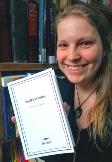
Last year participant with a copy of her printed book
Alex is the founder and developer of Hermit, a free to use, secure, and lightning-fast writing application for everybody who likes to write, from scribblers to aspiring authors. He’s been continuously improving it over the last 8 years and plans to continue doing so. His next goal with Hermit is to tailor the experience for different writing projects and let authors order physical copies of their work with as little effort as possible. Sign up & subscribe now and get a printed copy of your book at a low price.
Chris Baty's Blog
- Chris Baty's profile
- 63 followers


