
COLOR PALETTE Q&A ||| THE DESSERT CLUB!!
FRIENDS! How are you?! Happy August!
This month, we’re talking about COLOR PALETTES and I’m changing things up with a casual Q+A.
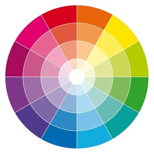
Be warned - I’m no color expert. In fact, I weaseled my way out of color theory class in college! I’m not discussing color wheel, terminology, or psychology of color, but simply my experience.
A couple weeks ago I put a call out on IG for color questions and got a plethora of good ones - you guys are amazing.
Before I jump into questions, here are a couple examples of my color palettes. They are usually muted but have space for bright pops of color. There are hues I shy away from and others I feel more confident with. ALSO know, I’m talking mainly about mixing with acrylics, gouache, or dry media. I am deplorable at digitally picking colors - you don’t want to learn from me in that regard, trust me.
(Each image below is linked to a process post about that book if you want to see more, including a bit about choosing a color palette!)

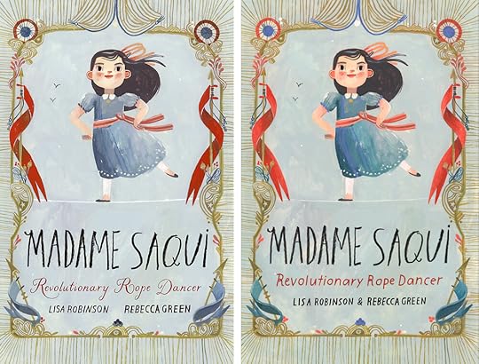
Color Palette for Madame Saqui, All Images © RebeccaGreen, 2020
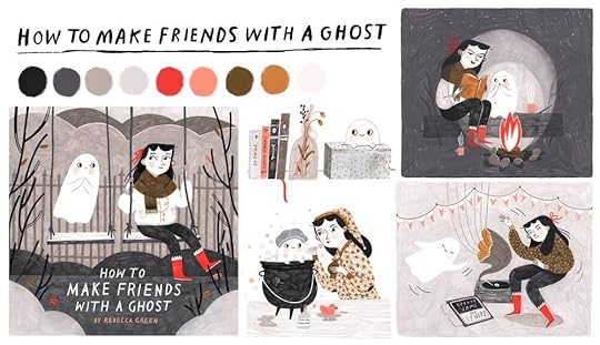
Color Palette for How To Make Friends With A Ghost, © RebeccaGreen, 2017

Color Palette for Becoming A Good Creature, All Images © RebeccaGreen, 2020
COLOR PALETTE Q+A
What's your process for selecting a color palette for a picture book?
There are typically three factors I pay attention to when choosing a palette for a book: Artist’s taste, Context, and Narrative/Emotion.

Artist’s Taste
- I gravitate towards muted tones, ‘aged’ colors, greens, corals and yellows, and also ashy and purpley blues. I assess my reaction to colors and try to find ways to pull my favorite ones into my projects. I also like the challenge of using a brand new color.
Context
- I look for clues within the book. What weather/seasons are represented? Are there specific historical or cultural details that call for certain colors? Are there colors that should be avoided? Sometimes, the text will highlight colors and it’s my job to build upon the words.
Narrative/Emotion
- When I read the manuscript for the first time, I pay attention to what colors come to mind. I visualize the story as a whole (as much as I can) to see where I can use color as a tool to show emotion and storytelling. Maybe this means a vivid night scene with darks or a raging pink sky, or perhaps I know I’ll need flashes of yellow for a bright moment.
Do you always keep primary colors in mind?
I’m not a stickler when it comes to color rules, but usually I pick a range of primaries (red, blue, and yellow) because I can get a good range from just a handful of paints. While I never actually use primary tubes (your basic primary cyan/primary magenta/primary yellow) I opt for colors like vermillion,ash blue, and ochre for example. With these, plus black and white (or more often sepia and white), I can get a variety of colors that feel balanced. Sometimes though I do have a full palette where I’m adding in greens and purples.

2019 Holiday Card for Parnassus Books!
How do you resist grabbing ALL the colors?
Self control!! It’s hard, but now that I’m more used to doing limited palettes, it’s much easier to improvise with what I have vs trying to balance in too many colors. If I need a green and I all I have is ash blue and ochre, I make a green from that for example. BUT some artists do grab ALL the colors and their work is fantastic - it’s all a bit subjective, so don’t feel too pressured to limit yourself.
How do you keep interest while limiting a color palette? Tips for monochrome palettes?
Doing a limited palette can, imo, be MORE interesting because you have to work smart, utilizing texture, layout, mark making, etc. We all know that limitations promote creativity and a limited palette is no exception. Can I share with you one of my favorite picture books with only two colors?
My Best Friend
by Julie Fogliano illustrated by the legendary
Jilian Tamaki
. I cannot even come to terms with how good at drawing she is. The colors here do not feel uninteresting - they feel purposeful, classic and calculated.
My Best Friend by Julie Fogliano and Jilian Tamaki
How do you keep track of the color palette for each project for consistency?
I have to take a picture of the paint tubes or materials, or write my colors down - juggling multiple books at a time, I can sometimes get the palettes confused. Some artists make thorough color mixing guides but my process is far less precise. If your colors are flat and exact, you might want to mix the paints thoroughly and put them in jars. For me, I like the variations in colors so I just mix as I go. Working with dry media is easier of course, you can just keep track of the pencils/markers/etc.

How do you keep consistent with the palette throughout the WHOLE project?
When doing a project as large as a picture book, it only makes sense that we find our groove half way through (or later!) Often the last pages look different than the first - this happens to me a lot, and I either have to go back in and completely redo some pieces or I edit them digitally. Here’s a great example - for Madame Saqui, I sent in an early cover that was navy blue and red, and a bit cold. When I finished the book, the palette had grown soft and warm. I had to adjust those hues in procreate & photoshop.
How do you create mood/ change the mood while staying in your color palette?
If mood or emotion is super important in the project, that’s best to prioritize at the beginning so color can be used efficiently. There is a lot of
information out there on color psychology
, so if you need to express emotion with color, dig into that. Also - test out options - do studies in different palettes and see which one has the emotional component you’re looking for. Also keep the ‘amount’ of color in mind - one small splash of color is different that a WHOLE spread of that color.
How do you keep your colors from getting muddy, dirty or grey?
Got many versions of this question! I love muted and aged tones and almost always push the saturation down a bit. A game changer for me was when I learned to mix the complimentary (opposite) to tone a color down instead of using black. To tone down green, I add red (or pink if I want it washed out). To mute blue, I add orange, to mute purple, add yellow. Look at the color wheel and find the complimentary color of the one you’re trying to push back. You’re not looking for equal parts, just a touch of red to tone back green, a touch of blue to mute an orange.
How do values affect your palette?
I’m not a good rule follower here, as I don’t pay much attention to value unless the lighting situation is paramount. If you turned my paintings black and white, they might not work that great, which I hear is a gauge for a good illustration but I beg to differ! That all said, I think the question is - do I need new colors when the value shifts, and you don’t, you just have to understand how to tint or shade a color. I found
this article helpful
in explaining this, but as we already discussed, I don’t often add black to my colors unless black is clearly IN the palette. If I need a really dark color, I’ll usually add sepia, navy blue, or a really dark green to shade colors. Tinting is easier - this is making colors lighter by adding white. I usually use Titanium White, which is strong and opaque but if you need something softer, look for a mixing white or a zinc white (these are more transparent).

Does a fixed color palette define your art style, is it important for recognition?
I also got the question: Is it a good idea to use only three colors and not change for consistency?
I feel awful if someone has told you that, for I can’t imagine sticking to three colors, I’d get so restless! This is truly a personal choice. If you feel you SHOULD limit yourself for recognition but inside your rainbow loving heart is dying, please use all the colors you want. I know artists that only use 2 colors and that’s it. I know artists that use every color imaginable. There is so much more to ‘style’ (though I don’t even like that concept) than color. Your voice and work also includes content, textures, shapes, layouts, line quality and more. Yes, on IG or a website it’s smart to have the colors balanced but if you’re making work you really love, the colors will harmonize. This may take a long time, and it probably won’t all come through in client work (that’s the kicker!), but it comes from making a lot of personal work.

How do you expand your palette and not get stuck in a color rut?
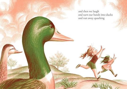
I do thrive on the challenge of a new material or color, and I’m currently on a mission to tackle blue. As we speak, I’m working on a book about a polar bear so guess what! I’m putting blue in this book, and lots of it. I also recently fell in love with periwinkle, a color I despised for much of my life. Being open is key but also knowing what colors terrify you is a good place to start. I suggest pulling in a single color at a time with your current palette so you can understand how it harmonizes.
There are two colors I never use - magenta and teal. Above is a study for a picture book I just finished where I was sure I was going to squeeze magenta in. It didn’t make the cut in the end, but it’s only a matter of time. MAGENTA you can run, but you can’t hide!
If you could pick five Holbein gouache colors for a YEAR what would you choose?
GOOD question! Could I just take my
color palette
? OK five colors - this is hard. I CHOOSE Vermillion, Sky Blue, Ivory White, Light Yellow, and Sepia. I’ll have my primaries in there so I could potentially make a ton of different colors from those!
THANK YOU to everyone who sent questions. I didn’t get to all of them, but tried to grab the ones I could explain efficiently. Color is natural for some artists and a mystery to be learned to others - we all have our strengths. I do hope these insights were helpful.
In my search for info on color palettes, I did find some cool resources that might be of use as well.
COOLERS on IG - a daily palette!
COOLERS Website - generate or find color palettes
COLOR GLOSSARY if you’re wondering about terminology
HISTORY OF THE COLOR WHEEL - the color wheel was created by Sir Isaac Newton, I literally had no idea - PROB would have learned that in color theory!
In other colorful news, I’m starting a membership this month!
It’s called THE DESSERT CLUB! It’ll be fun and tasty and informative but also playful and who knows what else!
Learn more below…

Welcome to The Dessert Club, a monthly celebration of illustration, process, and of course, dessert!
For those who are new here (welcome!) My name is Rebecca Green but you can call me Becca.
I’ve been illustrating for over a decade and have worked in many different industries including fine art, editorial, and publishing. I’m currently authoring and illustrating my own books plus a handful of books for other authors.
As many of you know, I love to share, talk shop, and dive deep into the technical and creative processes of my creative career. Every month, I share insights into my own process as an illustrator on my blog, and I send a fresh little Bulletin Newsletter to the inboxes of my ‘bulletin fam.’
So what’s this ‘membership’ about? I like to think of it as a dessert, a little something extra. You’ll get Sprinkles - members only exclusive process peeks, insights, and tips. It also includes Drawn Delights (for my fellow food lovers!) I’ll be baking/cooking a monthly goodie, drawing bits and bobs from the recipe, and exploring themes of celebration. And finally, I’ll share Bon Bons - monthly giveaways - books, prints, and more, as well as discount codes and treats.
The membership will be $5 a month (no fancy multi level tiers) and will be accessible right here on my site.
To be notified when The Dessert Club launches this month, sign up for my newsletter below!
Thanks for being here on the first of a new lovely month.
I hope your Summer is treating you well, and you’re finding time to get out in the Sun.
We’ve been camping and hiking and kayaking, making S’mores and listening to the trees sway. I’m working diligently on the line work for a new picture book and also in the writing stages of my own stories (YAY!) and also house hunting and trying to learn canning and preserving. All good things I’m immensely grateful for.
:) With love, until next time,
Becca


Rebecca Green's Blog

- Rebecca Green's profile
- 80 followers

