
IELTS Report, topic: Bar chart and pie chart describing Australian water consumption (from IELTS High Scorer’s Choice series, Academic Set 1)
This is a model response to a Writing Task 1 topic from High Scorer’s Choice IELTS Practice Tests book series (reprinted with permission). This answer is close to IELTS Band 9.
Set 1 Academic book, Practice Test 4
Writing Task 1
You should spend about 20 minutes on this task.
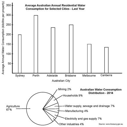
The bar chart below shows the average Australian water consumption in selected cities for last year. The pie chart shows the distribution of Australian water consumption for last year.
Summarise the information by selecting and reporting the main features, and make comparisons where relevant.
You should write at least 150 words.
Sample Band 9 Report
The bar chart shows the average Australian water consumption in selected cities for last year, while the pie chart shows how water was used in Australia for last year.
It can clearly be seen that water supply affected most of the key parts of Australian life and industry, but the most severely affected sector in a shortage would be agriculture.
The highest water consumer was the city of Perth with 300 kilolitres per property as an annual average. It was followed by Brisbane and Adelaide, where properties used 250 and about 240 kilolitres a year on average. In Sydney households consumed 200 kilolitres of water annually, and the smallest yearly average consumption was recorded in Melbourne and Canberra, about 150 and 140 kilolitres per property respectively.
Among industries, the largest water user in Australia last year was agriculture, which took up over two thirds of usage at 67%. The next largest usage was by households (9%), water supply, sewage and drainage (7%) and water used for electricity and gas supply (7%). The rest was used by manufacturing (4%), other industries (4%) and mining (2%).
Go here for more IELTS Band 9 Reports
Related posts:IELTS report, topic: Bar chart and pie chart describing residential water consumption (from IELTS High Scorer’s Choice series, Academic Set 1) This report was written by a student on a topic...IELTS Report, topic: Bar chart of average rainfall by month (from IELTS High Scorer’s Choice series, Academic Set 1) This is a model response to a Writing Task 1...IELTS Report, topic: Double bar graph describing water usage by industries (from Target Band 7 book) This report was written on a topic from “Target Band...IELTS Report, topic: Two tables comparing workers of foreign and US birth in the United States (from IELTS High Scorer’s Choice series, Academic Set 1) This is a model response to a Writing Task 1...IELTS Report, topic: Pie charts of electricity generation by source (from IELTS High Scorer’s Choice series, Academic Set 1) This is a model response to a Writing Task 1...


IELTS-Blog.com

- Simone Braverman's profile
- 52 followers

