
Behind the Cover Design for No Journey Too Far
 Hi Friends, I come from a family of artists, including my mom, Dorothy Swain, and my grandfather, Ed Brown. When I was young, my mom put a paintbrush in my hand and encouraged me to use my creativity. I don’t paint or draw often now, instead I channel my creativity into writing, flower arranging, and creating a peaceful and pretty home. But I do use some of my artistic skills to create images for book promotion, to share my faith, and to offer encouragement. When it’s time to create a new cover for one of my books, I enjoy putting on my artist’s hat.
It Takes a Team
There are several people who are involved in creating my book covers. I’m grateful my publishing team invites me to be involved in the process. The first step is for me to share information about the story and characters and give design suggestions. I send those, along with images from my Pinterest book board, to my editor, and she shares them with the design team.
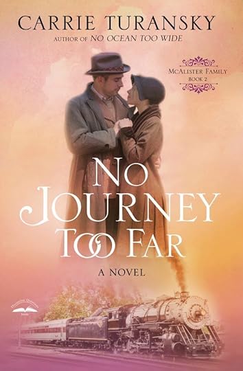
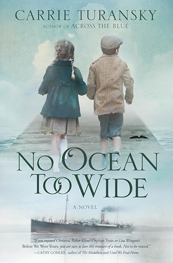 No Journey Too Far is the sequel to No Ocean Too Wide. We wanted to the covers to be similar, but to also look unique. The designer was able to accomplish that by choosing the same basic layout, with two people and a mode of transportation, as well as using the same font for the title. The designer made it different than No Ocean Too Wide by using an opposite color scheme and showing the couple as adults rather than children, and showing the train instead of the ship.

Take a Closer Look
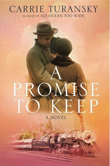
These are the preliminary designs that were considered. They used the working title, A Promise to Keep, which was eventually changed to No Journey Too Far.
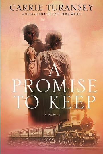
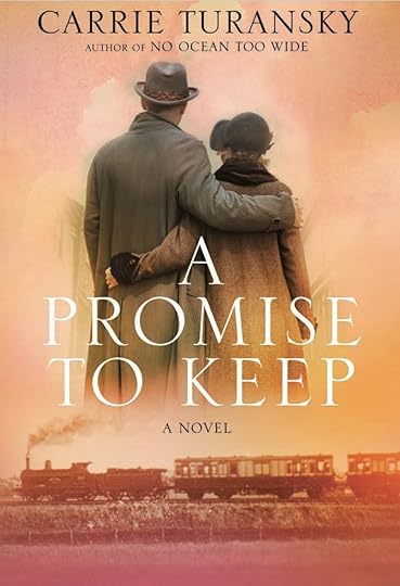
My editor liked the first design on the left, but I thought the man and woman looked older than my characters, and I didn’t sense much of an emotional connection between them. I liked the next cover, but the couple looked like a brother and sister, and I wanted to show the idea of romance with the couple.
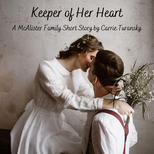 No Journey Too Far releases June 8, and I’m excited to share this new novel with you! Visit this page for easy order links to preorder your copy. When you preorder before June 8, you can download an exclusive short story, “Keeper of Her Heart,” as well as Grace’s Apple Cinnamon Muffin Recipe Card, and a fun Edwardian-themed postcard. You can preorder the book wherever you’d like, then visit this website and fill out the form to get your free gifts!If you haven’t read No Ocean Too Wide–now is the time! You’ll be swept away to Edwardian England and learn about the fate of British Home Children as you follow the adventures of the McAlister Family. Just click on the cover for easy order links to purchase your copy!Until Next Time ~ Happy Reading,Carrie
The post Behind the Cover Design for No Journey Too Far appeared first on Carrie Turansky.


