
Layout: More than Meets the Eye
I thought that doing the layout for Among would be done more quickly than Between because I could use the same template and save myself some work rather than building the document from scratch in InDesign. And it did... sort of. After I finally found the saved files on my backup hard drive. For those curious people who don't use InDesign, I'm going to try and give an idea of what goes into layout without overwhelming you with technical details.
Essentially, InDesign is a text and graphic layout program that is used for professional book layout (and tons of other projects.) It has lots of options and features that you can customize for your projects. It's great but it's also complex so sometimes when you change a setting and forget what you did, it's hard to troubleshoot. I usually don't have many problems doing layout. Usually.
Oddly enough, the first step in formatting a book is taking out all of the formatting. I do this by creating a "plain text" file in Word Pad. Usually, you would mark any formatting you did want to keep, like italics so you can go back and easily find it to put it back in, but I like to just go through the document on my own manuscripts and decide as I go which I want to keep.
This time though, I had two documents to import. The main manuscript for Among and the documents for the sections in the back. Mainly the "About Me" page and the first chapter of The Secret of Sentarra series which I was thinking of including. I imported it as "flowable" text which means the program will add as many pages as it needs to fit the text.
The manuscript imported and I went through adding "styles" to each paragraph. I have one style for the body of the text, one for the chapter heading, and one for the dropped cap at the beginning of the chapter. And "Font" styles for italics. And created a few new styles I have never done before.
Because Chloe texts her friends. She also IMs them on the computer. She also gets a flood of incoming texts after turning her phone on after disappearing. I wanted to go all fancy at first and put in actual graphics of speech bubbles, but I quickly figured out that was going to be confusing with the layout. I researched how other formatters handle it and found some bring one person's text to the right and the other to the left. I tried it, but there were several places in the manuscript where it looked confusing and sloppy against the narrative text. Especially where a random text comes in that doesn't turn into a full conversation.
I finally came up with two layouts that I think are clear and readable, set apart without breaking the flow of reading. Another challenge met. Then there was a day watching videos to brush up on how to get the headings started halfway down the page. And Layout #2.
Layout #2 is not my book. It is a memoir that belongs to someone else, a project that came smack dab in the middle of mine. So I've been working double time and adding some skills like extensive work with images and an appendix which I have never done. More research. More learning. And then there's the pesky habit of my internet going MIA for hours at a time. As of today, both of the manuscripts are done but I’ve hard to replace and re-anchor the 40 photos from this project around three times. The first day was fun. The second day was frustrating. The 3rd and 4th, I’m pulling out my hair and every time I think I’ve finished, something else goes wonkey.
I ordered a book in InDesign to add to my existing copy of designing books so I can look up when I need to brush up my memory or learn a new skill. I spent almost a solid two days doing the basic formatting for both books. I was almost finished with Among and just needed to add the back text.
The flowable text flowed right off the page. Then it jumped to other margins. Then it just disappeared. I tried several fixes. Finally figured it out. Got all of that text formatted. Then came the polish.
I go back through every chapter and every paragraph and look for words that have hyphens breaking to the next line. Then I expand or decrease the space between the letters to see if I can move the word up or down. The space between the letters is called "Kerning." I also look for lines that begin a page or end a page, called "widows" or "orphans." Nobody like to be alone, including lines in a paragraph so I'll adjust the kerning to see if I can move the paragraph forward or back. Sometimes I can. Sometimes, I just have to leave it looking a bit odd.
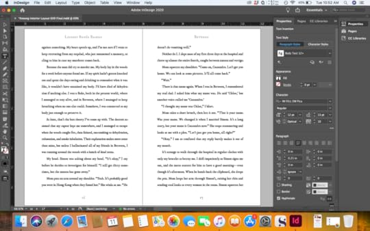
See how the last sentence runs onto the top of the second page? That’s what we want to avoid.
Honestly, I usually find the kerning step relaxing and feel satisfied with the results. This book seemed to have a lot more places where the fix didn't fix. But I finally got to the end of the document, just about the time I should be tumbling into bed. And the end matter I spent so much time importing? It's gone. I have no idea when in the process it disappeared. It doesn't appear to be hiding anywhere like it was last time. So I messed around the next day until I found it again.
So that is where this week leaves me. Among is ready but I’m doing one more read through. I have to remember to add the ISBN number to the front page of the manuscript.
Project #2 is in place and needs the greenlight from the author before I finalize the text and update the table of contents and the appendix numbers. So I am trying to get Among off to the printer so I can get my physical proof back in time to put the book for sale at the end of this month. At the end of this month, I'll know even more about InDesign. It all works out and helps me create more professional books. But it's a good thing I have a four-day vacation coming up. I was hoping it might be a real vacation. But I'm starting to learn that, for now, my vacations are usually book launches. And that's all right. Because creating books is what I love to do. Even when the end matter and photos do randomly run away.


