Find Five Fixes

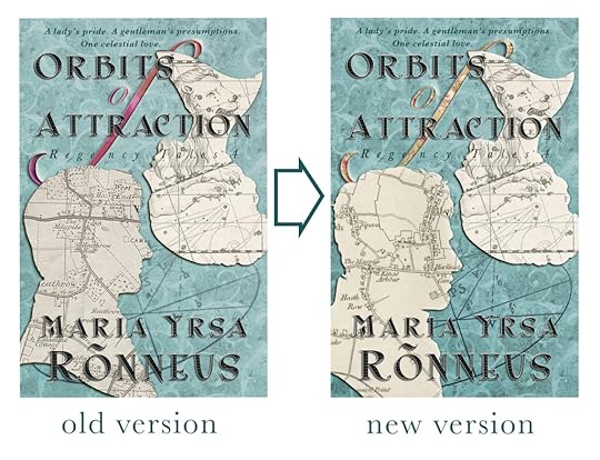
It may seem nitpicking, but when it comes to graphic design, the devil truly is in the details. Dear Reader, I have made the final adjustments to the cover of the 4th volume in my Regency series. Whilst I liked the left and earlier version well enough it came over a little too cold in the colour tones compared to the previous three books and I also wanted to give it a more aged look. There is also slightly more texture to the right version although that may not come across here.
I made five major alterations, do you spot them? Scroll down for answers.
Keep scrolling.
Just a little longer.
1. The ‘o’ in ‘of’ is larger and ‘Attraction is slightly further down. 2. ‘Of’ has a different pattern. 3. The man’s head is different. 4. The map in the man’s head is different although showing roughly the same area. 5. And the eliptical diagram in the background appears much darker and clearer.
Happy Monday!
__ATA.cmd.push(function() { __ATA.initDynamicSlot({ id: 'atatags-26942-60992fe86d88c', location: 120, formFactor: '001', label: { text: 'Advertisements', }, creative: { reportAd: { text: 'Report this ad', }, privacySettings: { text: 'Privacy', } } }); });


