Between the lines…
Formatting a paperback, Dear Reader, is essentially making a succession of choices which will permenently affect the book’s readability. Whilst Times New Roman, 12 pt, double spacing, is the industry standard for manuscripts to send to an agent or publisher, all bets are off when it comes to the final product. Self-publishing on Amazon and similar platforms means fewer options, yet everything from colour of paper to fonts has to be decided on. All too often we make these choices unthinkingly, perhaps not realizing that using one font rather than another may be what makes somebody buy the book or not. For myself, narrow text in single line spacing is a deal breaker. The words float about and merge, it’s a nightmare! Below is an example, Helvetica 12 pt, single spacing. ‘Helvete’ means hell in Swedish, so at least it’s aptly named.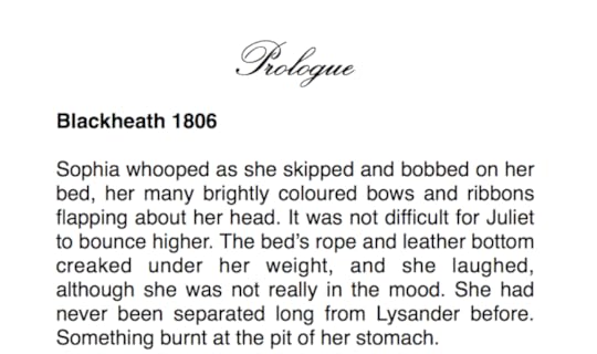
As we age our eyesight deteriorates, and not all these problems can be corrected with laser or glasses. Whilst it is impossible to cater to everybody’s tastes and needs, there are a few things that are generally considered to improve legibility.
One of those is line spacing. I chose Baskerville, 12 pt, for my historical novels because it pre-dates the Regency era, and helps keep the text in historical character so to speak. I find it easy to read, pleasing to the eye, as well as versatile for graphic design. I write with 1.5 line spacing, and hitherto I have published in 1.5 as well.
Whilst this improves readability, the downside is cost. In Amazon’s print-on-demand scheme, the customer pays the entire printing cost which increases with page number. A thinner book is cheaper. If price is too prohibitive, sales go down. Hence there is every reason to balance carefully these two factors.
I’m in the middle of the formatting process for ‘Orbits of Attraction’ and realizing that the final page count will approach 700 pages, something needs be done.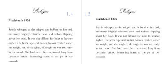
Trying 1.4 had only a slight effect, so I will try 1.3 and see how that turns out. I don’t want to diminish the type size, as I fear it would be too minuscule for some readers.
I’d like to hear from you, Dear Reader, what you you think!
Happy Saturday all!