
The New Unsupervised Learning Logo (2021)
We’ve not changed the logo for Unsupervised Learning since the first one back in 2015, so we thought it was time.
But going 6 years wasn’t the only reason. Here’s what I wanted that in the new design:
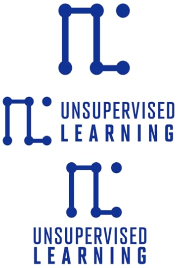
More meaning related to the brandMore square vs. roundThe graphical component to be able to stand alone without the textThe designHere’s a breakdown of the graphic’s meaning.
The visual overall of dots connected by lines is meant to signify circuitry and connections (like a neural net)The first part of the logo is an upside-down “U”, indicating unorthodoxyThe second part of the logo is an “L” for learningThe orphaned dot represents a connection that hasn’t yet been made—perpetually reminding us that there is always more to learnThe text is Advocate, by Matthew Butterick, which is used elsewhere on the site.
So I think we hit all aspects of what we were looking for, and I’m pretty happy with it.
MiscellaneaI just recreated my phone’s lock screen wallpaper to use the new logo, and here it is for anyone interested.
My updated UL phone lock screen
Let me know your thoughts on it.
NotesMy partner came up with a significant improvement to the visual part of the logo by recommending the upside-down “U” character, as well as the standalone dot. She also named the brand back when it started! 1,000,000 thanks to her!

No comments have been added yet.
Daniel Miessler's Blog

- Daniel Miessler's profile
- 18 followers
Daniel Miessler isn't a Goodreads Author
(yet),
but they
do have a blog,
so here are some recent posts imported from
their feed.

