
How to Evoke Emotions with Book Cover Design
We all know the importance of book covers in helping readers choose books. So what separates an engaging cover from one that potential buyers pass by? Would you be surprised if I said that emotion was part of the equation? Read on, as today’s guest writer, a graphic designer and creator of book covers, explains the connection and how to make it happen with your cover design.
Do you remember being a child in a bookstore?

With shelves upon shelves of books around, you felt positively overwhelmed and full of anticipation. Hundreds of stories waited for you to take a peek behind their covers. And then, you stumbled upon a book that grabbed your attention. Your eyes were glued to its shiny surface. The colors, the art, the beautiful font ��� they were impossible to ignore. Without even opening the book, you already wanted to experience the world hidden inside.��
That���s the cover every book deserves; it should evoke emotion, whatever the readers��� age.��
In this post, we���ll be examining how to achieve that hard-hitting first impression. But first…
How Do People Decide which Book to Buy?��A few years ago, aspiring writer Gigi Griffis decided to conduct��a little survey��to figure��out how��avid readers pick new books.��Here are her results:��
85% said that they buy books of the authors they already lovedA friend���s recommendation was the second most popular reason (77%)47% and 48% respectively cited book sales and gorgeous cover artThese numbers confirm what we���ve already suspected: people stick with the familiar and they let their eyes guide them. Fortunately, a professional book cover can help us create that sense of familiarity while also attracting readers.��While there is no secret universal formula, there are essentials that will help you lay a solid foundation for an emotionally impactful cover. The main and primary rule is:
Know Your Target Audience��Most of the time, readers already know what kind of a book they want. More specifically,��they know the emotion they want to experience:��
I want to be scared
I want to be thrilled
I want to explore strange and captivating worlds
I want to feel��in love
For a cover to ���hit��� the target audience in just the right way, it���s primary purpose should communicate: This book has the feeling/vibe you���re looking for!��
The first way we can accomplish this is through color.
ColorPeople��have strong, well-defined associations��with color and temperature, smell, and emotions. A color can be warm, cool, wet, or dry. It can signal danger or imply coziness. An effective book cover should use associations like these to achieve the desired emotional result.
Here are a few examples:

The combination of dark and red implies danger and tension, making it a good choice for horror and crime novels.
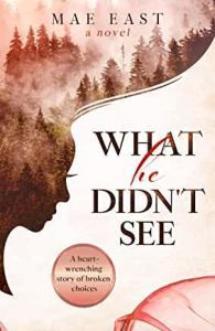
Pastel hues often indicate tenderness and sensitivity, so they do wonders for romance.��
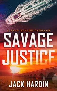
Red and orange are associated with energy. They���re fun, vibrant, youthful colors, which makes them a good choice for action.��
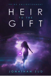
Purple is associated with royalty, majesty, or nobility and can often have a spiritual or mysterious quality. It suits fantasy or paranormal literature well.��
Of course, color associations may differ from culture to culture or person to person. But don���t let that stop you from using some common palettes to target as many potential readers as possible. Think about what emotions you want to evoke in your ideal audience and choose the best colors for the task.��
Imagery��Chip Kidd���a well-known and delightfully eccentric book cover designer���has said that his job in designing a cover is to ask: ���What does the story look like?���
The imagery of your cover should answer this question while also��communicating the book���s genre��(which helps achieve that sense of familiarity). So��don���t hesitate to follow the established canons of the genre. If the idea is common, masterful execution and a unique take can still make the visuals fresh, as we see in the following examples.��
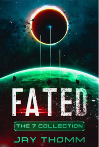
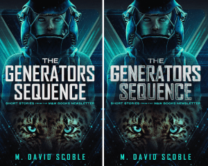
It���s okay to go for a wide-angle shot of a planet for sci-fi.
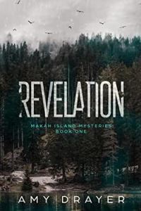
Spooky forest for a mystery story? No problem.��
A dragon silhouette for a fantasy book? Why not?
You get the idea.
Our recommendation? Do your research and find references. A nice source of inspiration can be movie posters, photoshoots, other book covers, and paintings.��As for the style of the art, it doesn’t matter whether you choose a photo-based, illustrated, minimalistic, or abstract cover. Just make sure it suits the mood and genre of your book.��
Typography��The primary rule of book cover typography is to choose the font that suits your genre and complements the imagery.��Here���s a handy example.��
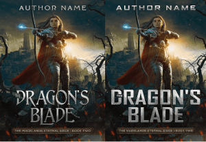
On the left, we have a traditional fantasy font. It emphasizes the genre; its elegance suits the imagery, and it communicates the proper sense of wonder and adventure.��The squarish font on the right belongs to sci-fi more than to fantasy. It creates dissonance and detracts from the familiarity we���re striving for.��
If you���re looking for tried-and-true fonts for a new story in a particular genre, consider the following:
FANTASY
SerifGothicBaskervilleApple GaramondTrajan ProCinzelROMANCE
CassandraCountrysideBeautiful PeopleBlessed DayPainterOne More DayCRIME AND MYSTERY
Hennigar Regular Roar Bold Cook County Jailhouse Trade GothicRomic InterstateSCIENCE FICTION
Encode Sans Josefin Sans Grove Orbitron Roboto Geom GraphicIf you���re worried about using a font that���s a little too predictable, amplify the vibe by adding a texture and/or some volume. Compare the following pictures.��Which is more interesting?
Besides choosing a proper font and breathing some life into it, here are some general typography tips:��
Try not to use more than two different typefaces. If you’re unsure, you can always use some of the Sans Serif family. Here���s��a handy tool��for finding font combinations.��Make the title the dominating element of the cover. If you don���t yet have a huge following, the title should be bigger than a subtitle and your name.��Place your subtitle either beneath the title or between its lines.��Align the title, the subtitle, and the author���s name similarly���left, right, or center. Usually, the latter option is the safest.����If you write for an audience that reads from left to right, use the Z-pattern layout. It follows the way we read: from the left-top then diagonally to the right-bottom.Never underestimate the typography, since it has the power to ruin or enhance your cover. Treat it as cake frosting ��� it���s there to make your creation even more impressive and appetizing.��
Summing UpOverall, if you keep in mind your readers’ desires, use the power of imagery to its full extent, and tie it all together with proper typography, you���re on your way to creating an emotionally impactful book cover. This piece of art will help promote your book to new readers while also releasing their inner child, freed from life���s responsibilities to get lost in the pages of the perfect book.
In your opinion, what makes a book cover emotionally impactful?��

Vova is a Senior Graphic Designer at��Miblart���a book cover design company for self-published authors. We believe a book cover is the ���1 marketing tool, and we help authors get the most out of it.
The post How to Evoke Emotions with Book Cover Design appeared first on WRITERS HELPING WRITERS��.


Writers Helping Writers

- Angela Ackerman's profile
- 1015 followers

