
Spaghetti Plot Alternatives
When differing longitudinal graphs are overlayed – in order to visualise data from a large number of sauces sources – the results can become confusing – possibly even meaningless. The outcome, in the parlance of data analysts, has turned into a so-called 'Spaghetti Plot'. (see pic below)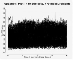
But Bruce J. Swihart and his colleagues Brian Caffo, Bryan D. James, Matthew Strand, Brian S. Schwartz, Naresh M. Punjabi at the Johns Hopkins University Bloomberg School of Public Health, Department of Biostatistics, Baltimore, USA, have between them created a new recipe for epidemiologists – who may now be able to avoid becoming embroiled in spaghetti plots, by using instead the team's newly created 'Lasagna plot' method, which as the picture below shows, is substantially less bewildering. And more colourful too.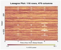
The team's paper Lasagna plots: A saucy alternative to spaghetti plots is published in the journal Epidemiology. September 2010 – Volume 21 – Issue 5 – pp 621-625.
Supporting info here


Marc Abrahams's Blog

- Marc Abrahams's profile
- 14 followers

