Judging a Book By Its Cover
When I first published "A Soul toSteal" back on Aug. 29, it's an understatement to say I was flying blind.The amount of research I had donewas negligible, I didn't have a blog, I barely had a Twitter presence and myknowledge of book blogs was practically nonexistent. Rather than taking thetime to learn all of that, I did what I usually do when undertaking a newactivity—I jumped in feet first. It was either sink or swim. For the most part, this was a gooddecision. I feel like by instinct or dumb luck (probably the latter), I made alot of right calls. The best was that "A Soul to Steal" was in good shape whenI published it. I had revised it several times, had it edited and had soughtand incorporated professional feedback on it. It was ready for prime time.
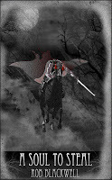
 What I didn't think through was thecover. At the recommendation of a friend, I contacted a very talented artistwho agreed—at no charge—to mock up a cover for me. He had several intriguingdesigns and I had my own ideas and ultimately we settled on the one you see tothe left—the Headless Horseman racing down a path at midnight.It was a good cover, evokingmystery and suspense, and I was quite happy with it. Several of my friends likedit too, noting that it had an old-timey, grainy feel that made it unique.But that uniqueness came at aprice. Although I like the cover andbelieve the artist did a terrific job, the flaw in it was that it didn't looklike the kind of cover you would see on a Big Six title. It was proudly,defiantly indie and while I liked that idea, I didn't realize its significance.There were other issues which can be laid at my doorstep: the overall look wastoo dark and it was difficult to see when reduced to a very small size—which itwas, all the time, on Amazon. Also a problem: the image wasn't good enoughresolution to put on the print version of my book.
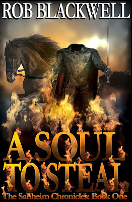
 In December, my sister-in-lawhelped me design a cover for the print version, this one going away from theHeadless Horseman. Instead, it was a photo of Virginia woods. Again, I liked the evocativefeel and the hint of mystery it provided.But by then I was deeply troubled.I didn't like having two different covers—one for print and one for ebook—andneither seemed the kind of cover art that was going to get an immediate,gripping reaction. About two weeks ago, I decidedenough was enough. As I mentioned, I jumped in with both feet when I publishedmy book, concerned about spending any money on the book and watching it drag medown financially. By now, however, it was clear I needed to hire an artist whowould give me a cover for both versions of the book—and one that looked exactlylike the kind of cover you would see in a book store. Enter Travis Pennington of Pro Bookcovers. Travis, a writer himself, came up with the design and then patientlymade various tweaks and revisions to it. In the end, I think he got it justright. The new cover is bold, brash anddemands attention. It has the Headless Horseman on it, but it's not trying torecreate the look of "The Legend of Sleepy Hollow" (which is good, because thebook doesn't either.) I hope it will win the novel some more attention. Most importantly, it also lookslike a "real" cover. The original one might have screamed indie, but that's adangerous position. When people buy a book, they usually aren't looking forsomething hip or different—they are looking for something that grabs them anddoesn't let go.With this new cover, I think "ASoul to Steal" does just that.
Published on February 08, 2012 18:24
No comments have been added yet.


