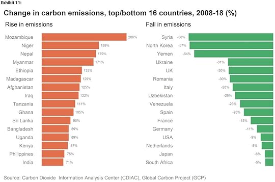
Here’s a graph that caught my eye recently, posted on Twitter by David Roberts of Vox. It’s from a Morgan Stanley report that I don’t have access to, so apologies for not providing a linked source. It shows the 16 countries where carbon emissions have fallen fastest between 2008 and 2018, and the 16 countries where they have risen fastest.

There are a couple of really noticeable things here. One is that for the most part, the places where emissions are rising fastest are poorer countries...
Published on October 15, 2020 05:01
