Color Part 9: Practical Tips for Painting
When applying color theory to your own work, here are some things that may be helpful to keep in mind. Some of these were mentioned in earlier color posts in more detail.
 © Jen Betton
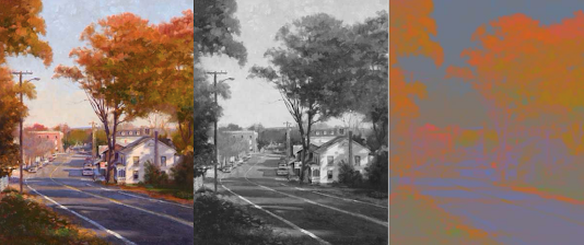
1. Think value first – a strong value structure is more important than the hue you use.
 © James Gurney2. Limit saturation – be careful not to overdo bright colors. A little goes a long way.
3. DON'T use black or gray for shadows. Shadows are full of color. Generally, be very cautious using black (or white) in your pain...
© Jen Betton1. Think value first – a strong value structure is more important than the hue you use.
 © James Gurney2. Limit saturation – be careful not to overdo bright colors. A little goes a long way.
3. DON'T use black or gray for shadows. Shadows are full of color. Generally, be very cautious using black (or white) in your pain...


No comments have been added yet.