
Ira Schnapp in TOMAHAWK
 All images © DC Comics
The DC frontier fighter Tomahawk began in issue #69 of STAR-SPANGLED COMICS dated June 1947. The first page of his first story is above featuring a logo that would reappear on his solo series. The letterer of the story is unidentified. It’s possible that the logo was created by that letterer for this story, but I think it was done by either Ira Schnapp or the unknown letterer whose work was the model for Ira who I’ve nicknamed Proto-Schnapp. Neither of them has a lettering style like the caption shown here. I think Proto-Schnapp was on staff at DC at the time, so he’s the likely candidate, and he tended to use a lot of curved shapes and lively bounce, while Ira tended to prefer straight lines and aligned letters. The tomahawk behind the T is part of the logo, and a nice visual tie-in that either man could have added, or perhaps the artist Edmond Good did. Tom Hawk and his young friend Dan Hunter ranged across America before and during the Revolutionary War, often fighting Native Americans, sometimes allied with them. The characters were likely inspired by Davy Crockett and Daniel Boone.

After appearances in STAR-SPANGLED and WORLD’S FINEST, a solo title launched in 1950, first issue above. It was edited by Jack Schiff with help from George Kashdan and Murray Boltinoff and it had a long run of 140 issues, ending in 1972. After 1963 the title was edited by Boltinoff alone. Usually each issue had three Tomahawk stories, sometimes with other short features. It was bimonthly at first, then published eight times a year for a while, then bimonthly again. The cover lettering on this issue above the logo looks like the work of Proto-Schnapp to me, not Ira. The caption could be either, but I’m putting it in the Proto-Schnapp column as it’s unlikely two letterers would work on one cover.

The lettering on the cover of #2 looks more like Ira Schnapp’s work to me with its very square and regular letters, though the question mark is a bit odd.

Issue #4’s cover lettering is definitely by Ira Schnapp, and he lettered almost all the covers from here until issue #114 in 1968. Ira lettered a few stories in the series, but most of his work was on covers. Note that Proto-Schnapp’s top lines continued to be used for a while.

On issue #6 in 1951, Ira created an unusual story title meant to suggest Aztec writing, which I like a lot. It may have been the only time he used this style.

Issue #9 in 1952 is the first to have a Schnapp word balloon, not quite in his regular style yet, though the story title is.

By issue #27 in 1954, Ira’s cover lettering was in his typical style seen on nearly every DC title through the 1950s and later, and he’s also redone the top line.

Issue #36 in 1955 has one of the largest Ira Schnapp captions of the 1950s touting the appearance of Davy Crockett, then in the popular TV series from Disney. The real Crockett was not born until 1786, well after the Tomahawk storyline, but few kids would know that.

With issue #55 in 1958 a new Ira Schnapp logo appears. Very simple, with a stylized tomahawk shape around the letters. It left a lot of space above, but is otherwise effective and easy to read. By this time, as you can see, elements of fancy and fantasy were becoming more common.
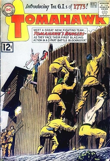
By 1962, DC’s war comics were popular, and with issue #83 this series tried to attract readers with “Tomahawk’s Rangers” billed as the soldiers of 1775.

This logo version by Schnapp appeared only on one cover, #99. A new use is made of the tomahawk, but the red white and blue stripes work against it. By now the series was drifting far from frontier America. Ira’s slanted caption is a clever way to fit things in.

On issue #101 in 1965 there’s a new top line banner and bottom line on the logo that fills the space nicely. The caption at lower right touts a Revolutionary War superheroine, Miss Liberty, thus trying to attract war-comics and superhero fans at the same time.

Issue #110 in 1967 debuted another new Ira Schnapp logo, one of his last, with notched block letters and telescoping. I find it effective except for the head of Tomahawk, which is not by Ira. The infamous “Go-Go Checks” at the top of the cover do nothing to help this one.
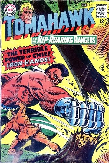
Ira’s final cover lettering on the series was on issue #114 dated Jan/Feb 1968. The treatment of IRON-HANDS shows Ira still had creative ideas. He would leave the company in this year. Here are the covers I see Ira’s lettering on: 2-7, 9-10, 12-36, 38-40, 42-53, 55-59, 61-114. That’s 107 in all, an impressive run.

Schnapp did not letter many stories on this series. The first one is in issue #10 from 1952, above.

In issue #14 he lettered the backup feature “Tales of the Arrow Maker.” I’m not sure if he created this logo, but he might have.

Ira’s final story lettering was in issue #78 in 1962, which had two stories he worked on. It’s interesting to note that the stories were still using the original logo after it was revised on the cover.
Here are the stories I find Ira Schnapp lettering on. Since most issues had three Tomahawk stories, I’ve given the number.
#10 March/April 1952: Tomahawk (3) 8pp
#12 July/Aug 1952: Tomahawk (2) 8pp
#14 Nov/Dec 1952: Arrow Maker 6pp
#15 Jan/Feb 1953: Tomahawk (1) 8pp
#17 May/June 1953: Arrow Maker 6pp
#37 Jan 1956: Tomahawk (2) 8pp
#43 Sept 1956: Tomahawk (2) 8pp
#59 Nov/Dec 1958: Tomahawk (2) 8pp
#67 March/April 1960: Tomahawk (2) 8pp
#76 Sept/Oct 1961: Tomahawk (1) 9pp
#78 Jan/Feb 1962: Tomahawk (1) 9pp, (2) 8pp
That’s a total of 94 pages, showing that Ira lettered more covers than pages on this comic. Perhaps Westerns were not something that appealed to him and he only filled in on stories when no other letterers were available.
More about TOMAHAWK on Wikipedia.
More articles in this series are on the Comics Creation page of my blog.
The post Ira Schnapp in TOMAHAWK appeared first on Todd's Blog.


Todd Klein's Blog

- Todd Klein's profile
- 28 followers

