Forecasts for most countries
On March 15th, I started trying to forecasts the development of the epidemic in Lombardy (Italy), where I live.
I did it just because I prefer to understand what I see. I’ve seen other forecasts around, and most of them have been made by people more prepared than me on epidemic.
After almost two weeks, I can say that the method was good. I predicted Lombardy reached the peak and of March, and it looks like (see the original post). Locked at home, like other 3 billion people, I really hope we will soon be able to start thinking having a normal life again.
As more people asked me forecasts for their regions, and then their countries, I developed a more comprehensive code (you can find it here on github) to analyse various datasets, downloaded automatically.
Before looking at the charts, please read the caveats below.
Nothing is written in stoneI built animated images to show that forecasts actually depends on policies. In the image below you have all forecasts made from beginning of February onwards:
In blue the actual data. In red the best projection. In gray, between the two green lines, the 70% confidence band. When no band is present, the error is simply too big to be shown, i.e. the forecasts have little sense. I try not to show those anyway.
The algorithm initially forecasts a huge amount of infectious people, but as lock-down policies are put in place, the forecasts become more optimistic.
Data are not perfect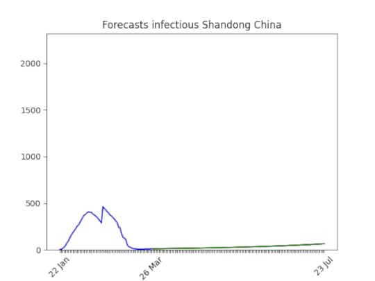
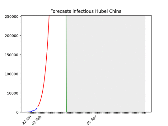
Rightfully, the priority in hospitals is curing people, not registering data. But data quality is vital to understand if the situation is actually improving or not. Like in the picture above, sometimes data are problematic.
What are we actually predicting?Originally, I looked at the number of infected in hospitals. This looked to me a much better proxy than the reported number of cases. As The Economist wrote today March 27:
[In Italy], the daily count in new cases reached a high-water mark of 6,557 on Saturday. Yet Thursday’s 6,153 was not much better. Epidemiologists warn this is anyway a questionable measure; any rise in positives may be an artefact of the recent increase in testing. … An arguably more reliable figure — the number of infected in hospitals — keeps rising, though the daily percentage increase has fallen.
I am now downloading data from the COVID-19 (2019-nCoV) Data Repository by Johns Hopkins CSSE, and they only report infected, deaths, recovered. I try to predict infectious here, i.e. infected — (deaths+recovered).
It’s not over even if it looks overThe epidemic can start again and again. I’m not saying that as soon as we go down with the number of infectious everything is going back to normal. Have a look at Singapore:
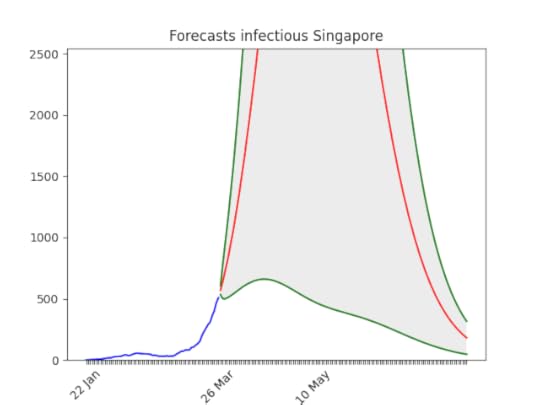
The situation will soon improve, given the state experience with epidemic, but still…
There might be bugsIf you want to check the code, please do it.
ForecastsBelow the forecasts for a few countries (those where people asked me for the projections). You can still find all projections on the github repository.
Italy
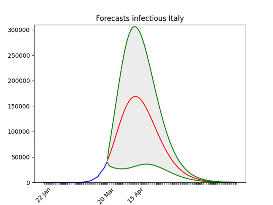 There is little doubt, I believe, that the situation is improving. Of course this is not true for all regions in the country.
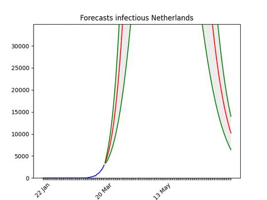 Definitely improving…
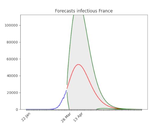 Note that the confidence band is still huge. No animation because of the quality of the data.
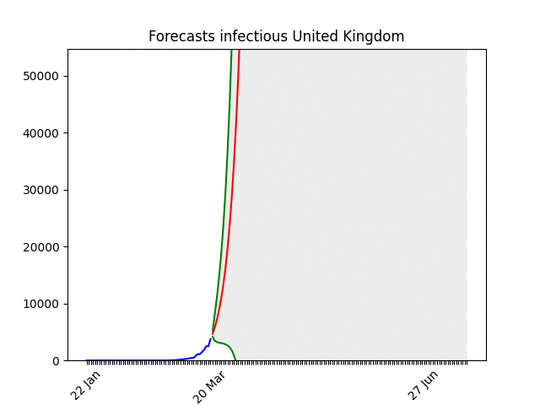 What everyone knows, but the big uncertainty in the results means the situation can soon improve.
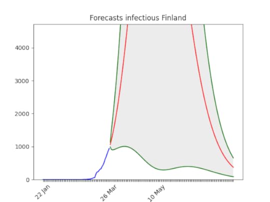 Not good, but huge error still
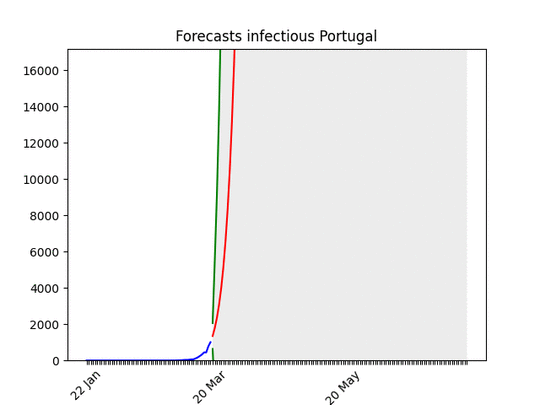 Improving
 Surely too optimistic about the date of the peak, but it’s improving.
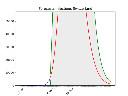 Switzerland is an example of the situation going fast from bad to good.
 From good (probably a lack of data) to bad…
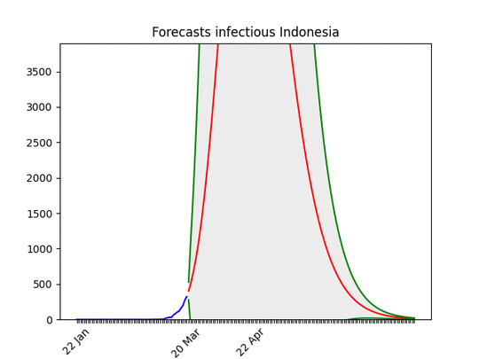 It seems improving, but the error is still huge.
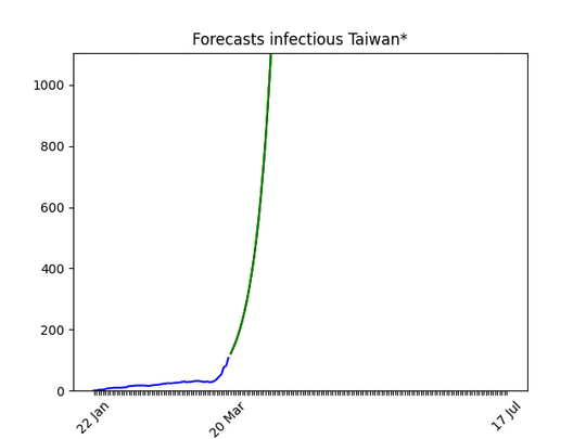 Clearly improving.