
Meet the New "Snake Chart"
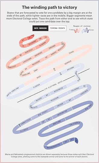
The team at FiveThirtyEight have created a new data visualization they are calling the “Snake Chart” to help show which U.S. states are key to the Presidential election, and how they are currently predicted to swing.
From FiveThirtyEight:
We call this the


No comments have been added yet.


