
EHD Insider Design Agony Group Chat with Julie & Jess (Because Two Is Better Than One)

We were originally going to call this post, “Julie and Jess: The Design Agony Crushers”… too much time by ourselves in quarantine?? Probably. BUT that sentiment is real because all we ever want to do is help (or crush) all of you with the design challenges plaguing your lives. We also think it’s almost impossible to design alone. Everyone needs at least a second eye. With us, it’s always collaborative in some small way. Mainly like, “Hey what is this room missing?” or “Do you like this? I can’t tell if I do.” So since we heavily rely on each other’s opinion for all of our design issues, questions, and panic attacks, we thought that we would tackle this post together. I mean we were going to consult each other anyway, so might as well divide and conquer.
Let’s start crushing…
The Dark Accent Wall In An Open Plan Space

From Jess: I thought this one was a great one to start with because it touched on something that Emily JUST talked about in her family room post… painting a high contrast color in an open (or open-ish) plan home. We totally get wanting to make a room feel cozy by painting it a moody color (especially blue, have you seem our site? Blue is our thing). Hooowever, this is Emily’s rule of thumb, and Julie and I agree.
RULE: Painting a high contrast color on only some of the walls in an open concept home will cut off the visual flow. The only time it really works is if the color is painted in an architectural feature (like a nook, see here). You want your eye to happily bounce around without it abruptly halting (and not the good kind).
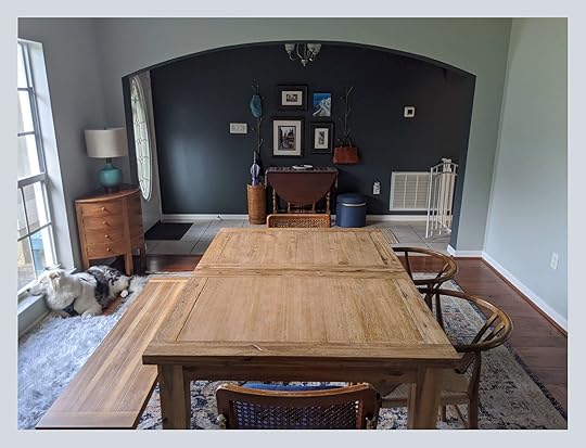
So as much as we love this moody blue view from Alessa’s dining room into her entry, she noted that the entry opens up to the kitchen which opens up to the living room and she doesn’t want to paint it all dark. Our conclusion then is to keep the house all the same light color for maximum flow. This means some repainting might be in order. But as we always say, it’s your house so it’s your rules. If you like it then it’s perfect.
The “Not Ready To Renovate” But “Can’t Live Like This” Bathroom

From Julie: The Insiders had some great suggestions for Betsy that included painting the floor tile, replacing the wood mirror, getting rid of that “interesting” blue wall color, putting up some fun wallpaper, and painting the vanity.
She took your suggestions and decided to lean into the EEG trend (Eccentric English Grandma) to make it work for now so she can one day brush her teeth in peace. Betsy sent over some initial mood boards to Jess and myself which were on the right track but she felt something wasn’t quite working. So, of course, I couldn’t help myself and came up with the one below.
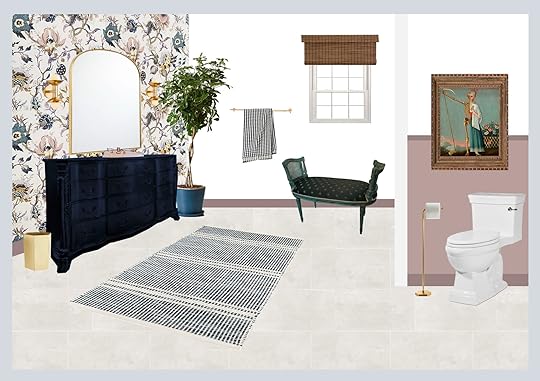
Wallpaper | Sconces | Mirror | Vanity Color | Trash Can | Towel Bar | Towel | Window Treatment | Rug | Art | Toilet Paper Holder | Paint Color
First off, let’s give this room a coat of white paint on the walls to start off feeling fresh. Then with using a latex paint, Betsy could take those tan floor tiles and paint them a soft gray. Some floral wallpaper behind the vanity and a dusty pink accent color in the toilet nook would add life back to the walls without it being too overwhelming in the space. As for the vanity, I think it should be a dark navy which again plays off the color in the wallpaper to tie it together. Then swap out the mirror and sconces for a more simplistic/modern shape and sprinkle that brass throughout the rest of the room in the towel bar, trash can, toilet holder, and other accessories. A bit of unexpected art above the toilet overlapping the paint would bring in some fun quirk and of course placing an amazing vintage cane upholstered bench (Betsy found this one and I am in love!) under the window adds some character into the space. For some texture, she could install a natural woven window treatment and a tree will of course add warmth. Last but not least, throw down a large rug in a smaller scale pattern (to nicely contrast the large scale wallpaper) which ties into the color palette. Betsy, I hope this temporarily solves your bathroom blues…literally.
The “Wait, Is This Art Generic??”
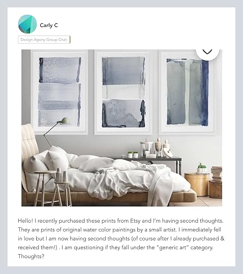
From Jess: Buyer’s remorse is real. Sometimes it’s a few days after it’s too late to cancel or it happens once the piece gets into your home and clearly doesn’t work. One of the best things about having friends whose taste you trust is avoiding this potential issue. And if you don’t have a friend like that or instead prefer to ask hundreds of design enthusiasts in a design-loving community like Carly did with her art purchase, then the EHD Insider Community is for you.
Buying generic art is one of our official design mistakes. We wrote about it here. And while I totally understand the second-guessing of a large purchase, Carly’s prints are beautiful and not at all generic like she was worried about! The key to making any home look unique is A. Loving pieces you own, B. Varied textures/patterns, and C. A little bit of vintage because it always adds soul.
So congrats to Carly and her new pieces and we hope you feel at ease after asking your many new design friends if they were keepers. Lastly, if any of you are looking for some special prints here are some current favorites (some are printable!):
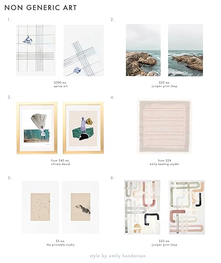
1. Lost & Found Again – Quarantina 5 & Lost & Found Again – Quarantina 4 | 2. Rocky I & Rocky II | 3. She Split the Earth That Day & This is Mine. You’ve Taken Enough. | 4. Pale Pink Stripes Print| 5. Flying Birds & Minimal Landscape | 6. Paths II & Paths I
The “Does My House And Detached Garage Need To Match?”
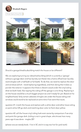
From Julie: This one seems to be all about personal preference and here is mine. 


Emily Henderson's Blog

- Emily Henderson's profile
- 10 followers

