
sensory overload
I've just been to the Hockney exhibition. The colours are brilliant. The canvases are enormous. The exhibition is enormous. The crowds are thick. It's everything they say it is in the reviews. It's great. It's limited. It's full of meaning. It's empty of meaning. It's all about looking. It's repetitive. Its repetitiveness is its strength. It's shallow. It's deep. It's a joy to behold.

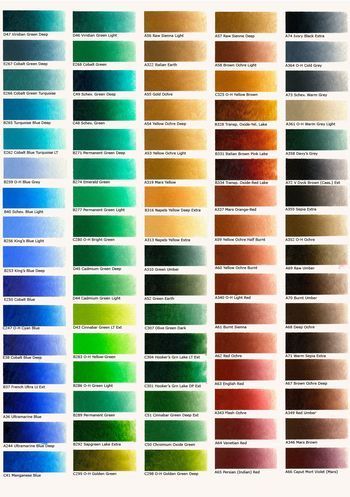
I loved being immersed in that much colour, wandering through a gloriously bright landscape. And at some point I began to wonder just how much oil paint Hockney used to paint the pictures here. Does he order his supplies by the tube, by the tin, by the bucket, or does he have oil paints delivered by his own personal paint pipeline? When he turns on the taps in the studio, do gallons of emerald green and shocking pink, lemon and turquoise, scarlet and viridian pour out? How does he write his shopping lists? Does he have Cadmium Yellow, Prussian Blue, Sap Green and Magenta where we have bread, milk, and baked beans? Because I tell you, there are acres of Yorkshire in there, all painted in huge, fluid, exuberant, confident brush strokes which probably each use up a little tube at a time, and it's not just a celebration of landscape, it's a celebration of a spectacularly rich and expressive medium.
[colour charts for Old Holland oil paints, although Hockney - and Howard Hodgkin who is also very generous with paint - has been known to use Michael Harding's paints]


Jane Brocket's Blog

- Jane Brocket's profile
- 27 followers

