Map of unemployment during COVID-19

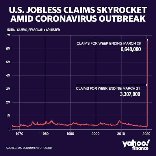
The coronavirus has rocked the United States’ economy, resulting in millions of laid off or furloughed workers. The result has been the biggest unemployment spike in the country’s history, with over 6.6 million people applying for unemployment benefits since the stay-at-home orders were given.
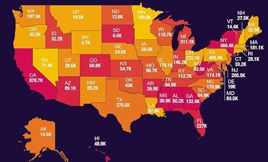
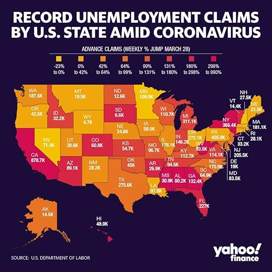
Yahoo created a graph and map that paints a clear (and troubling) picture of the unemployment situation in the US.

Photo: Yahoo
In many cases, states that took longer to implement lockdown orders also took longer for their unemployment numbers to rise, hence the staggering increase in the past week (double the numbers from the week before that, from 3.3 to 6.6 million claims in total).

Photo: Yahoo
Texas, for example, was one of the most recent states to introduce a shelter-in-place order, so its unemployment numbers began reflecting the situation just this week. Indeed, this week Texas saw a 77 percent jump in unemployment claims, after posting relatively mild numbers the previous week.
New York has logged over 366,000 unemployment claims to date, while California has over 878,000. 

More like this: TSA checkpoint numbers show just how few people are traveling right now
The post Unemployment in the US spikes as the coronavirus crisis unfolds appeared first on Matador Network.

Matador Network's Blog
- Matador Network's profile
- 6 followers


