
Gerhard Richter – The sublime on a postcard
BY MAREN MEINHARDT
There are many ways to deal with the succession of excellent, once-in-a-lifetime art exhibitions London seems to throw up all the time. One approach is to form a firm intention of going, congratulate oneself on said intention, and live smugly up until the point where it becomes clear that the exhibition has come to an end some months ago.
I'd been doing quite well with this technique, and Gerhard Richter's great retrospective, Panorama, at Tate Modern, was all set to become the latest event that had got away. Until unexpectedly a friend, who moreover possessed one of those lovely membership cards, swept me up almost at the eleventh hour.
One might have expected interest to have ebbed a bit by the time of the closing weekend, but a truly astonishing queue made it clear that this wasn't the case at all. Nor would the magic membership card allow us to queue jump.
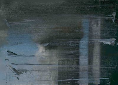
It's tempting to wonder what aspect of Richter's work it is that attracts such numbers of people. He can hardly be accused of catering to any one particular taste. His range is so very broad, that even within the different rooms, where paintings have been grouped into periods, there is still great diversity.
There are the artworks called things such as "Grey", or "Mirror", which are just that, and, which never fail to invoke a mild sense of impatience.
But then among cloud pictures and sea scapes, beautiful but stern with a sparse palette, an astonishing blur of colour stands out: a version of Titian's Venetian Annunciation. The painting, a blurred impression of the original, represents, so the exhibition notes explain, a comment on the fact that it was "impossible to paint like Titian today, and that the 'beautiful culture' of Old Master painting was irretrievable". In an interview (with Michele Leight, in the City Review), Richter had explained, disarmingly, that he had copied the painting from a postcard, "simply because I liked it so much and thought I'd like to have that for myself. To start with I only meant to make a copy, so that I could have a beautiful painting at home and with it a piece of that period, all that potential beauty and sublimity."
Is it being German that makes it difficult to resist the dark pull of the room with the Baader-Meinhof pictures for long? Craig Raine, who reviewed the exhibition for the TLS, remarked that the "Baader-Meinhof pictures inevitably attract ideological inflation, even though Richter is a pains to repulse it".
I, too, had been wondering about the place of ideology in those pictures. In the past, Richter has made clear his opinion that ideology is best avoided. But the title of the monumental canvas showing Andreas Baader lying dead on the floor leaves does leave some room for doubt. In the official, and widely accepted version, Baader committed suicide; the English title of the painting "Man Shot Down" seems to suggest otherwise; the German "Erschossener" (shot person) is less controversial.
Of the triple portrait of Ulrike Meinhof, Raine describes how "in Richter's version, it is gradually, successively, eroded. Eyebrow, eyelid, open mouth blur into vagueness."
Richter does not glorify, nor criticize, and if one is looking for clarity, his work is not the place to search for it. The Baader-Meinhof story looms over the German psyche, just as monumental and shocking as Richter's portraits. His pictures represent this, but they don't explain.


Peter Stothard's Blog

- Peter Stothard's profile
- 30 followers

