A Simple 6-Part Formula for an Effective Homepage Design
Your website is not just a decorative accessory for your business. It’s often the first impression someone has of your business and it needs to be assisting you in making revenue. This starts with an effective homepage design.
We’ve spent years building websites for our service-based businesses (offering branding and website design) as well as for our digital product businesses (selling online courses, e-books, memberships, and more).
Optimizing your website to be more effective in support of your strategy is vital to making your business successful. Your website should be working on your behalf to reach your revenue goals. If you aren’t hitting your goals and you desire growth, you need to consider the possibility that your website isn’t doing its job.
In this article, we’re going to share with you the processes we use over and over again to design an effective homepage.
[image error]
Is your website missing the magic of effective web design?
You’re probably in one of these two categories right now:
#1 You feel somewhat confident in your website. Your product or service is selling (infrequently) but you know you haven’t spent time optimizing your website and you’re not even sure what to optimize or focus on.
#2 You don’t feel confident in your website at all. You may be selling your product or service but it’s mostly or entirely through word-of-mouth referrals. You feel constantly overwhelmed by what to change on your website and what to do next.
We’re here to BOOST that confidence and make sure your website is helping you hit your goals of owning and running a profitable business. We’re going to walk you through practical (and fun!) formulas for making your website speak more clearly to your client/customer and better support your ONE primary objective.
If you follow our advice you should absolutely see these results:
Your website will clearly speak to your target customer
You’ll have a boost in conversion rates (to email signups or sales)
You’ll feel confident continuing to tweak your homepage moving forward
The magic isn’t in rebuilding your site from scratch. It’s about making tiny, strategic changes to your site over time to improve its effectiveness.
We’re all about spending your precious hours on things that actually make a difference so you can devote the rest of your time to a life that brings you true fulfillment, rather than working tirelessly day after day wondering why you aren’t seeing progress.
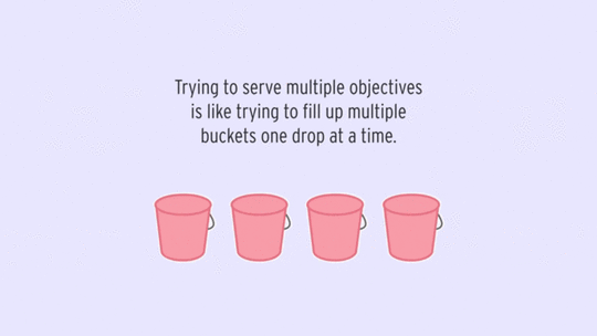
Before you start on your homepage design, set YOUR objectives for building a profitable business
Before you can update your website to be more effective, you have to define what “more effective” means by setting your objective(s). Your site should have a primary, secondary and tertiary goal.
[image error]
Objective #1) SALES: Your primary goal is to sell your product or service. If you have multiple offerings, define ONE* clear winner among them to optimize for.
Objective #2) LEADS: Your secondary goal should be leads. “Leads” can come in many forms. Define what that looks like for your business. Is it to get people to join your email list? Sign up for a challenge? Contact you? Set up a consultation call? Be specific.
Objective #3) INTEREST / TRUST / AUTHORITY: Your ongoing goal with your website should be to deliver value to your ideal audience and have them coming back to your site consistently because they know you’re going to deliver for them.
*We know you may have multiple product offerings. Heck, we do too! But, your website’s homepage should sell your main offering. If you give people the Sizzler Buffet of things to buy from you, guess what will happen? They won’t buy anything. Pick your “product pony” and have that be the focus on your homepage. Create a Products or Work With Me page to share more of what folks can buy from you.
Process #1 to Gauge The Effectiveness of Your Homepage: 4 Questions Clarity Test
Before you go making changes to your site, you need to gauge how effectively your homepage is communicating with your customer at the moment. Start by climbing into the shoes of someone visiting your site for the first time who knows nothing about your business.
[image error]
Does your current homepage CLEARLY answer these 4 questions:
Q1: What do you do?
As a visitor, would you know immediately what kind of business your site promotes and what mental category to put it in? What’s the two-word category that your customer/client should put you in? You don’t want someone to be confused about what kind of business you run.
TIP: We call this your “two-word tango.” Someone should easily be able to identify you as a graphic designer, web developer, marketing consultant, business coach, fiction author, etc.
Q2: Are you for me?
As a visitor, would you be able to identify if this business was geared toward you? Would you recognize yourself in the copy or resonate with the design elements?
Your website homepage should explicitly state your audience somewhere. Your target audience should be able to say to themselves, “I’m in the right place!” It’s about showing them that your business, brand values and personality are a match for them.
It also helps you sort through who you want to be working with. What kind of customers or clients do you want to be spending your time with? You want your site design to speak to those people, even if it means people who don’t fit that bill will be turned off.
Q3: How can you help me?
As a visitor, would you know how your life would be improved by hiring this business or buying a product from this business? There should be a clear outcome stated for your client/customer. As Donald Miller from StoryBrand says, “make the customer the hero” and show them the journey they can go on with your business.
[image error]
We love this quote from April Dunford on positioning yourself and your product:
“Customers don’t care about your unique features, they care what those features can do for them. Your positioning needs to be centered on the value that you alone can deliver for customers.”
Q4: What’s my next step?
As a visitor, would you know what action you should take next if you were interested in this business? It should be super obvious, compelling and visually distinctive.
Please, for the love of Pete (whoever Pete is) stop burying your email signup form in the footer of your website, especially if that is one of your main objectives for your website. Also, don’t just say “sign up for my emails,” add a compelling statement as to WHY someone should give you their email address.
[image error]
 4 Qs ACTION STEP
Pop open a new browser tab and go to your website’s homepage (we know you have about 17 others open